Split toning a black and white image
When developing a negative film and printing in the darkroom, a split tone would often be applied to a black and white photograph at the printing stage. In doing so a photographer could change its appearance to artistically enhance the feel and emotion in the image. I have never worked in the darkroom but speaking to those that have, there is a great deal of skill, patience, expense, not to mention trial and error involved to achieve the results envisaged by the photographer. To produce a body of printed work is even more challenging, as this must require real dedication and a consistent approach to how a series of pictures are printed.
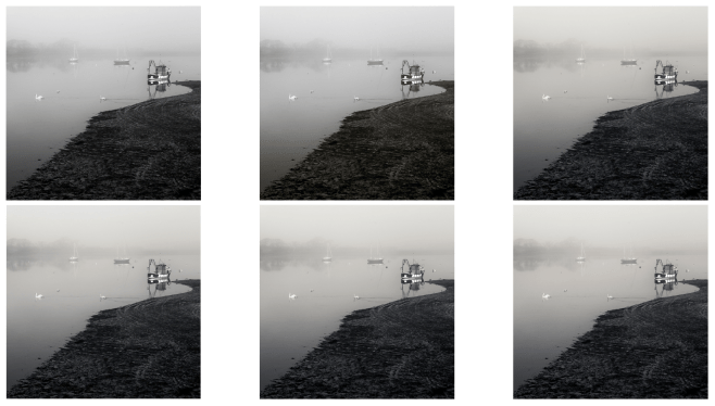
Six versions of the same image – read on to see larger versions of each one
I greatly admire those photographers who still work in a darkroom and one day I may go on a workshop to learn more about it. For now though I am happy to try and apply these darkroom techniques in a digital world where the likes of Lightroom and Photoshop make the process so much easier.
I am firmly of the view that toning an image can and will, if applied sympathetically, improve a photograph. I have therefore been experimenting in Lightroom with a variety of split tone settings to the same image for comparison purposes. For those not familiar with split toning, you have the choice of applying a hue and saturation for both the highlights and the shadows. The choice of hue can be different in each case and the level of saturation can be adjusted. The balance between the toning applied to the highlights and to the shadows can also be adjusted. In a phrase there are endless permutations, so choosing the settings which work for you takes time and a lot of consideration. This of course is before you start printing, as the choice of paper, printer and monitor calibration all play a part in the final result. What looks right on screen may not print quite as you expect, so there is more work to be done. In the meantime I thought I would illustrate how small changes can bring about very subtle alterations to the look of a photograph.
Below are six variations of the same image. Under each version I have provided details of the ‘split tone’ settings that have been used in Lightroom. The balance is set at zero in every case.

Image 1 – Straight black and white – no split tone

Image 2 – Highlights – 240 (blue hue) Saturation 3 – Shadows 50 (sepia hue) Saturation 8
At first I thought I wanted the highlights to have a slight blue tone with a sepia tone applied to the shadows (as above in image 2) – but I soon realised this was not the look I wanted.
Instead I opted for the reverse treatment with a sepia tone applied to the highlights and a blue tone applied to the shadows as you will see in the next four images below.

Image 3 – Highlights – 50 (sepia tone) Saturation 8 – Shadows – 240 (blue tone) Saturation 5

Image 4 – Highlights – 50 (sepia tone) Saturation 5 – Shadows 240 (blue tone) Saturation 5

Image 5 – Highlights – 50 (sepia tone) Saturation 8 – Shadows – 240 (blue tone) Saturation 8
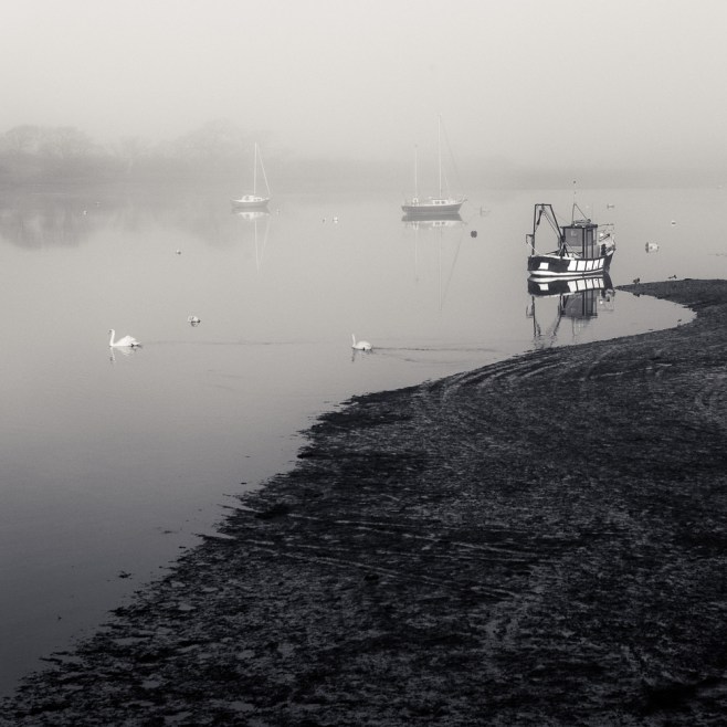
Image 6 – Highlights – 50 (sepia tone) Saturation 10 – Shadows 240 (blue tone) Saturation 10
Applying a sepia tone to the highlights, gives warmth , whilst a blue tone cools down the shadow areas. This is a classical approach to split toning a monochrome image and as you will see from the settings the changes are small, but each version is very slightly different. You probably need to be viewing this post on a large screen and calibrated monitor to fully appreciate the minor differences.
Why am I doing this? Well regular readers will know that I will be exhibiting my work for the first time later in the year and I want this body of work on Chichester Harbour to be appropriate to the subject matter, cohesive, consistent, and as good as I can make it. Split toning, amongst many other decisions to be made including choice of paper, mounting and framing, is just one aspect requiring experimentation and consideration. How each one prints will help me make a final decision as to which one I prefer. If asked to make a choice right away, then I would probably opt for Image 5. If you have a preference do let me know, as I would welcome your feedback.

5 Responses to “Split toning a black and white image”
I’m looking on a 27″ high resolution screen, but with my poor eyesight and using (only) distance glasses on the end of my nose, in 1 & 2 the foreground looks a bit too dark to me. In 6 the foreground looks a bit wishy-washy and too blue (to me).
So not sure between 4 or 5?
Having said that, sometimes I find it helpful to turn the image upside-down to get a true balance on the rare times I ‘tweak’ my images. I don’t do much in the way of editing myself. I found this tip of turning something upside down from a book called Drawing on the Right Side of the Brain (?) many years ago and don’t have the book any more.
Back when I first took up photography in 2010 and had more money (to print whenever I liked 🙂 ) I certainly found my own images looked very different and poorly focused when printed.
LikeLiked by 1 person
Hi Vicki. Thanks for your feedback. I too use a 27″ iMac, and whilst I can see differences between each version they are very subtle. I will have a go at printing a ‘test’ sheet in the next few days and see where I go from there. I also know from experience that what appears sharp on screen, some of this sharpness can be lost when printing. Thanks for the tip about ‘flipping’ an image. I have heard that artists will turn canvases upside down and look at them in a mirror as well. Its easily done in LR so I’ll give it a try.
LikeLiked by 1 person
I like Image 3. Gut instinct.
LikeLike
Thanks for your feedback. I’m far from sure but will have a clearer idea when I do some test prints. Might experiment with the balance slider in LR as well.
LikeLike
[…] Split toning a black and white image […]
LikeLike