Has Capture One Pro consigned Lightroom, Photoshop and Silver Efex to the history bin?

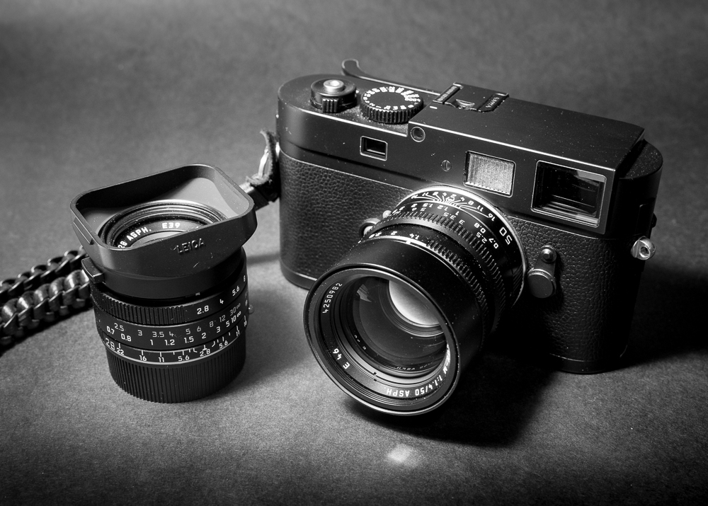
Leica M Monochrom
I have been quite serious about my photography for a little over 10 years now. Before then I can’t say I knew much about RAW files or how they should be processed. In the early days it wasn’t long before I was hooked on Lightroom and its sister program Photoshop.
In 2012 I regarded myself as a dedicated black and white photographer and then in 2014 I purchased a second hand Leica M Monochrom, which I still love and use to this very day. As its name suggests it is a black and white only camera. It’s an inspiring tool but not to everyone’s liking particularly given the cost of both the camera and a set of manual only focus lenses. Even today a second hand M Monochrom camera body, which is up to 8 years old, is around £3,000, assuming you can find one.
The M Monochrom was sold with a licence to use Silver Efex Pro, arguably the best plug-in for black and white processing. The fact Leica supported this program was a significant endorsement and the majority of my photographs have benefited from its use.
Time though moves on and earlier this year I purchased a Fuji X100v as a carry anywhere camera. I had read that Capture One had a close working relationship with Fujifilm and their RAW editor was a considered to be better than Lightroom. (Let the arguments begin!) I purchased a perpetual licence but this only allowed me to process Fujifilm files and not the Leica DNG RAW files.
Having watched many of the excellent Capture One webinars hosted by David Grover and very informative Live Editing sessions with Paul Reiffer, not only did I learn a great deal about Capture One in the past few months, I was starting to wonder how well it would perform if I could process my Leica RAW files. After all the Monochrom is the camera I use for what I consider to be my best work.
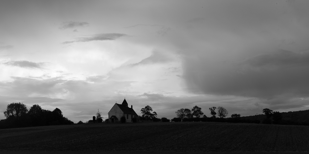
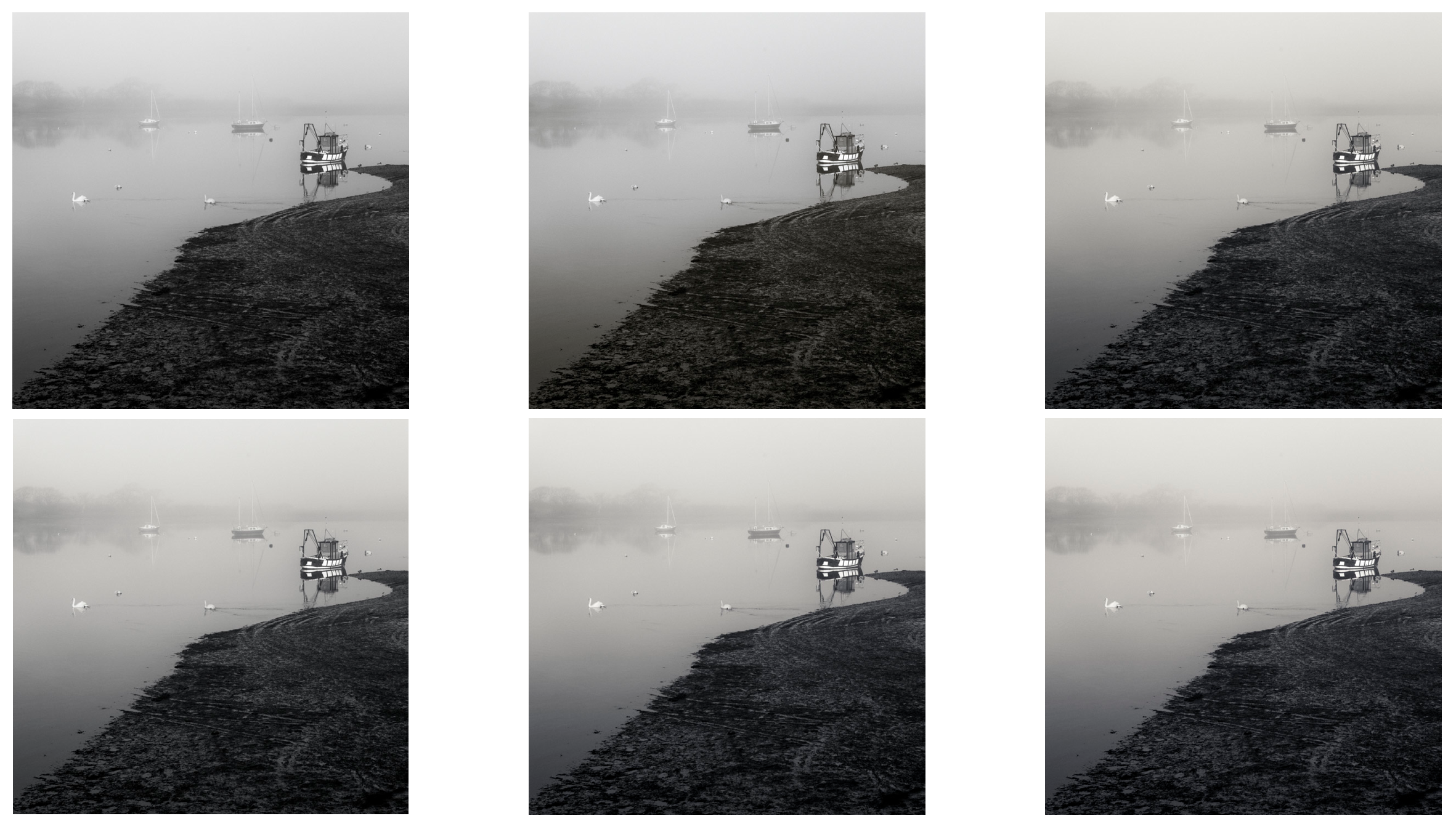
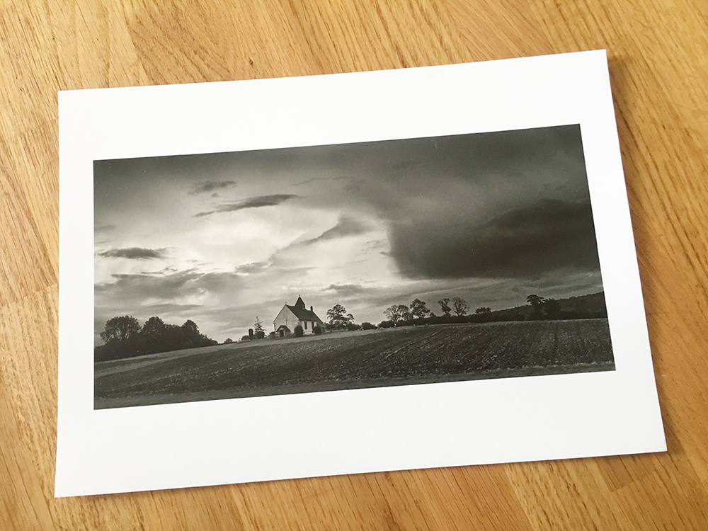
Yesterday I processed an image I had captured last week. A picture of Idsworth Church close to the Hampshire/Wets Sussex border. The dramatic sky was the appeal and I visualised a dark moody result. Taken with the M Monchrom I imported the file into Lightroom and followed my usual workflow. I always expose to preserve the highlights but this did leave me with a very dark foreground. From experience I know that I can readily recover detail in the shadows and balance the overall exposure. I couldn’t achieve the look I wanted in Lightroom alone, so I exported the partially processed image into Photoshop and from there into Silver Efex Pro. It was a lengthy process but in the end I made the image you can see below.
Don’t get me wrong I was pleased with the result but it was a long and drawn out process. It made me wonder how well I could do if I just used Capture One Pro? If only I could import the Leica RAW file I said to myself. I couldn’t resist the temptation, so yesterday I upgraded the software so that I could import the RAW file of any camera make and that of course included Leica. I was excited to find out how much could be achieved in Capture One Pro alone. Cutting to the chase I was not disappointed. In fact the results exceeded expectations. Why you may ask?
First and foremost I was familiar with the Luma Range tool in Capture One to create a mask. Yes, there is a similar tool in Lightroom but in my view it doesn’t do the job particularly well. The Luma Range tool of Capture One is far more refined, easy to use, and the ability to feather the edge around the trees and the church made masking the sky an absolute breeze. No nasty halos to worry about. 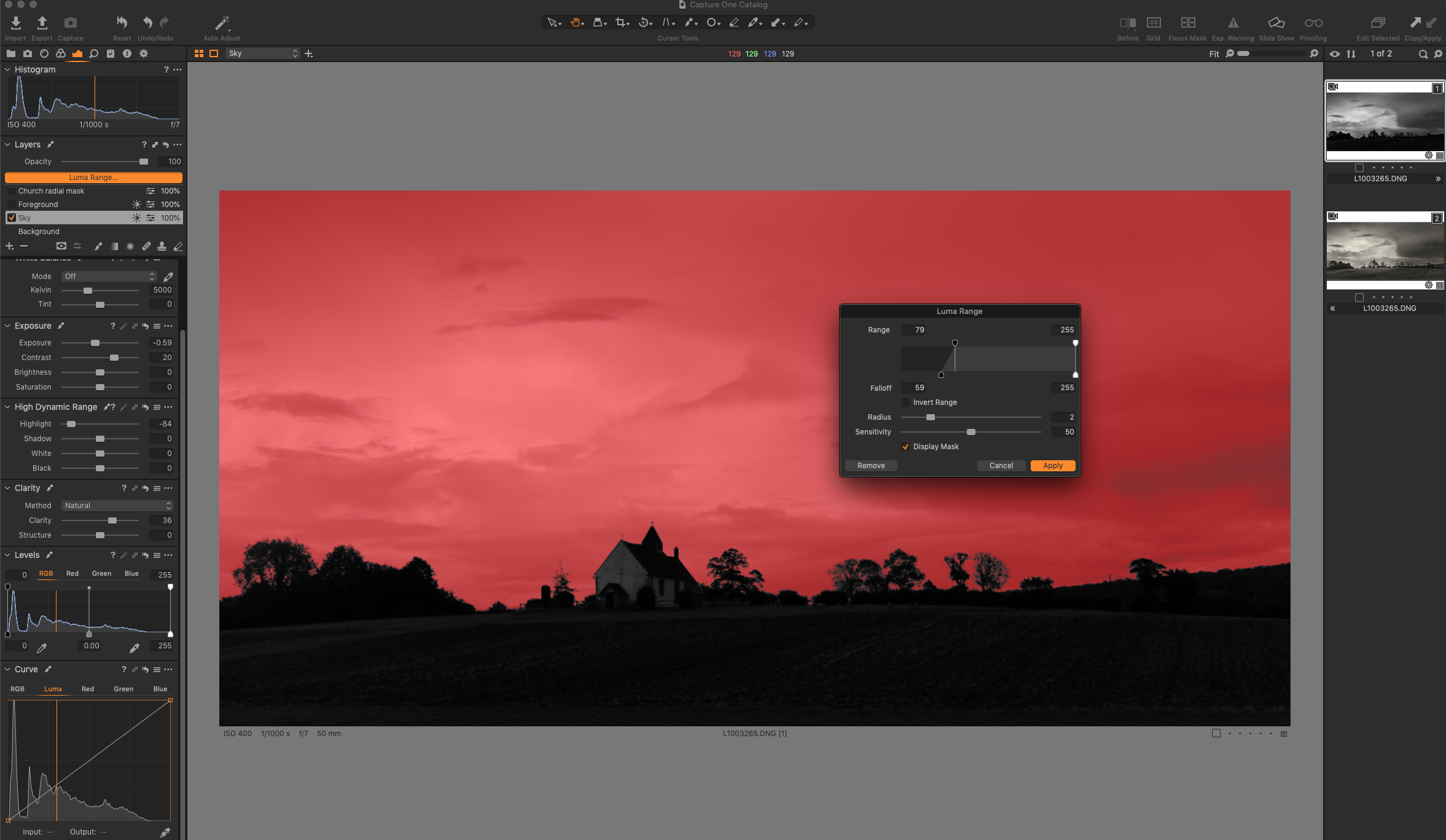 A Luma range mask applied to the sky.
Having processed the sky to my liking it was a very quick and similar process to mask the dark foreground and make the necessary adjustments. I continued by making some further local adjustments on separate layers. This is something you cannot do in Lightroom, hence the need to export from LR into Photoshop.
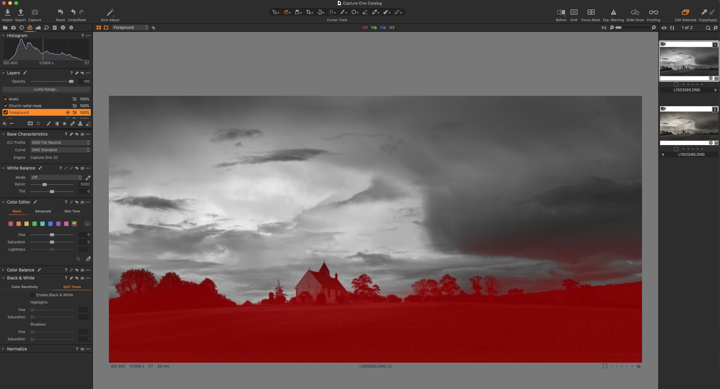 Luma Range mask applied to the foreground.

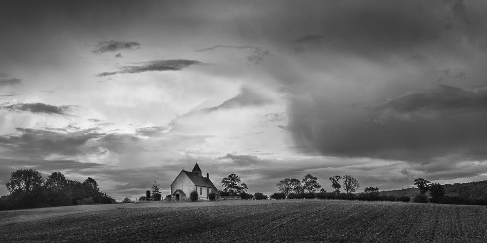
The before and after view clearly shows how the sky has been darkened and the church and foreground lightened. The overall result is quite dark and moody but that is what I wanted the finished image to look like.

The finished result processed in Capture One Pro.
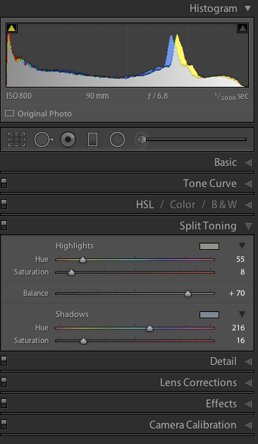
And lastly I applied a split tone……
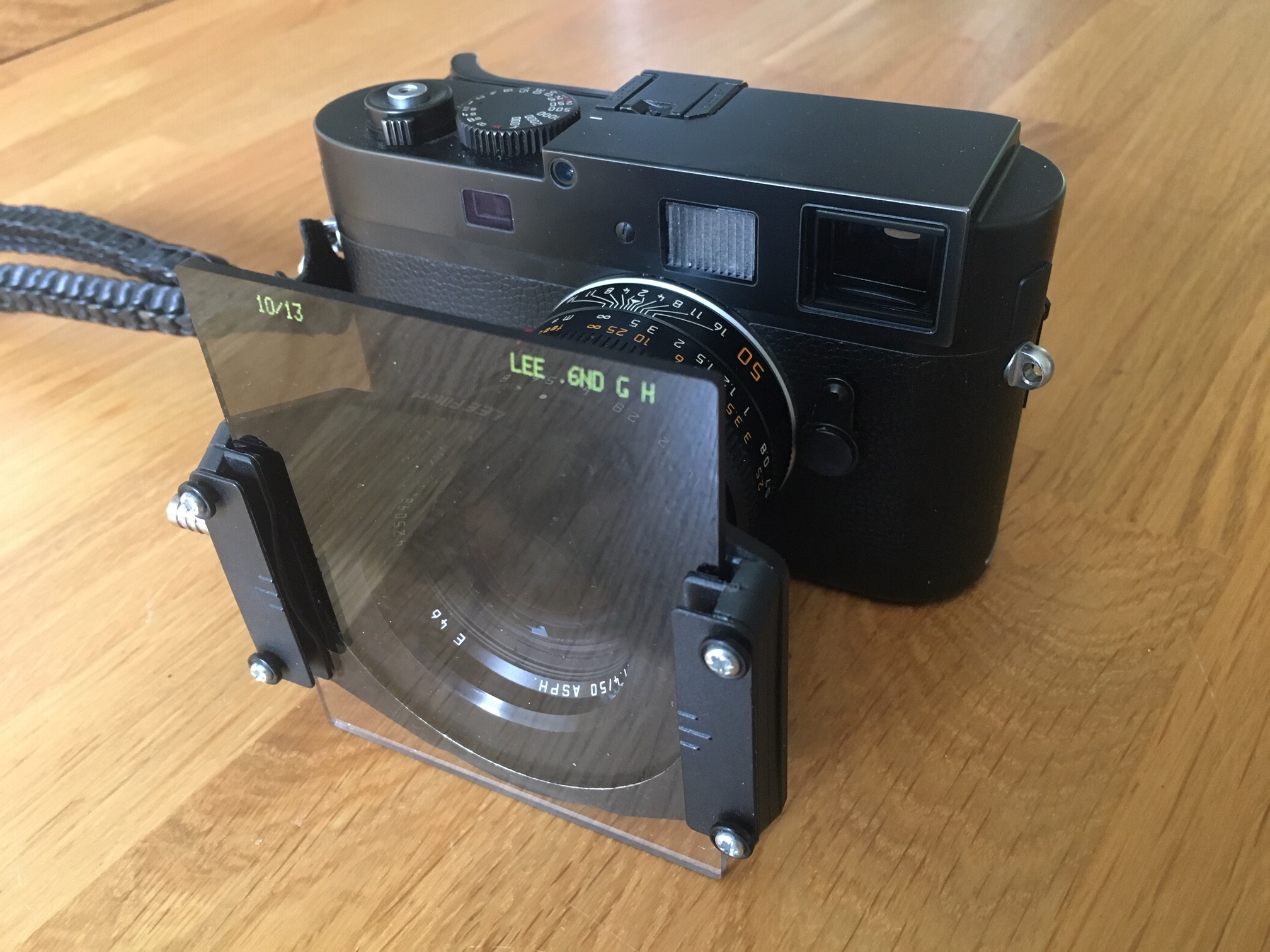 Some of you may be asking the question why didn’t I balance the exposure in camera by using a ND graduated filter. A fair point but a rangefinder camera with attached filters and no ‘live view’ is not a workable combination. The filter holder obscures the view through the rangefinder window and there is no way to accurately position the graduated filter to match the scene in front of you. More recent versions of the Monochrom, the M246 and the newly announced M10 Monochrom overcome this problem, as they both have ‘live view’ and can show clipping warnings before taking the shot. The use of a filter might of course further reduce the amount of post processing, but this on the proviso that the composition includes a relatively straight horizon.
Conclusions.
May I start by saying that I have the advantage of comparing the results of the two processing methods on a large screen at full resolution and not much smaller resized versions in a blog entry. Whilst I enjoy both versions the finished image processed in Capture One has the edge. It looks less processed, the rendering is smoother, it’s a cleaner result which should print very well. There is also visibly more noise or grain to the image from the combination of LR/PS and Silver Efex. Perhaps I used too much clarity in Lightroom or the processing engine in Silver Efex has had an effect, I don’t know for sure. What I do know is that Capture One Pro is a superb RAW converter.
Not only is the overall result more pleasing but the time taken was considerably reduced and far easier to achieve. In Capture One I also have the advantage of retaining all the layers and adjustments in one program, which means I can revisit and fine tune the image at a later date should I wish to do so. A win win, in my opinion.
So are the other programs consigned to history, well yes and no. This is the first time I have processed an image from the Leica M Monochrom in Capture One. I need to work on other images and see what results are possible. I also have a back catalogue of many thousands of images stored in Lightroom and I don’t intend moving them into Capture One. It would take a very long time and life is too short.
I am sure there will be occasions when a pixel editor like Photoshop will work wonders when Capture One simply doesn’t offer the functionality required. The ‘Content Aware’ healing brush is one such example and there will be others. Horses for courses.
I can of course edit an image in either Photoshop or Silver Efex Pro direct from Capture One in the same way as I can at the moment with Lightroom. However if I can do most, if not all my processing in Capture One this has to be a distinct advantage. More consistent results are likely to be achieved and this is particularly valuable if trying to create a harmonious body of work.
And finally…..
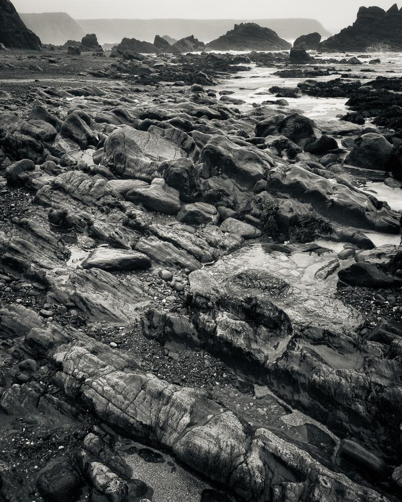
This is the first time in quite a while that I have been out with the Leica M Monochrom specifically to make some images. It reminded me how much I love this camera, its handling, the superb lenses and the RAW files it generates. Having now discovered a new workflow using Capture One Pro 20, the process from beginning to end is that much more pleasurable and that has to be a good thing.
‘A photograph is not finished until it is printed’
Printed using an Epson 3880 on Canson Platine Fibre Rag 310gsm.