Processing for fun with integrity – Glengorm Castle

In this digital age there are an infinte number of options when you start to process an image, so what do I mean when I refer to processing with integrity?
Read moreIn this digital age there are an infinte number of options when you start to process an image, so what do I mean when I refer to processing with integrity?
Read more
It goes without saying that any outdoor photography is weather dependent. Sometimes the conditions are just right, and at other times they work against you.
This was very much the case during a recent workshop in Dorset with another photographer – Anthony Blake. Throughout the day it had been overcast and misty. As we approached our final destination before the sun set, we walked up a hill to the site of St Catherine’s Chapel in the hope that we would enjoy a great view of Milton Abbey through the trees. On arriving unfortunately the Abbey was nowhere to be seen. A veil of mist had descended in the valley and obscured its view. We waited a while but if anything the mist was getting worse not better.
We returned to the car and drove around looking for different viewpoint without any success. Unfortunately the light was fading fast but we decided to try one more time and return to the first location in the wishful hope that the mist might have lifted.
Much to our surprise and delight the Abbey could now be seen and you can see the result in the image above. An ethereal view of the Abbey with the mist hanging in the valley but with a clearly visible outline of the hills in the distance. I was very fortunate to capture this view…….and in doing so I couldn’t help but be reminded of the saying which I have used for the title of this post.

Firstly some background information about this shot. Bosham (pronounced Bozzum) is arguably the most picturesque sailing village (read tourist honeypot) forming part of Chichester Harbour. Regular readers will know that a current project of mine is to photograph this area but in trying to do so I am very keen to avoid the typical picture postcard view.
Everyone who visits Bosham takes out their camera and posts their results on social media for all to see. They are mostly in colour and feature the church from across the water with a few boats in the foreground for good measure. If the sun is setting, then this is a further attraction, as it’s unquestionably a great place to be at the end of the day. (Scroll down to the end of this entry to see an example)

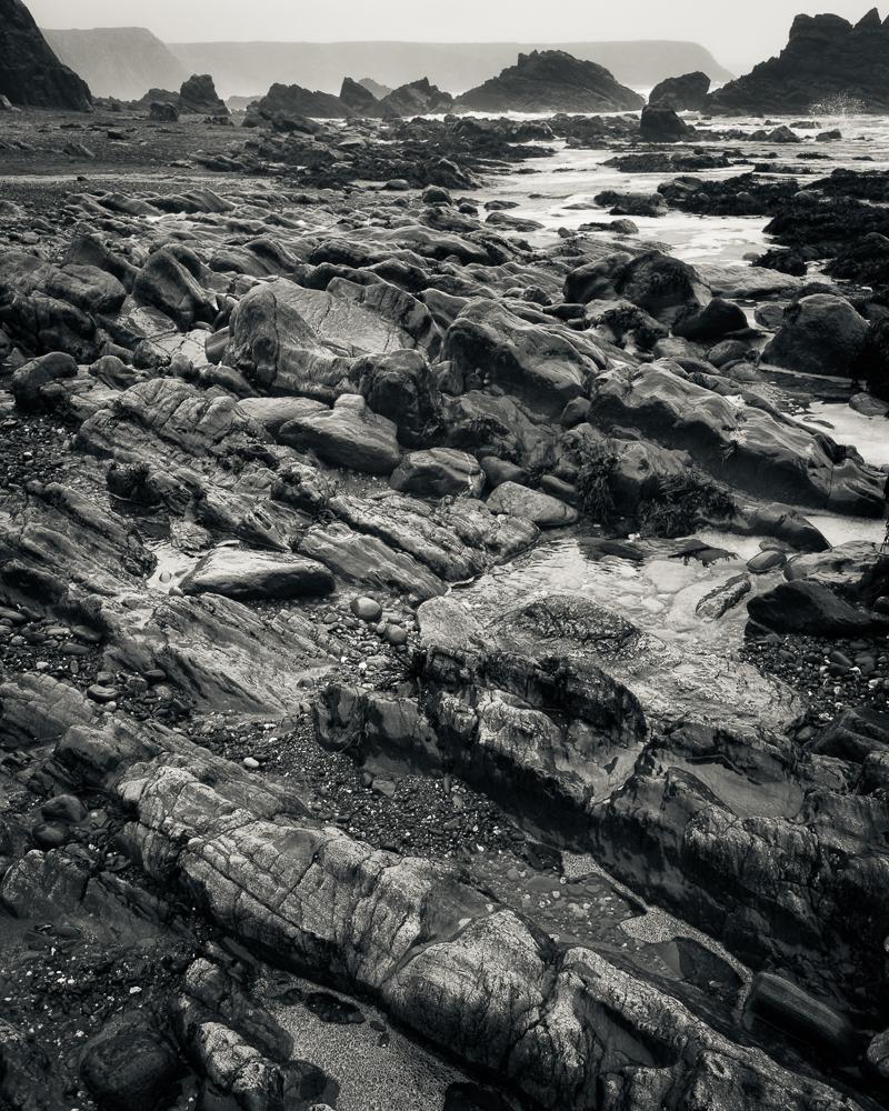
As I write this post the sun is shining and Summer is almost here but these four images depict a very different time of year. They were all taken on the same day back in February. Some may say a typical late winters day in Wales, when nobody in their right mind would be out with their camera. Mist, drizzle and poor visibility. However these conditions can be ideal for the monochrome photographer.
In all cases the native 3 x 2 crop of the 35mm sensor included too much sky, and with little or no interest in this part of the picture I have cropped each image to what might be described as a ‘letterbox’. The aspect ratio is about 3 x 1, but what really matters is whether or not the crop works compositionally, and I believe it does. Photography is often about what you choose to exclude from the frame to strengthen a picture, not just about what is included already.
In the first shot taken at Newgale Sands, I focused on the foreshore which has softened the figures, the sea and distant rocks. This has helped to emphasize the misty conditions. The couple and their dog are an essential part of the image. The provide scale and as they are the only people on the beach they serve to reinforce the fact that the weather was so poor keeping most sensible people indoors, but for dog walkers and photographers!
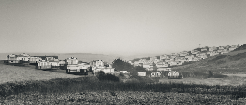
After taking the first shot I looked behind me only to find a swathe of mobile homes which overlook this section of coastline. Very quiet at this time of year, and only coming to life when the weather improves and the holiday makers return.

Moving further along the coast I stopped at Little Haven. Conditions remained the same and this time I wanted to capture the tidal movement of the sea. Resting the camera on a wall I used a ND filter to give me a slow shutter speed, about 1.6 seconds. Several exposures where necessary to give me the look of the movement in the sea water I was after.

Finally a shot of what I assume is a farmhouse taken at Marloes. A typical dwelling in this part of the world but what appealed to me was the telegraph poles and how they could be used to create what I think is a pleasing composition.
Each picture looks better larger, so do click on an image to view a larger version which will open in a new window.

If you read my blog on a regular basis you will probably have noticed that although I work almost entirely in monochrome, rarely are my images in ‘pure’ black and white – in other words they are toned. Either with a single colour, or more recently I have used a split tone where the highlights are toned with one colour and the shadows are toned with a different colour. This split tone is easily applied in Lightroom and the balance between the two tones can also be adjusted.
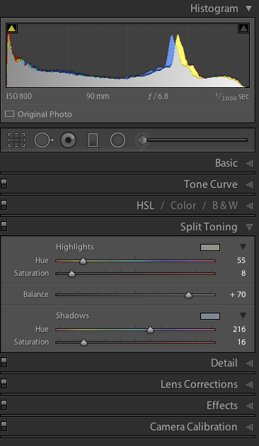
Whilst I like the effect of split toning it does present me with a new problem, and that is one of printing. I very much enjoy the process of printing; in many ways it’s the rightful conclusion to everything that has gone before it. In the past printing a ‘pure’ black and white photograph was fairly straightforward from my point of view. The fact that my monitor wasn’t properly calibrated (good but not great) didn’t matter hugely to me; I could produce a perfectly acceptable print by observing the histogram, processing accordingly and adjusting the contrast to achieve the look I was after.
With split toning, however subtle the effect, I am now printing a ‘colour’ image, so what I see on the screen and how that image is produced in print becomes much more critical. The choice of paper (and there are now so many excellent photographic papers), use of the appropriate colour profile for printing, as well as having a correctly calibrated monitor, now all play a more important part than they did before.
For these reasons I started exploring the soft proofing panel in Lightroom which forms part of the ‘Develop’ mode. It is easily opened by pressing ‘S’ on the keyboard. From here you can select the colour profile for the paper you wish to use and select either perceptual or relative as the intent. From here Lightroom will create a virtual copy of the image with the colour profile and intent embedded. The name of the file/copy will include a reference to the colour profile, which is a very convenient feature for future reference. This is an invaluable benefit and one that Lightroom makes so easy. Depending on how the image changes its appearance in soft proofing you can go on to make the usual processing adjustments to the contrast, clarity, exposure etc so that the image reflects how you want the photo to be printed. By choosing a matt paper colour profile I found the proof copy was much ‘flatter’, it lacked contrast when compared to the original image. In processing I added back more contrast to the proof copy.

I do not own a device for calibrating my monitor and perhaps that is something I should acquire in the future. In the meantime I did use the Display Calibratior Assistant on my iMac and whilst not a precise tool, I have been able to calibrate my monitor to more closely represent what comes out of the printer.

There is no question that I still have more to learn regarding printing and with two exhibitions on the horizon this year; one in July and one in November, I am very keen to make a decision on my choice of paper and be able to produce consistent results. More test printing is required. I also know that Photoshop has a soft proofing feature and in time I may look into this as well but for the moment Lightroom seems to be a very straight forward way to achieve the results I am wanting.
I shall leave you with a few more images of Marloes in Pembrokeshire, Wales. Fortunately when I visited this location earlier in the year, the height of the tide was just about right – ideal conditions for some dramatic coastal photography.


Please note that I am using Lightroom 5 and I am not using the most recent operating system on my iMac, so the screen grabs may look different. To be frank I am not a great one for always upgrading to the latest software. If it works then I don’t feel the need to automatically change anything. I do realise this might get me into trouble one day but for now I’m very happy with what I’ve got and it works for me!
