
Private Jetty at Bosham – and thoughts on split tone presets for a b&w image
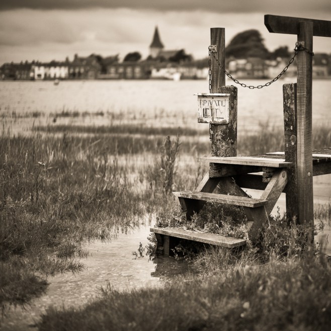
Firstly some background information about this shot. Bosham (pronounced Bozzum) is arguably the most picturesque sailing village (read tourist honeypot) forming part of Chichester Harbour. Regular readers will know that a current project of mine is to photograph this area but in trying to do so I am very keen to avoid the typical picture postcard view.
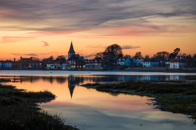
Everyone who visits Bosham takes out their camera and posts their results on social media for all to see. They are mostly in colour and feature the church from across the water with a few boats in the foreground for good measure. If the sun is setting, then this is a further attraction, as it’s unquestionably a great place to be at the end of the day. (Scroll down to the end of this entry to see an example)
However my objective is to photograph the area in mono, so trying to find a different viewpoint, but one that was still recognisable was never going to be easy. I timed my visit to coincide with high tide, walked along the road to the east of the harbour and made my way down to the jetty or walkway. The tide was just about right. Using a 50mm lens at f1.4, I was able to focus on the sign and allow the background to blur. However to anyone who is familiar with the area, they would still know it was Bosham and for my purposes this was important.
Pleased with the outcome it was now a question of processing and in particular whether or not to apply a split tone and if so, which of my presets in Lightroom would be the most suitable.
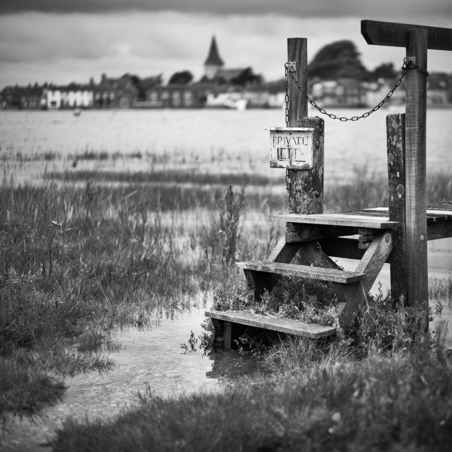
Straight black and white – no preset
All of these five images share exactly the same processing, the only difference is the split tone I have used. The first picture (above) is a straight black and white photograph with no split tone.
The next four images have all had a split tone preset applied. They are custom presets in Lightroom, some of which I regularly use in my workflow.
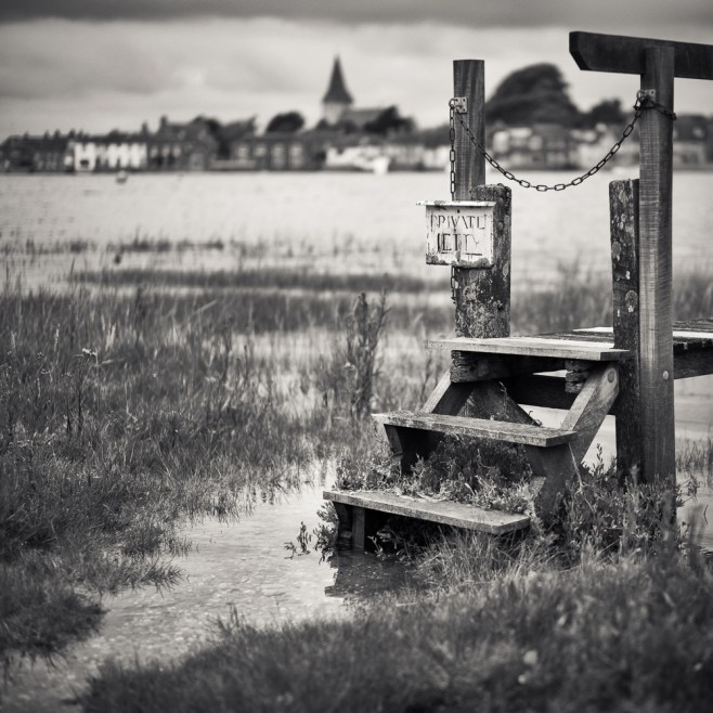
Preset 1
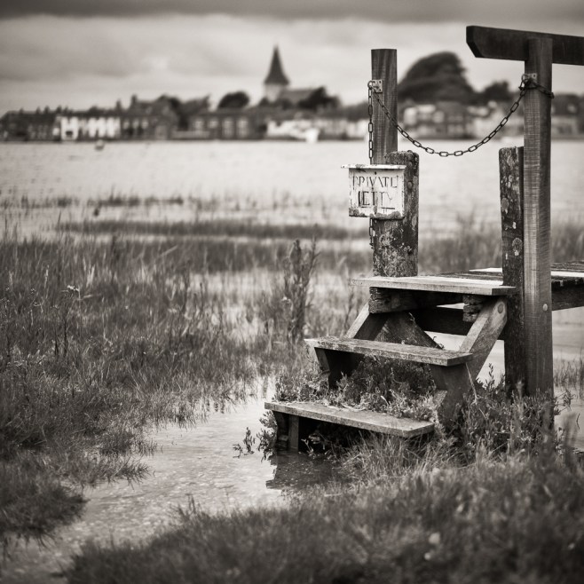
Preset 2
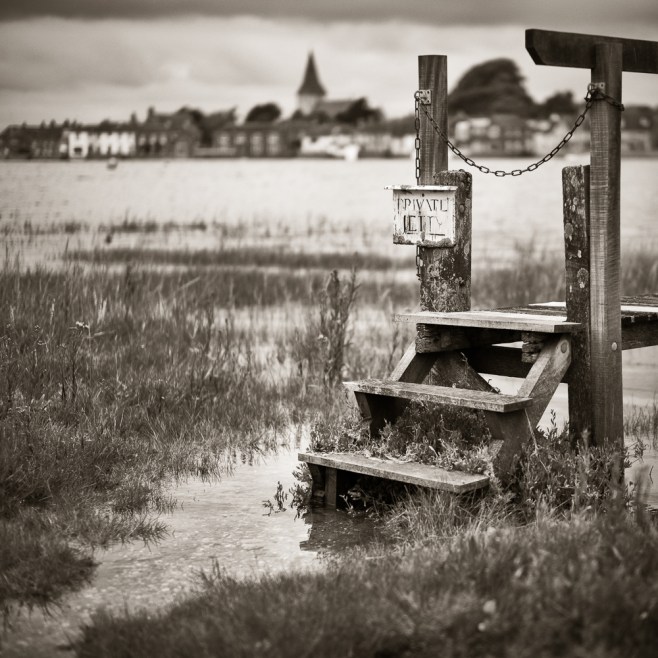
Preset 3
Preset 4
So what are my thoughts. Firstly I should say that rarely do I make an image these days and leave it just ‘black and white’, I much prefer to apply a split tone. I believe this approach enhances a photograph and works well for me when I come to print. Of the four presets each one is progressively warmer in tone. In fact ‘Preset 4’ is one I discovered from the truly excellent online magazine called ‘Lenswork Online’ by Brooks Jensen. If you subscribe you have access to a wealth of content and very valuable information and I recommend it highly. ‘Preset 4’ is supposed to emulate Palladium printing, but I find it a little too warm in tone. ‘Preset 3’ works well, as does ‘Preset 2’ which is a little more subtle. ‘Preset 1’ has more blue tone in the shadows which gives the image a ‘cool’ appearance.
Which is looks best is a very personal thing, and I dare say that everyone reading this will have a different opinion. Overall I think that ‘Preset’ 3 works very well. What I do know is that the finished print will be a split tone and not stay purely as a black and white photograph.
I have written before about split tones, so you may wish to read this entry.
Split toning a black and white image
If you would like more details about these split tones please comment or get in direct contact with me. Just click here.
Oh, and if you want to see a sunset shot of Bosham Harbour then here it is.

Leave a comment