How many elements + which aspect ratio = different results
The three images which make up this entry are essentially the same subject but in terms of their composition are all quite different. Through this post I want to illustrate the decisions we have to make each time we make a photograph and what we can learn from the process.
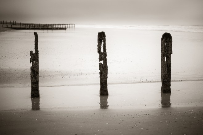
The first image above, uses a classical 3:2 aspect ratio….the same as any 35mm film or full frame sensor. The composition is balanced with three groynes, with the one in the centre arguably being the most visually interesting. The distant and out of focus groynes on the horizons provide both context to the location but also depth. I think it’s important to have retained separation between the left hand groyne and those in the distance.

The second image shares the same elements but is further simplified as only two groynes are included in the frame. The distant groynes are a more important third element in this picture, creating a triangle with the groynes. There is added space between them and the much shorter groyne on the left hand side, which gives a more open feel to the shot. The aspect ratio is now 5:4, the equivalent of a medium or large format film camera.

And finally the third image. The single groyne fills more of the frame and is clearly the main focal point. The distant groynes are less intrusive but still play a key role in providing context and depth. The 1:1 or square aspect ratio, is one I particular like and lends itself well to this more minimalist composition. This aspect ratio mimics the 6:6 medium format ratio found in the classic Hassleblad 500 series of cameras.
So do I have a preference as to which image I enjoy the most? The first picture is too busy for my liking. Increasingly I find myself drawn to simpler compositions. The second image has a little more tension as the three elements form a triangle and I like the fact that one of the groynes is much shorter than the other which adds visual interest and feeling of openness. The third image is simpler still, but might be even stronger if the distant groynes were not in the frame.
It doesn’t really matter which image you or I prefer, although I would welcome your comments. What I wanted to demonstrate is how a relatively simple subject can be treated in different ways. What do you include and what is better left out? Your choice of aspect ratio and how this can impact on the end result. How simple or complicated do you want the composition to be?
For all these reasons it makes sense to me to truly explore or work a location and subject. Look around, consider the visual relationships between all the elements in the frame and at the same time think about a variety of aspect ratios and how these may improve the final image.

11 Responses to “How many elements + which aspect ratio = different results”
I too have a preference for the third one Alan, although all three have aesthetic merit and are pleasing to my eye.
I think, also, your comment about perhaps isolating the groyne post further would be an improvement. Either that or take the same image but with the post in wet sand instead of standing in shallow water which would then introduce a visual separation from the distant posts which are also in the water.
Thanks for sharing them!
LikeLiked by 1 person
Thanks for your observations and comments Allister. I have a leaning towards No.2, despite my preference for square but so much of this is down to you own personal view.
LikeLike
I think I’d go for number 2. I think no 1 is a bit obvious and it’s what most people would probably do. I like the way no 2 makes you examine all three elements of the image more than you might in the others
LikeLiked by 1 person
Thank you. 2 is my preferred choice but I have decided to post some more versions based on other comments received.
LikeLike
The problem I see with the first one is the line formed by the tops of the near groynes nearly touching the line of the horizon and the far groynes; that doesn’t work for me. If you’d lowered the point of view, as in the other two pictures, the near left groyne would have cut across the far groyne, which also might not have worked. I’m inclined to think no 2 works best, but if the post in no 3 was shifted a bit further right I think that shot would have balanced better and might work really well. I do like square! (Sometimes… makes it hard with a 6*6 camera!)
LikeLiked by 1 person
Hello Chris and thanks for your feedback. Having looked at no. 1, I agree with your comment re. the placement of the horizon. It doesn’t quiet work and it was my third choice anyway. 2 is my preferred choice but I also think your slight adjustment to 3 would work well so I’m going to give that a try. As a result I’ll be posting some more alternatives in the next 24 hours! Thanks again.
LikeLike
Thanks for sharing 3 different views of the same subject. I find them really helpful in learning to ‘see’.
I think I prefer the more simple no. 3 but without the distant groynes.
I’d like to see no. 2 as landscape size, not square. I think no. 2 has merit, but the distant groins look (to me) too far above the left hand groyne. There’s something not quite right to my eye, but it could be just the square format which I’m not used to. I’m mainly used to landscape size and not so good with portrait either.
I like reading about commenter’s likes and dislikes also.
We are all different in photographic composition and style. 100 photographers could interpret exactly the same scene in 100 different ways. There may be no right or wrong, merely different interpretations.
I’d love to see some more examples with 3 different views – they make me think more.
LikeLiked by 1 person
Hi Vicki. Thanks for your comment. It’s been a useful exercise for me as well and following on from these comments I will be doing another entry, with some more variations on the same theme. Thanks again. Alan
LikeLiked by 1 person
[…] my previous entry which you can read here, I posted three images all of the same subject but with differing compostions, aspect ratios etc. I […]
LikeLike
For me, its No 2. I’m a great lover of symmetry but I find the placement of the groynes in 1 and 2 a little too precise. The second image has a tension that the others lack. I’m sure I’ve seen these groynes on my travels (or something like them). ?Littlehampton.
LikeLiked by 1 person
Thanks Andy. I’ve really enjoyed all the feedback. These groynes are down at Bracklesham.
LikeLike