Question – How simple can it be?
Answer – Not as simple as the title of this post would suggest.
When composing an image I have often read: ‘It’s not what you include, it’s what you choose to leave out’. Just think about that for a moment. It’s certainly worth having that thought in mind when you are framing your next shot.
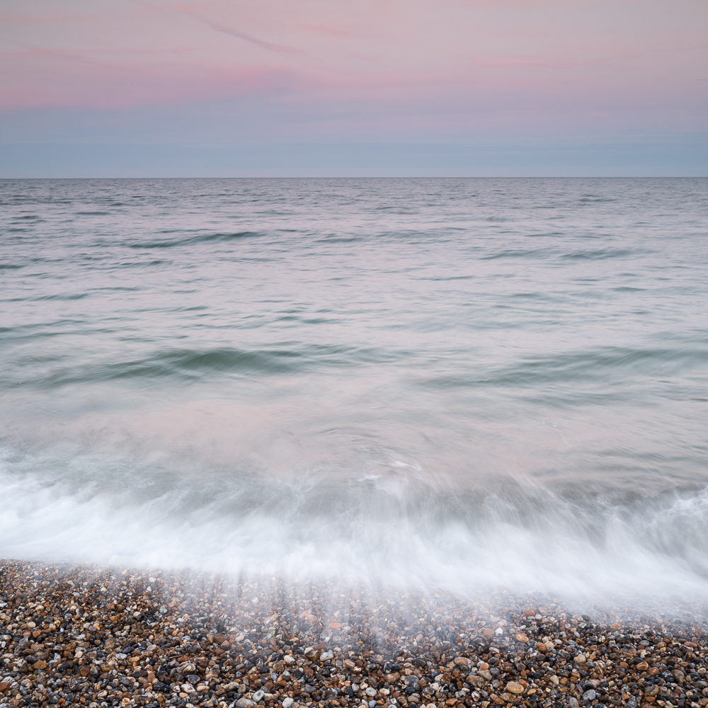
I have always been drawn to simple compositions. A complicated image with many elements can be a challenge to appreciate, there can be just too much going on. The emotional reaction to a busy image can be one of excitement or tension, whereas an image with simplicity at its heart can be quite the reverse, being both quiet and restful. But even with a ‘simple’ image there are still choices to be made, so I thought it would be interesting to analyse the four photographs in this post. They all share the same viewpoint and were taken during the blue hour after the sun had set.
The composition of first image which is shown below is split into three broadly equal parts. The upper third being the sky, the middle third the sea, and the lower third the movement of the lapping tide where it meets the shingle shoreline. In essence a very starightforward composition.
In the second image I have stepped back from the shoreline so the bottom section has less detail. The horizon now intersects the midde of the frame revealing more of the sky. And lastly the exposure time was longer than the first image, which has resulted in less texture in the water. In my view this is now a simplified version of an already fairly simple image.

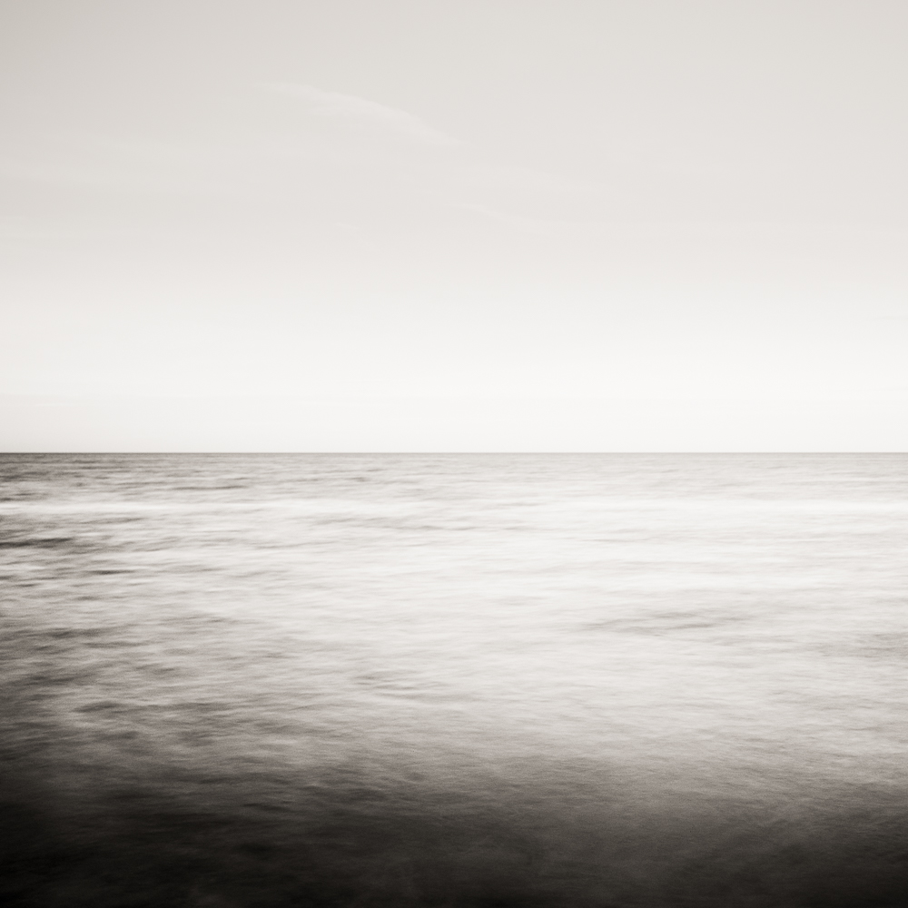
The third image shares much in common with the second. The horizon still splits the frame in two, the exposure time was about the same, but crucially the shoreline has been left out. Instead of three main elements there are now just two; the sky and the sea. A further simplification but as a consequnce you might now ask yourself the question whether this was taken from dry land or out at sea. Not only is this third image simpler than the previous two versions, it evokes a very different feeling.

In the third image you might have also noticed that I did adjust the colour balance, but what happens if all colour is removed and the photograph becomes monochrome? Again it’s a further simplification of the scene. There is little or no detail in the sky and the juxtaposition of warm and cool tones (above) has also been lost.
It is not for me to say which is best or which one I like best, they all have their merits in my opinion. However I hope they illustrate the point I wanted to make in this post. What might at first glance appear to be a simple scene, the photographer is still required to make a number of decisions. What to leave in and what to leave out. How fast or slow should the shutter speed be. Where does the horizon line sit in the frame. What colour balance should be used or should all colour be removed. Some of these choices can be made in post production, others must be made before the shutter is pressed. Undeniably though each of these choices will have an impact on the final image; how it feels and the emotional impact it has on the viewer.
As an aside the last photograph in the series was inspired by the work of the Japanese photographer Hiroshi Sugimoto. It also just happens to be my most ‘liked’ photograph on my Instagram account.
Arguably it is the most simple composition I have ever posted – so is simple, simply the best?