Elements + Aspect ratio = more choices
In my previous entry which you can read here, I posted three images all of the same subject but with differing compositions, aspect ratios etc. I received some interesting feedback so I have decided to post four more versions which reflect some of the comments made.

This first shot again features three groynes but I have moved round so the groynes in the background are no longer in the frame.
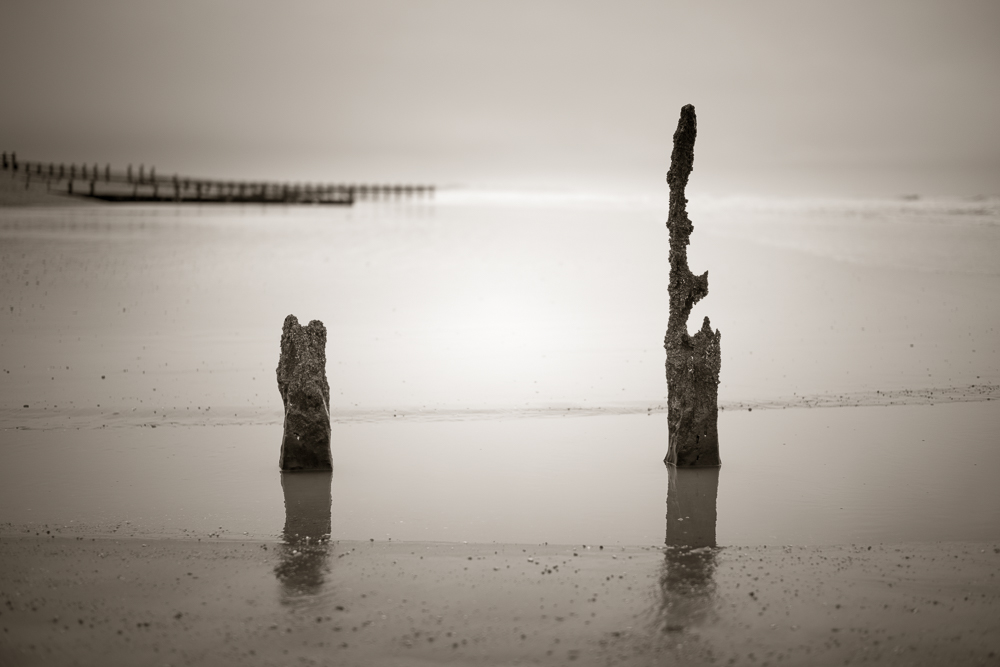
This second shot is the same as yesterdays image but instead of a 5:4 aspect ratio it is now 3:2.
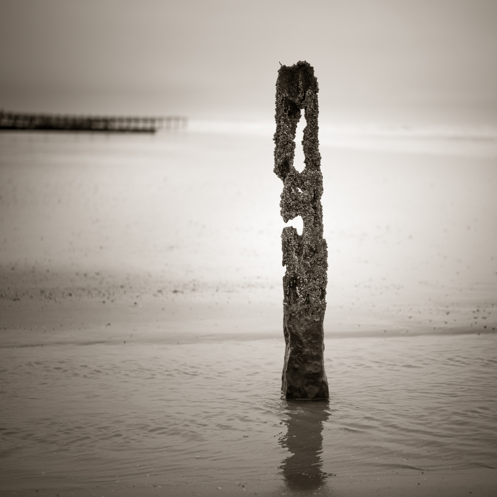
Again the same file as I posted yesterday but it was suggested that I move the groyne slightly to the right instead of it being centrally placed in the frame.

And finally the same image as the one above but instead of a 1:1 aspect ratio it is now 5:4.
For comparison here are smaller thumbnails of the three versions I posted yesterday.


I think this selection of images demonstrates a number of points. Firstly that its worth taking a good number of frames when on location unless you are very confident about the finished image you have in mind. Secondly the various permutations are endless and these images concentrate on composition, aspect ratio etc, we haven’t even touched on processing. Thirdly, whilst I try and crop in camera, sometimes it pays to have some additional space around the subject so that other crops are possible. And lastly isn’t photography and being creative good fun? I think so!
Thanks to all those who responded to the first post – additional comments would be most welcome.

11 Responses to “Elements + Aspect ratio = more choices”
Interesting to compare them. I much prefer 1, 2 & 3, but not 4.
I think the groyne in no. 4 could stand on its own (without the background groynes in the distance).
(and why does my computer keep turning groyne into groin? 🙂 )
LikeLiked by 1 person
Thanks Vicki. The consensus of opinion would suggest No.2 is the most popular but some of the others have merit as well. I have enjoyed the feedback and the experiment.
Auto correct – Don’t you just love it!!
LikeLiked by 1 person
As to autocorrect, I thought I was going mad when I proof-read some of my writing more recently.
LikeLiked by 1 person
A very thought-provoking post Alan. I particularly like the 1:1 and 3:2 aspects. Will be experimenting with this next time I visit the Solway Firth with a camera. I agree with you that it’s sometimes best to leave additional space around the subject so there’s a little leeway when processing.
LikeLiked by 1 person
Thanks Simon. Look forward to seeing some of your work from the Solway Firth. Alan
LikeLiked by 1 person
Interesting! In the first one, without the distant groynes, I found the skyline confusing. There’s a line of surf (I think) that is much more prominent than the horizon, but “slopes”, leading to an insistent feeling that the shot is wonky (though it isn’t). In the other shots, I think the distant groynes are enough to stabilise my view of the image (although maybe the horizon is a tiny bit more prominent?). It’s amazing how those subliminal clues can work.
I find no 2 a very pleasing and well-balanced shot. I like the way the right hand post projects above the horizon and the left hand post below, balanced by the distant groyne above it. Seeing the wet sand in front of the water the posts are sitting in also helps.
Not sure about 3 and 4. I do think the off-centre post works better. Toss-up between the two, but I don’t like them as much as no 2.
Great experiment! Thanks,
LikeLiked by 1 person
Hi Chris. Thanks for your follow up response and in depth analysis of what you like and don’t like in these images. I see what you mean about the horizon in No. 1. To some extent its true of the other images but in No.1 ot’s more pronounced because of the angle I am standing in relation to the shoreline. Arguably No.2 wins the popular vote, but I also like the square shot particularly having moved the groyne to the right – so thanks for the suggestion.
As you say it’s been a thought provoking experiment.
LikeLike
Fascinating to see these variations, Alan. I like today’s version of the first image better than yesterday’s. The shift to lose the distant groynes simplifies the image and I really like it. The change in the ratio of the second image, to my eye, improves the composition, and off-setting the groyne in the third image is better.
My new compact – a Lumix LX100 – offers me a choice of four different aspects. It’s a great idea but it adds a whole new layer of complexity to the image capture process. Some of the time I wish I didn’t have those options as it feels as if it gets in the way of creative thinking. But there are times when certain scenes are greatly improved when I can use 3:2 or square instead of the standard 4:3.
Digital is great for the fact that it enables us to shoot multiple frames without counting the cost of each shutter press as we used to do in the film era, but having recently come home with 1,300 new images to work through I realise how complicated life becomes when you have so many decisions to make about the relative qualities of a big bunch of similar shots.
LikeLike
I am inclined to agree they make a better set with No 2 just edging out the other versions. Might be time to see what a judge has to say! I don’t have the ability to change the aspect ratio in camera 3:2 or nothing. I am therefore having to visualise a different crop and make an allowance for it when I frame the shot. Having said that a rangefinder is never precise anyway. Good luck with the 1300 images. I wonder how many you would have taken on the same trip if it had been film not digital??
LikeLike
Very interesting to see how the different choices change the feel of the image. Like you I normally compose my pictures as I take them, having a choice of four aspect ratios in camera but sometimes leave a bit of extra space to allow for playing around later.
LikeLiked by 1 person
Thanks for your comment. I don’t have the option to change the crop in camera, which may or may not be an advantage. I will though allow space around the subject for the same reasons as you.
LikeLiked by 1 person