Posts tagged ‘black and white photography’

Elements + Aspect ratio = more choices

In my previous entry which you can read here, I posted three images all of the same subject but with differing compositions, aspect ratios etc. I received some interesting feedback so I have decided to post four more versions which reflect some of the comments made.

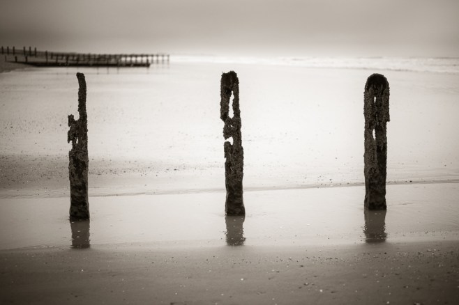
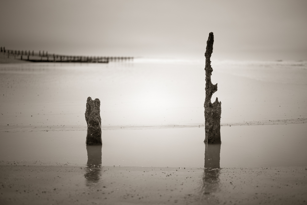
This first shot again features three groynes but I have moved round so the groynes in the background are no longer in the frame.

This second shot is the same as yesterdays image but instead of a 5:4 aspect ratio it is now 3:2.

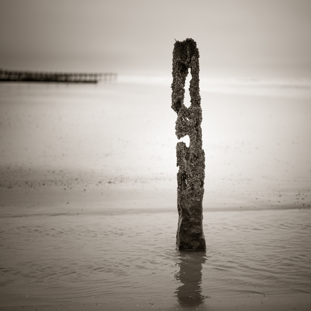
Again the same file as I posted yesterday but it was suggested that I move the groyne slightly to the right instead of it being centrally placed in the frame.

And finally the same image as the one above but instead of a 1:1 aspect ratio it is now 5:4.

For comparison here are smaller thumbnails of the three versions I posted  yesterday.

I think this selection of images demonstrates a number of points. Firstly that its worth taking a good number of frames when on location unless you are very confident about the finished image you have in mind. Secondly the various permutations are endless and these images concentrate on composition, aspect ratio etc, we haven’t even touched on processing. Thirdly, whilst I try and crop in camera, sometimes it pays to have some additional space around the subject so that other crops are possible. And lastly isn’t photography and being creative good fun? I think so!

Thanks to all those who responded to the first post  – additional comments would be most welcome.


How many elements + which aspect ratio = different results

The three images which make up this entry are essentially the same subject but in terms of their composition are all quite different. Through this post I want to illustrate the decisions we have to make each time we make a photograph and what we can learn from the process.

Groynes

The first image above, uses a classical 3:2 aspect ratio….the same as any 35mm film or full frame sensor. The composition is balanced with three groynes, with the one in the centre arguably being the most visually interesting. The distant and out of focus groynes on the horizons provide both context to the location but also depth. I think it’s important to have retained separation between the left hand groyne and those in the distance.

Groynes-2

The second image shares the same elements but is further simplified as only two groynes are included in the frame. The distant groynes are a more important third element in this picture, creating a triangle with the groynes. There is added space between them and the much shorter groyne on the left hand side, which gives a more open feel to the shot. The aspect ratio is now 5:4, the equivalent of a medium or large format film camera.

Groynes-3

And finally the third image. The single groyne fills more of the frame and is clearly the main focal point. The distant groynes are less intrusive but still play a key role in providing context and depth. The 1:1 or square aspect ratio, is one I particular like and lends itself well to this more minimalist composition. This aspect ratio mimics the 6:6 medium format ratio found in the classic Hassleblad 500 series of cameras.

So do I have a preference as to which image I enjoy the most? The first picture is too busy for my liking. Increasingly I find myself drawn to simpler compositions. The second image has a little more tension as the three elements form a triangle and I like the fact that one of the groynes is much shorter than the other which adds visual interest and feeling of openness. The third image is simpler still, but might be even stronger if the distant groynes were not in the frame.

It doesn’t really matter which image you or I prefer, although I would welcome your comments. What I wanted to demonstrate is how a relatively simple subject can be treated in different ways. What do you include and what is better left out? Your choice of aspect ratio and how this can impact on the end result. How simple or complicated do you want the composition to be?

For all these reasons it makes sense to me to truly explore or work a location and subject. Look around, consider the visual relationships between all the elements in the frame and at the same time think about a variety of aspect ratios and how these may improve the final image.

The Chapter House – making amends for a missed opportunity

Chapter House-8

Doorway to The Chapter House

The last time I visited Wells Cathedral back in 2015 I did not go and see, let alone photograph, The Chapter House. Why, I cannot tell you, as it is arguably one of the finest features of this glorious building and one not to be missed, but somehow I did!

Earlier this week I made amends and as well as photographing other parts of the cathedral I spent quite some time in The Chapter House, walking up and down the famous staircase, which is often referred to as the ‘Sea of Steps’. As you might imagine this is a very well photographed subject so trying to make an ‘original’ image is nigh on impossible. Nevertheless its beauty, its proportions and its truly majestic architecture are quite breathtaking. I hope you enjoy this collection of images.

Chapter House-9

The ‘Sea of Steps’ staircase leading to The Chapter House

Chapter House-3

The Chapter House vestibule

Chapter House-7

The central column and roof inside The Chapter House

Chapter House-4

Another view of the Chapter House ceiling

Chapter House-5

Looking up – taken from the vestibule

Chapter House-2

‘Study’ inside The Chapter House

Chapter House-1

A more abstract view of the ‘Sea of Steps’

I have copied this extract from the Cathedral’s website about the history of The Chapter House –

‘The Wells Chapter House is the only octagonal chapter house to be built as a first storey on top of an undercroft, which was the ‘strong room’ of the cathedral. A crypt would not have been practical because of underground water. The undercroft itself, with its rugged supporting pillars, was certainly constructed by 1266, just after the completion of the West Front but work, first on the staircase (1265-1280) and then on the Chapter House itself(1286-1306), proceeded slowly.’

For my other posts about Wells Cathedral do click on the links below.

A quote by St Francis of Assisi reminded me of Wells Cathedral

A Monochrome Masterclass and a visit to Wells

As always do click on an image to view a larger version

Another entry with more images of Wells Cathedral will follow soon.


It’s a Bank Holiday – time to play!

L1002505-Edit

It’s a Bank Holiday weekend in the UK. Unusually the sun is shining brightly, it’s pretty hot and quite rightly people are giving themselves permission to relax and enjoy themselves – and why not?!

In a complete break from my usual style, I too have been playing – just processing an image in a rather exaggerated way purely for the fun of it. High on contrast, lots of grain, blue toned, rotated through 90 degrees and a fancy border as well.

I think it’s important to do something different once in a while. Creative freedom can lead to unexpected results. Nothing too serious but good to inject a change of tack – after all ‘variety is the spice of life’.

For the record I took this shot yesterday at The Arundel Festival. There were huge numbers of people around; the main roads in the town had been closed to traffic, and tables and chairs were everywhere to cater for the thirsty and the hungry.

Have fun whatever you choose to do this Bank Holiday.


‘The tide is high’ at Bosham

Chichester Harbour Project-54

I have been wanting to make the above image for some time. The view is across the harbour from Chidham towards the village of Bosham with its instantly recognisable Church and spire reaching to the sky.

I often return to this particular spot when out walking but to get the result I was looking for, the height of the tide had to be at a certain level. Too low and there is too much vegetation…..too high and the posts are disappearing into the water. I do have the ‘Tides Planner’ App for my iPhone which tells me the height of the tide, so today I headed out with time to spare to watch and wait as the tide started to come in. I had also been cotemplating that a long exposure would enhance the scene and this of course would require a tripod, ND filters etc. Not the sort of stuff I usually carry with me when out walking. I am normally a spontaneous photographer but this shot was planned and thought about in advance.

Although a fairly bright day there was no direct sunlight which is exactly what I wanted. Too much contrast would have made life more difficult, so a little bit of good fortune was on my side. Welly boots on, tripod securely standing in the silt, camera set up with a 28mm lens, composition decided, hyper-focal distance set and after 12 seconds at f11, the image was exposed to the sensor. I checked the histogram which showed me no blown highlights and in truth a balanced tonal range. Ideal for post processing.

I sometimes wait a few days or even longer before I process my images but on this occasion I couldn’t wait, so earlier this afternoon I sat down at my Mac, fired up Lightroom and overall I am pleased the result.

Here is another image taken at the same time. I thought about placing the posts in the centre of the frame but I rather like the fact they are offset to the left and lie on ‘the rule of thirds’. Placing them in the centre was a little too obvious.

And lastly another image of Bosham taken yesterday from a different position on the shoreline. This time at low tide.

All of these photographs are being added to my ‘Chichester Harbour’ project portfolio and when I get the time I will upload a gallery to this site.

Do click on an image to view a larger version.