Experimenting with Colour Grading in Capture One Pro

Getting out and about in ‘Lockdown’ has been essential during recent times. In the past week or so some measures have been relaxed and in theory we can now travel as far as we like to take our exercise. In fact we can spend as much time out of doors as we wish, providing we still respect the rules on ‘Social Distancing’ – i.e. keeping 2m apart.
‘Lockdown’ has had its benefits. As well as taking more exercise than I might do normally, I have also given myself permission to play with my photography. Trying new things and just seeing what happens. As well as my recent series of ‘Eclectic Fun in Lockdown’, my acquisition of the Fuji X100v has motivated me to experiment with colour grading, by using the colour balance tool in Capture One Pro.
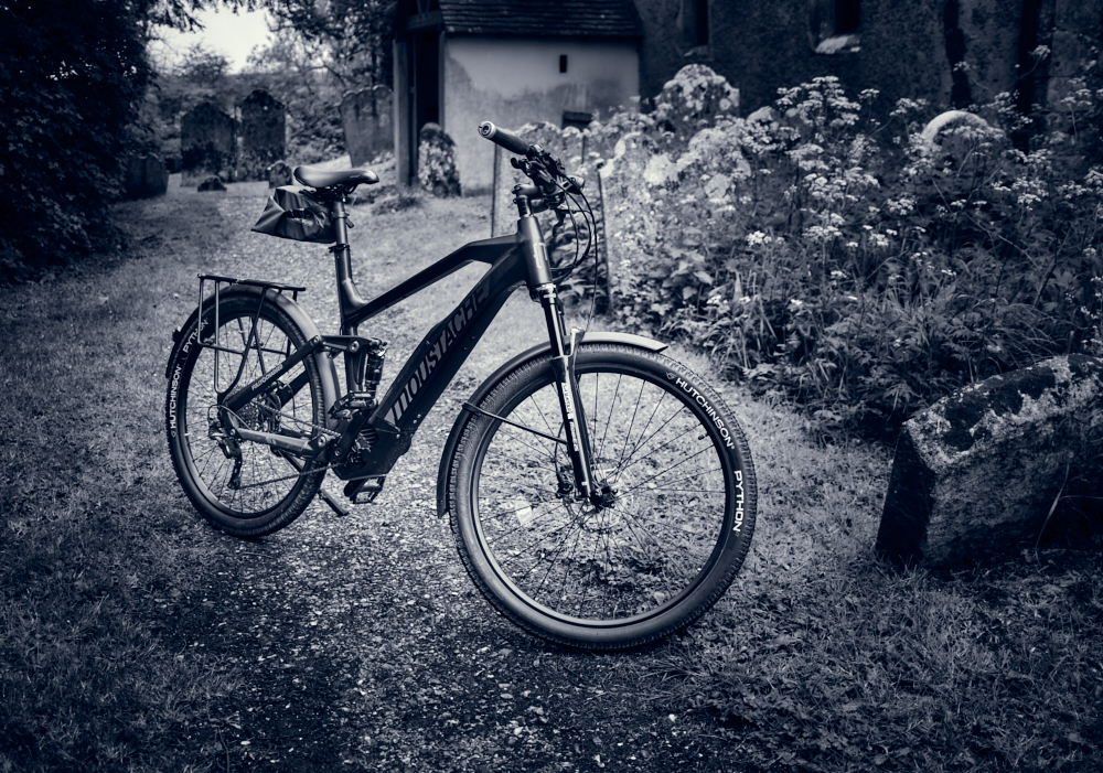
As much as I enjoy the Fuji Film simulations in the Fuji X100v I wanted to see what effects could be created in Capture One. The shot below is pretty much straight out of the camera, using the Classic Chrome film simulation. Natural colours but now the fun begins.

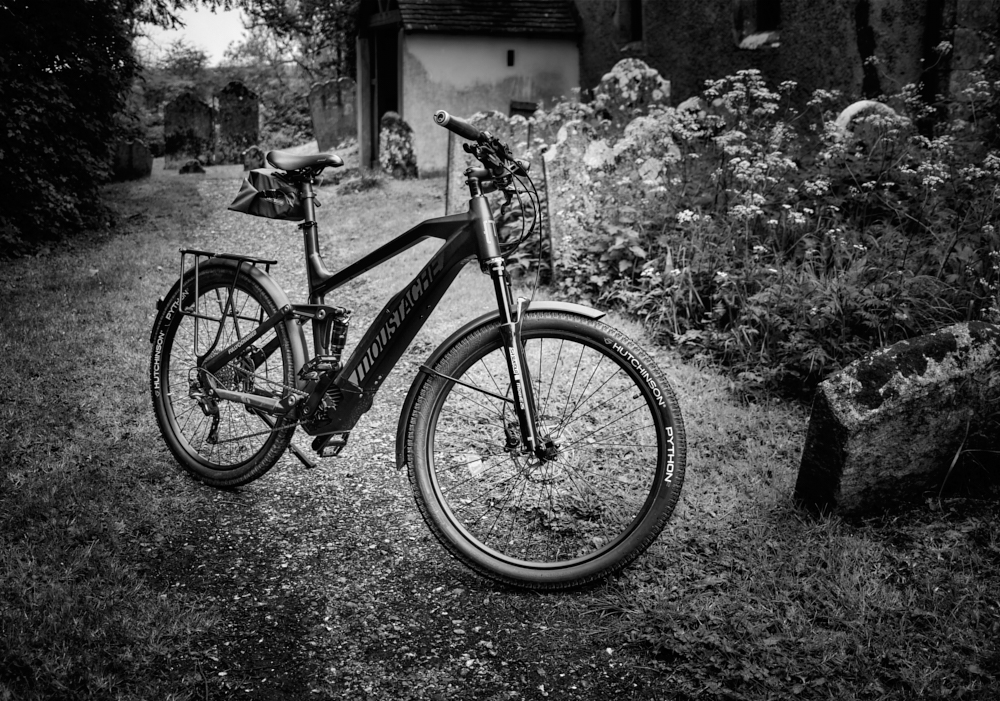
Using the colour balance tool and adjusting the saturation and lightness of the colours, you can see in the next image that the greens have been muted and now there is more warmth to the church, the gravestones and the pathway.

In the next version I opted for a much cooler look, the colour temperature now akin to the evening as opposed to a daytime shot. This treatment evokes a very different feel to the previous image and one I rather like, although each to their own when it comes to a personal preference.

There is nothing to say of course that colour grading or split toning can’t be used in a black and white photograph as you can see below.
And in the final version, a pure monochrome image.
The colour balance tool in Capture One Pro is very easy to use and allows the photographer to experiment with different colour grades in the shadows, mid-tones and highlights. A mask can be applied in a new layer so that the colour grade doesn’t necessarily have to be applied to the whole image in equal measure. Further the opacity of the layer can also be adjusted and toned down if the overall effect of the changes made are considered to be too great. A colour grade can be copied to another image or saved as a custom preset to be used again if you are trying to create and apply a consistent look.
Another tool called the colour editor, can be used to change the saturation, hue and lightness of a selected colour using a colour picker. The range and fall off applied to this colour can also be adjusted. I found both these tools very intuitive to use and made working with a colour image so much more interesting and creative.
As an aside the photograph of my Moustache Electric bike was taken on a recent 18 mile round trip from my home to one of my favourite churches deep in the Sussex countryside. The combination of combining exercise and photography in Lockdown has been a joy and one which will continue well into the future.
I hope you have enjoyed this insight into colour grading – you might also like this post about cycling and photography.
Photography – how best to get around.
Stay safe and well, and have fun if you can.

4 Responses to “Experimenting with Colour Grading in Capture One Pro”
Thanks for sharing these great examples.
I love the shot with the warmer path and church, but like you also like the cooler tonal range too.
I had a look at Capture One Pro after you suggested it, but then got sidetracked with other offline tasks. I have done a bit more browsing in my archives and played around with some editing though. My really old images from 2011.12, 13 & 15 are quite dark from the poorly lit room my desk was in for editing in my previous home. I’ve started ‘fixing’ or ‘lightening’ them so that’s been a bonus of the lockdown.
I’ve also got so far into my archives, I’ve lost track of time and ended up not posting anything to WordPress for a few days now 😀 That is not a bonus of the lockdown. Wasting time browsing for hours I mean 🙂
LikeLike
Thanks Vicki. I have to say I am really impressed with Capture One and in many prefer it to Lightroom. It has taken a while to et my head round it but now my confidence has grown it’s a worth addtion to the way I can post process images. Going back through the archives is always worthwhile. Tastes change so how you would have edited in the past is going to be different to how you might approach the same shot today. It’s certainly not a waste of time and lessons can be learned. It might be inetersting if you posted some before and after shots perhaps?
LikeLike
The colour grading in Capture One is superb and the ability to select a colour range as a masked layer and then process is such a bonus over what can be achieved in Lightroom. Enjoy your bike!
LikeLike
Absolutely David. The more I use Capture One the more it demonstrates its advantages over Lightroom which I have been using for many years now. Whilst I do very little colour work the colour grading tool allows me to ‘play’ which I am rather enjoying. As you say applying a mask to the colour grade is such a versatile tool. And yes, I am enjoying my bike!!
LikeLike