“What are you photographing?”….. the stranger asked inquisitively.
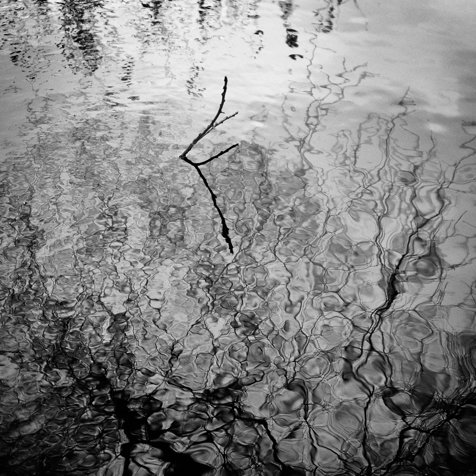
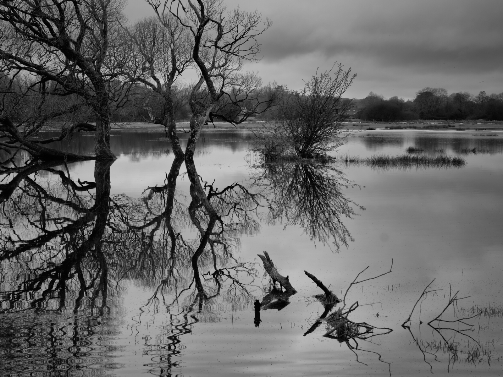
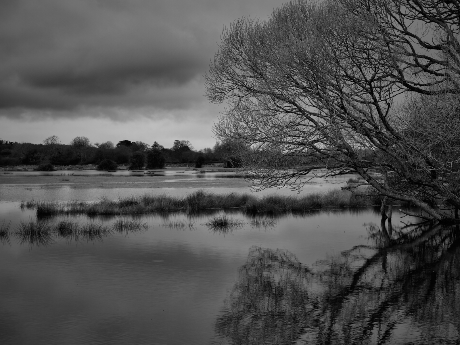
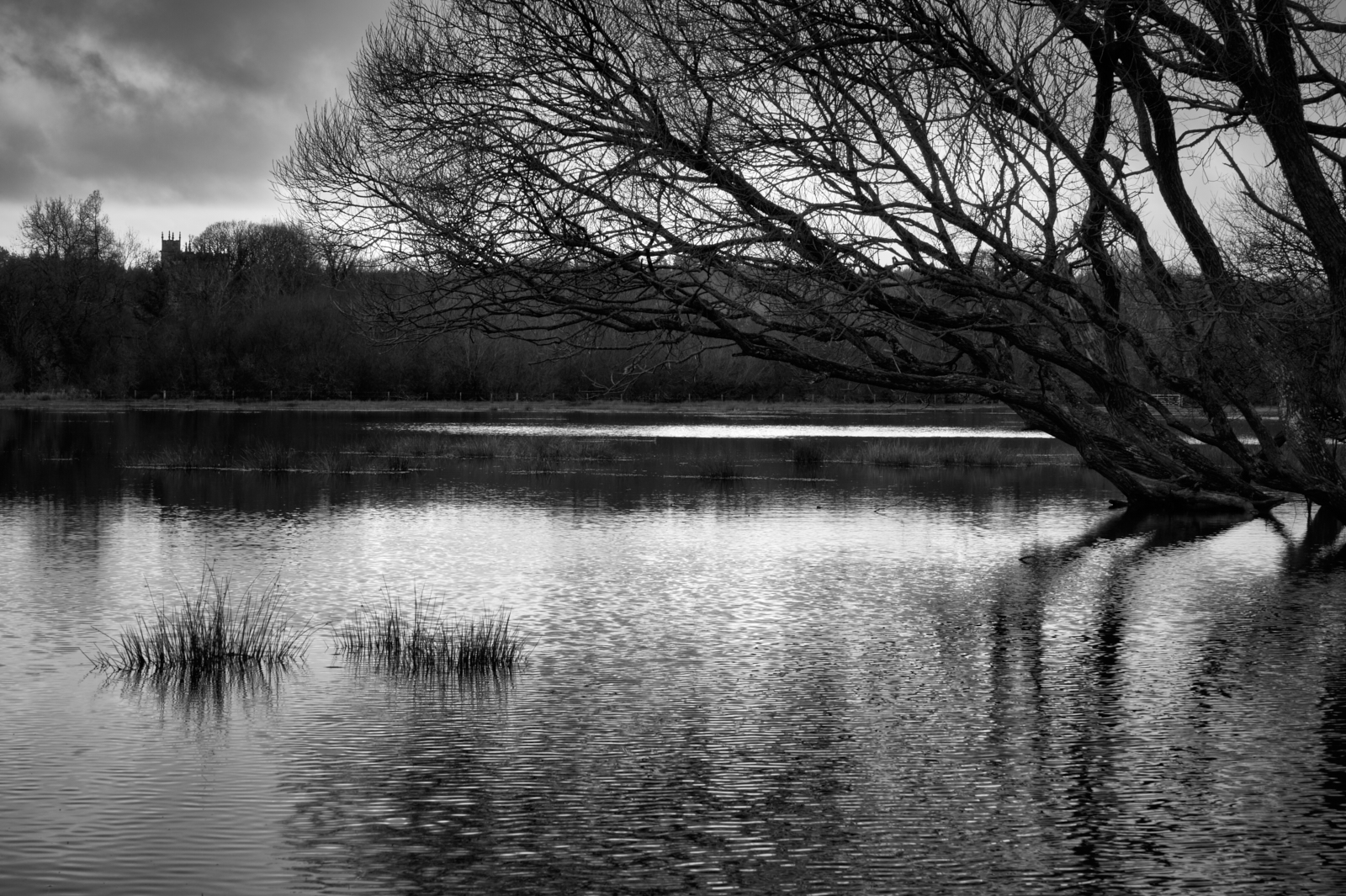
Crouching down with my camera and staring into the rather murky water of a small pond….a man approached me and asked me what was I photographing? He could have simply asked what on earth I was doing. Instead, he chose to be more tactful and polite with his questioning. Had I been in his shoes I may well have posed the same question. After all there was nothing obvious to be seen, let alone photograph…or was there?
And that’s the great thing about being a photographer. The eye is honed to see something which others may not notice. And the more you look and observe the more you see.
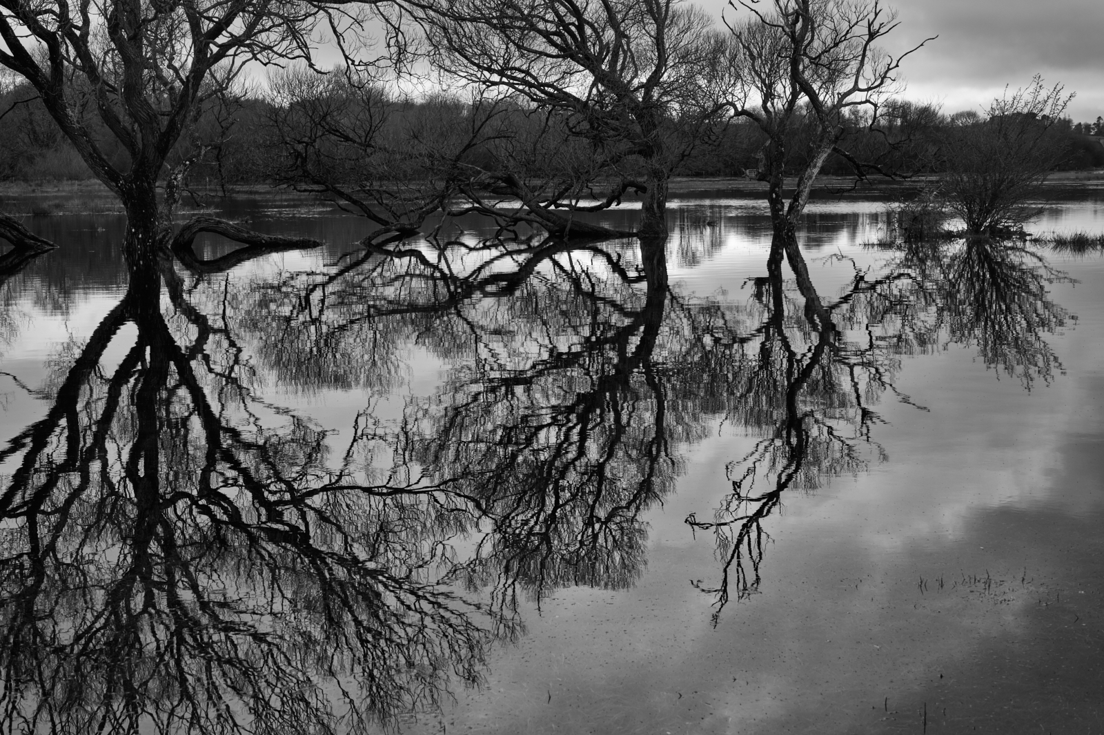
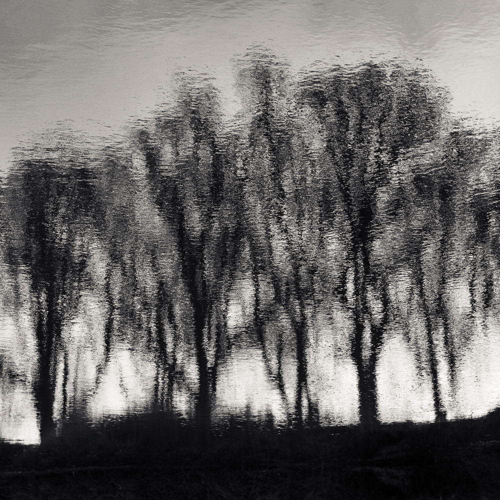
In this case I had been drawn to the stillness of a small twig which appeared to be rising out of the water. The reflections of the surrounding trees were being moved by a gentle breeze. The combination of stillness and movement appealed to me.
What I guess wouldn’t have been seen by the passerby was how these reflections would be frozen and captured by the use of a fast shutter. I focused on the twig and used a wide aperture intending to isolate the main subject.
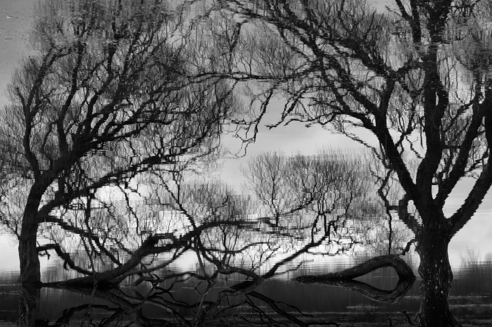
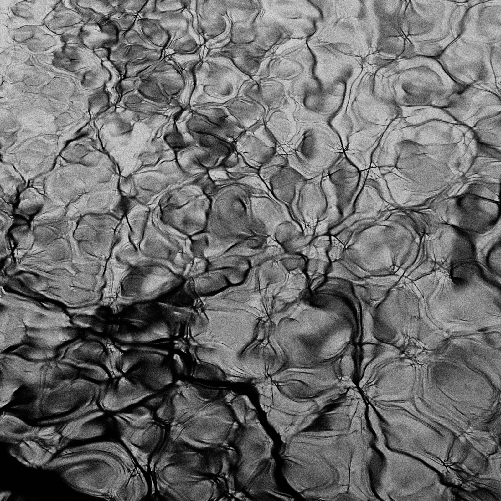
If you are viewing this image on a small screen, you may find it difficult to appreciate the abstract quality of the reflections. So I have included a crop of one part of the picture.
Of course the answer to the question ‘what are you photographing?’ is in the eye of the photographer and is only concluded when the image has been captured and processed. At this moment the photographer’s vision comes together and makes sense – hopefully!
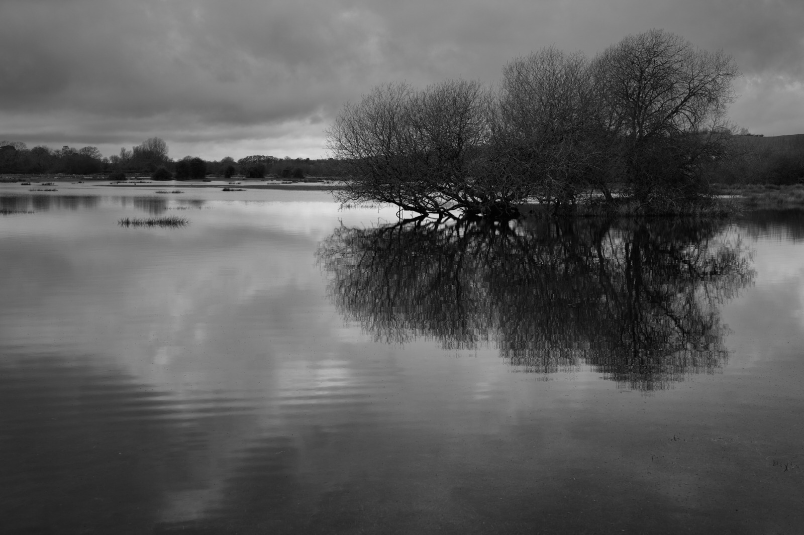
There is something about this photograph which really appeals to me. It’s something out of nothing, being both simple and complex in its makeup. To my eyes it’s the hidden beauty of nature which is very special. All too easily missed, but once seen, never forgotten.