Posts tagged ‘monochrome’

Bracken – when an overriding instinct prevails


As hard as I try I can’t break out of my comfort zone. Whenever I find myself in a beautiful location which is full of colour, my instinctive monochromatic mind gets the better of me. As I explore the autumnal woodland of Arne Nature Reserve, near Wareham in Dorset I have a perfectly acceptable colour subject in front of me but in visualising and later processing the image I soon strip away all the colour, and work on a black and white conversion, and here is the result. A shot of ‘Bracken’ in amongst conifers.

I am not colour blind but I do seem to see the world in black and white and of course all the shades of grey in between. I am drawn to a pleasing composition, shapes and lines, strong textures and different tones. I believe my creativity improves once the distraction of colour is removed from the frame. I start to see things more clearly and whilst you cannot tell by looking at an image on a screen, a well printed black and white image on a suitable photographic paper is hard to beat.


Do click on the image to view a larger version and truly appreciate the level of detail in this shot.

……


Three very different views of the Jurassic Coast

Jurassic Coast-3

Charmouth – Reflections of Light

Apart from my home county of West Sussex there are two other places I most like to visit. Top of the list is Scotland. Unfortunately it’s the best part of 400 miles just to cross the border, let alone reach the Highlands; not to mention the journey time by car of at least 6 hours and that doesn’t include hold ups or any stops. It’s therefore not very practical to go there on a regular basis.

Much closer to home is the county of Dorset and my wife and I are regular visitors. It offers a wonderful combination of varied countryside and a truly majestic coastline – or in other words The Jurassic Coast, which has been a World Heritage Site since 2001.

Photographic opportunities are in abundance. Here are just three images from our most recent visit to the area.

Jurassic Coast-2

Charmouth – Towards Golden Cap

Jurassic Coast

Jurassic Clifftops from White Nothe

Spectacular scenery and in many ways a more than adequate substitute for Scotland……and I can get there and back in one day, very comfortably!

Here are links to a few other posts which feature Dorset.

Portland Bill Lighthouse with the Leica M9-P

Colour of light on The Jurassic Coast

Alone on The Cobb

St Catherine’s Chapel – from picture postcard to a more dramatic view

In this post I thought it might interest those who read my blog to illustrate my approach to capturing a well known landmark and how I come to make a few images which become my take on a much photographed location.

One such famous landmark is St Catherine’s Chapel on the outskirts of Abbotsbury in Dorset. Perched high on a hill overlooking the Jurassic coastline it is very visible from the surrounding hills. The colour image is arguably the ‘straight’ picture postcard shot. A perfectly pleasing image, technically sound, but nothing out of the ordinary.

Convert the same image into black and white, and after a little processing in Lightroom and Silver Efex (my go to software for mono work) and the Chapel instantly has a more dramatic appearance. In my opinion still nothing special, but the sky is more a feature of the shot.

The third shot and a very different composition, this time a portrait. The wispy clouds above the chapel are all important but somehow I still don’t think it is the best shot in this sequence.

Finally, I moved in much closer to the chapel using a wide angle lens. As a consequence the building now dominates the frame and the converging lines of the buttresses give a sense of height and mass. This is complemented by the clouds which are a wonderful backdrop to the harsh lines and solid golden buff limestone structure of the chapel itself. The surrounding landscape has been excluded, so this image no longer provides a sense of place, but as a photograph it’s my favourite of the four. Would it be your choice as well? Certainly the most dramatic, and no longer the picture postcard view which I am always keen to avoid if at all possible.

The chapel is thought to have been built in the late 14th Century by the monks of nearby Abbotsbury Abbey. It was used as a place of pilgrimage; its isolated setting allowing monks to withdraw from the monastery during Lent for private prayer and meditation. As it can be seen from the sea it would also have served as a beacon after the Dissolution.


Do click on any of the images to view a larger version.

Elements + Aspect ratio = more choices

In my previous entry which you can read here, I posted three images all of the same subject but with differing compositions, aspect ratios etc. I received some interesting feedback so I have decided to post four more versions which reflect some of the comments made.

This first shot again features three groynes but I have moved round so the groynes in the background are no longer in the frame.

This second shot is the same as yesterdays image but instead of a 5:4 aspect ratio it is now 3:2.

Again the same file as I posted yesterday but it was suggested that I move the groyne slightly to the right instead of it being centrally placed in the frame.

And finally the same image as the one above but instead of a 1:1 aspect ratio it is now 5:4.

For comparison here are smaller thumbnails of the three versions I posted  yesterday.

I think this selection of images demonstrates a number of points. Firstly that its worth taking a good number of frames when on location unless you are very confident about the finished image you have in mind. Secondly the various permutations are endless and these images concentrate on composition, aspect ratio etc, we haven’t even touched on processing. Thirdly, whilst I try and crop in camera, sometimes it pays to have some additional space around the subject so that other crops are possible. And lastly isn’t photography and being creative good fun? I think so!

Thanks to all those who responded to the first post  – additional comments would be most welcome.


How many elements + which aspect ratio = different results

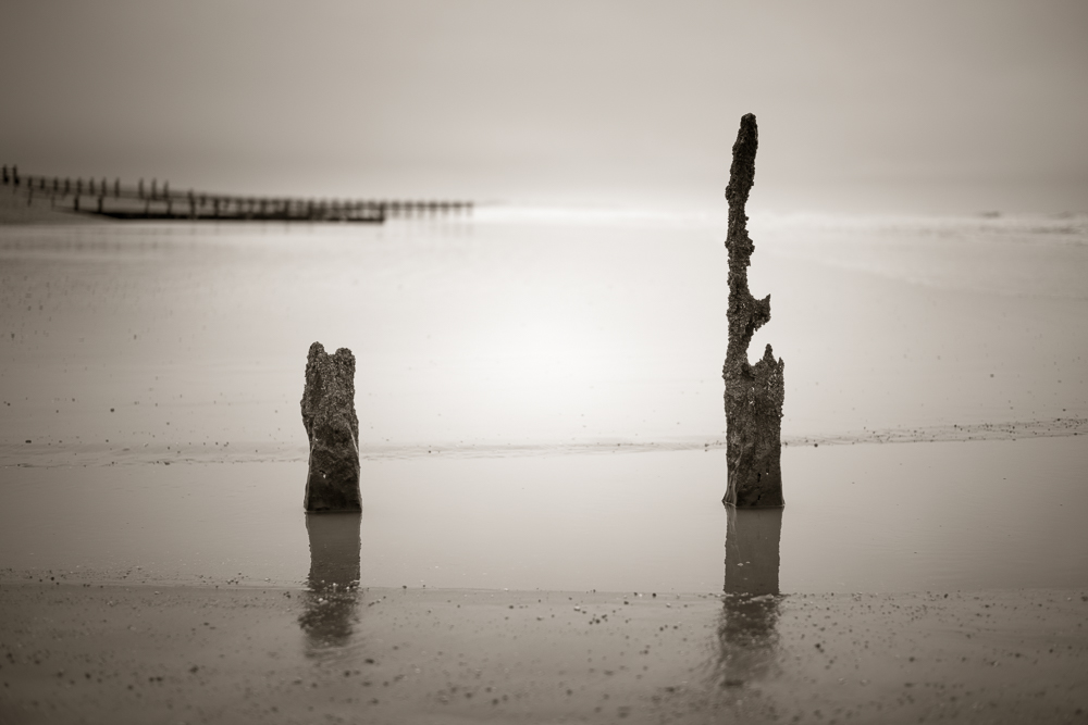
The three images which make up this entry are essentially the same subject but in terms of their composition are all quite different. Through this post I want to illustrate the decisions we have to make each time we make a photograph and what we can learn from the process.

Groynes

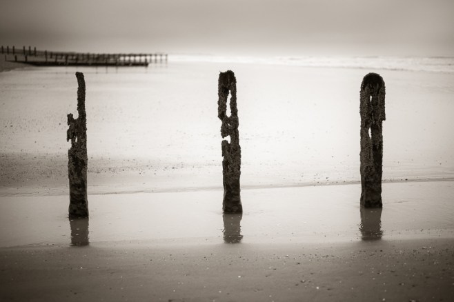
The first image above, uses a classical 3:2 aspect ratio….the same as any 35mm film or full frame sensor. The composition is balanced with three groynes, with the one in the centre arguably being the most visually interesting. The distant and out of focus groynes on the horizons provide both context to the location but also depth. I think it’s important to have retained separation between the left hand groyne and those in the distance.

Groynes-2

The second image shares the same elements but is further simplified as only two groynes are included in the frame. The distant groynes are a more important third element in this picture, creating a triangle with the groynes. There is added space between them and the much shorter groyne on the left hand side, which gives a more open feel to the shot. The aspect ratio is now 5:4, the equivalent of a medium or large format film camera.

Groynes-3

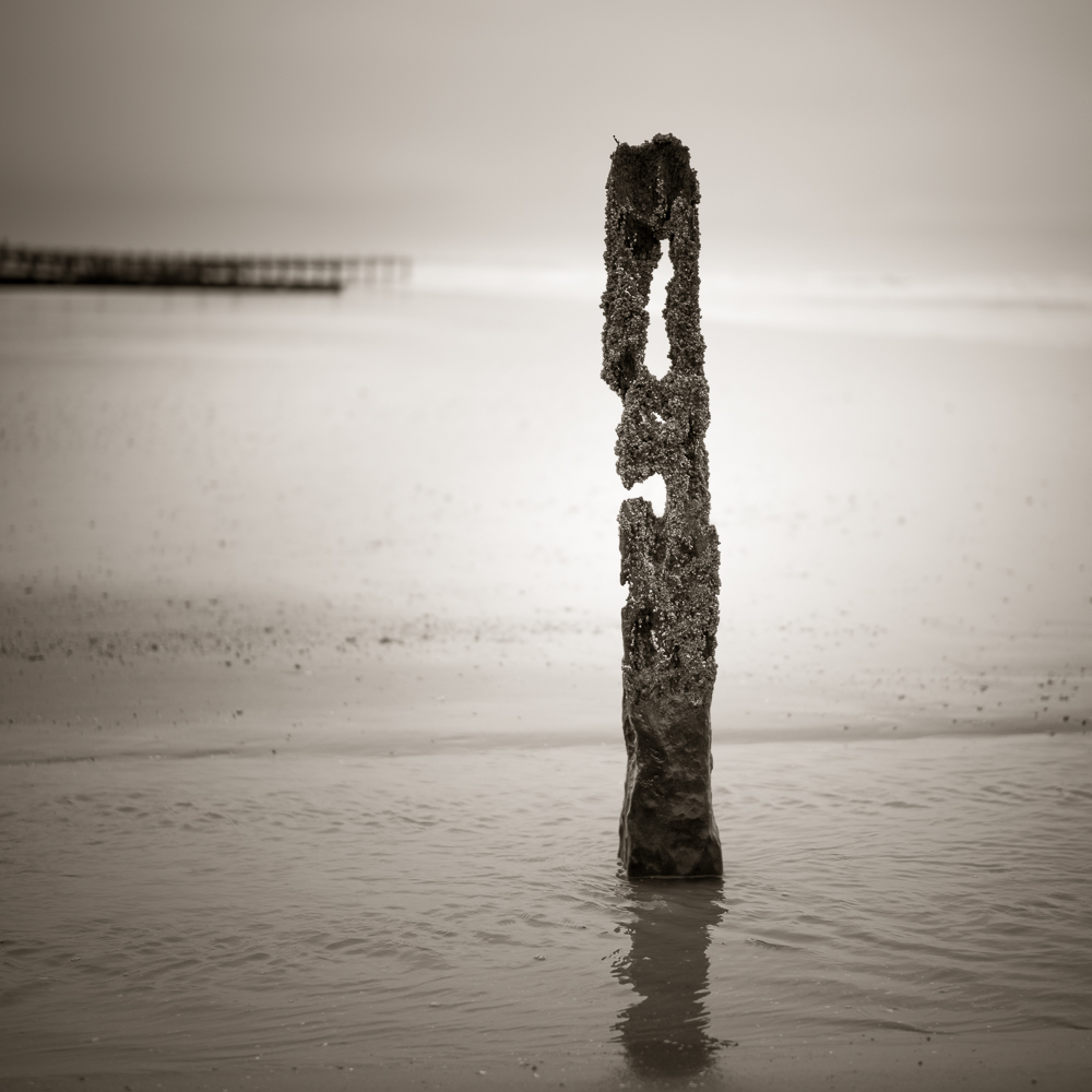
And finally the third image. The single groyne fills more of the frame and is clearly the main focal point. The distant groynes are less intrusive but still play a key role in providing context and depth. The 1:1 or square aspect ratio, is one I particular like and lends itself well to this more minimalist composition. This aspect ratio mimics the 6:6 medium format ratio found in the classic Hassleblad 500 series of cameras.

So do I have a preference as to which image I enjoy the most? The first picture is too busy for my liking. Increasingly I find myself drawn to simpler compositions. The second image has a little more tension as the three elements form a triangle and I like the fact that one of the groynes is much shorter than the other which adds visual interest and feeling of openness. The third image is simpler still, but might be even stronger if the distant groynes were not in the frame.

It doesn’t really matter which image you or I prefer, although I would welcome your comments. What I wanted to demonstrate is how a relatively simple subject can be treated in different ways. What do you include and what is better left out? Your choice of aspect ratio and how this can impact on the end result. How simple or complicated do you want the composition to be?

For all these reasons it makes sense to me to truly explore or work a location and subject. Look around, consider the visual relationships between all the elements in the frame and at the same time think about a variety of aspect ratios and how these may improve the final image.