Exploring colour landscape photography: a shift from monochrome ….. because variety is the spice of life
Here on the south coast of England we have experienced a very dry and hot summer. Several months have passed with no rain whatsoever. The ground is bone dry, grass has turned to straw and I fear that some of the plants in our garden will not have survived the drought.
From a photographic point of view summer is never a good time of year for me. The sun is too high in the sky, the contrast is too great and clear blue skies maybe great for a day at the beach but there is no mood and atmosphere to capture. Plus, and being somewhat selfish, there are too many people at the places I wish to photograph.
So apart from the occasional shoot, I have spent the last few weeks and months giving more time to reflect and think about my photography. Devising plans for when the weather changes, the days become shorter and the light is more favourable. One area of specific consideration has been whether or not I should make more images in colour.
Ever since 2012 virtually all my work has been in black and white. You only need to look through past entries or any of my galleries (apart from one) to see that black and white is ostensibly what I do. However I make images for my own pleasure. There are no rules which inhibit me from doing anything I like, and that includes switching to colour if I so wish, even if I naturally default to monochrome.

As I haven’t been out with my camera I have been trawling through my back catalogue of thousands of images and selecting a few which I have now processed in colour. Some have been captured this year others have lain idle on the hard drive for many years. I have to say that I have thoroughly enjoyed spending my time in this way. I have come across many images which I had largely forgotten. Seeing them afresh as well as opening my eyes to colour has been quite liberating.
There is no question in my mind that monochrome and colour are two very different photographic disciplines. Over time my photographic eye has learnt to see the world in black and white, helped of course by being able to preview the image on the rear screen or in the EVF. Photographs that work in mono do not always make a good colour image and vice versa. Perhaps this goes without saying but it does make me think that a fundamental decision needs to be made before the shutter is released. The decision is one of intent – is the end result going to be in black and white or colour? And how might this choice impact on the composition, exposure and any other factors which could be relevant and improve the final outcome.

In editing this selection of images I have very quickly come to realise there are a whole new set of processing skills I need to learn and hone to make pleasing colour photographs. Well, images that I am happy with anyway. Of course I understand the fundamentals of colour editing but I need to practice much more and develop a better understanding of the tools which are available to me and which I wouldn’t have used previously to make a black and white picture. I fully recognise the workflow is not the same and I will need to make adjustments accordingly. To be frank I am looking forward to the challenge.
In editing these images I have noticed two things in particular. Firstly my choice of crop or aspect ratio. Originally these were all captured on a full frame or APSC camera with a 3×2 aspect ratio but in many cases I have cropped the image to 16×9 or even 3×1. I don’t think this has anything to do with the fact that they are colour files necessarily, but I really like how this ‘letterbox’ approach changes the overall feel and impact of the image. Fortunately the large sensors offered by most if not all camera manufacturers today provides plenty of latitude when cropping without degrading the image too much.
Secondly colour balance or colour temperature has a big affect on the feel of the photograph. Should it be cool or warm? Any noticeable colour cast could of course render the picture unrealistic but there are creative choices to be made. I always shoot in RAW so adjusting the white balance is quite straightforward, although I did find myself revisiting this aspect of the editing process as I wasn’t always happy with my first or even my second attempt!
Being creative with colour as opposed to black and white is not the same. Black and white is far more flexible in this respect. The lack of colour means a mono image is instantly an abstraction of what we normally see as we go about our daily lives. If you applied the edits in a mono conversion to the same colour file, the result would probably be horrendous so as I said earlier the two disciplines are very different.

Looking forward it is my intention to make many more images in colour although I don’t think I will ever lose my love for black and white. How could I after so many years? But there is a place for both styles of imagery and as the old saying goes – ‘variety is the spice of life’.

10 Responses to “Exploring colour landscape photography: a shift from monochrome ….. because variety is the spice of life”
Hi Alan, I’ve gone through a similar thought process as you and now I’m doing more colour work and varying my usual square format approach. Because? Why not!
LikeLiked by 1 person
Why not indeed!!
LikeLike
I agree with you in that clouds and interesting skies definitely make a difference.
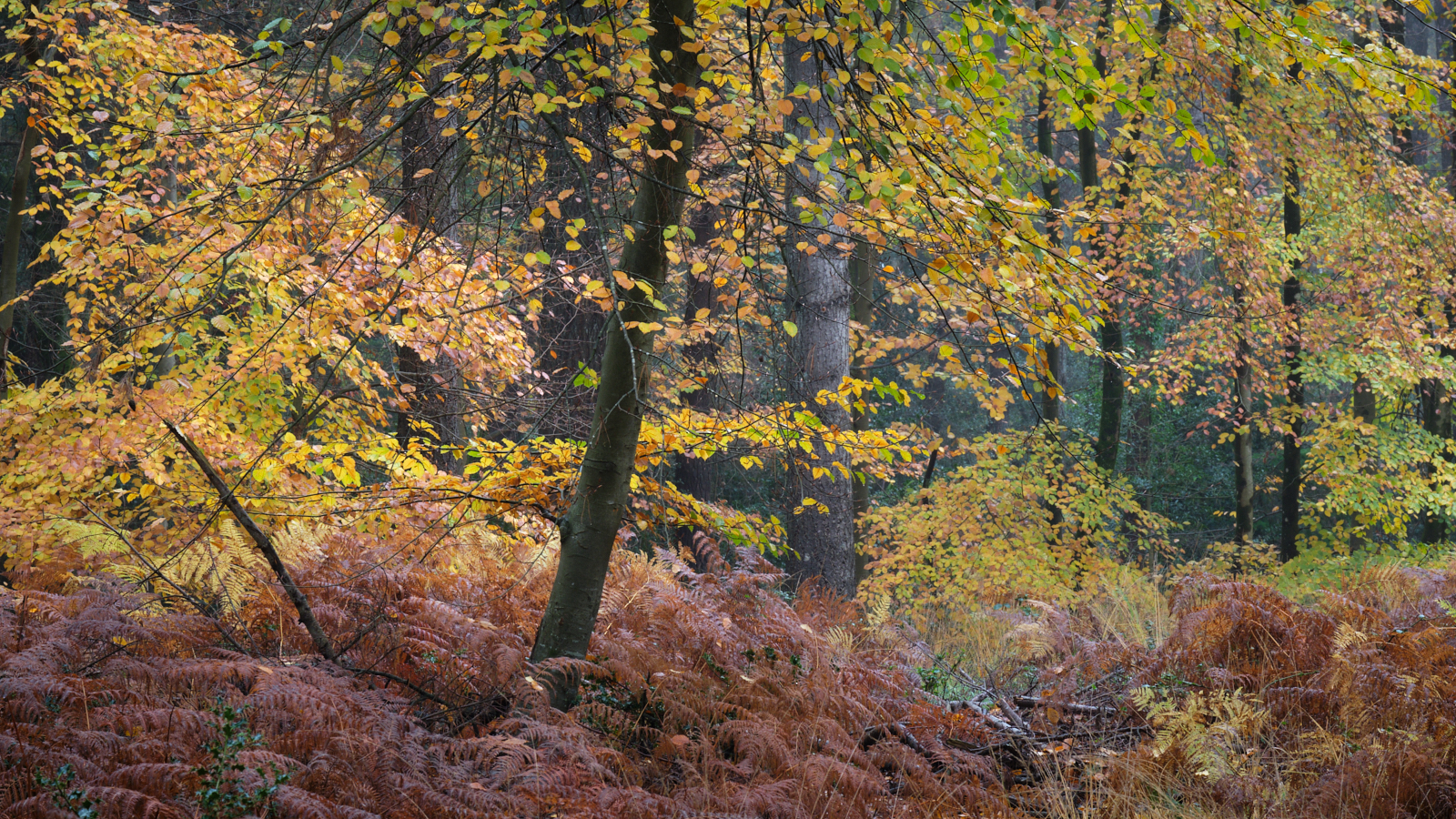
Love all your colour images, except for the Autumn Woodland in Dorset. It seemed a bit tame and unremarkable. Nothing drew my eye into the frame.
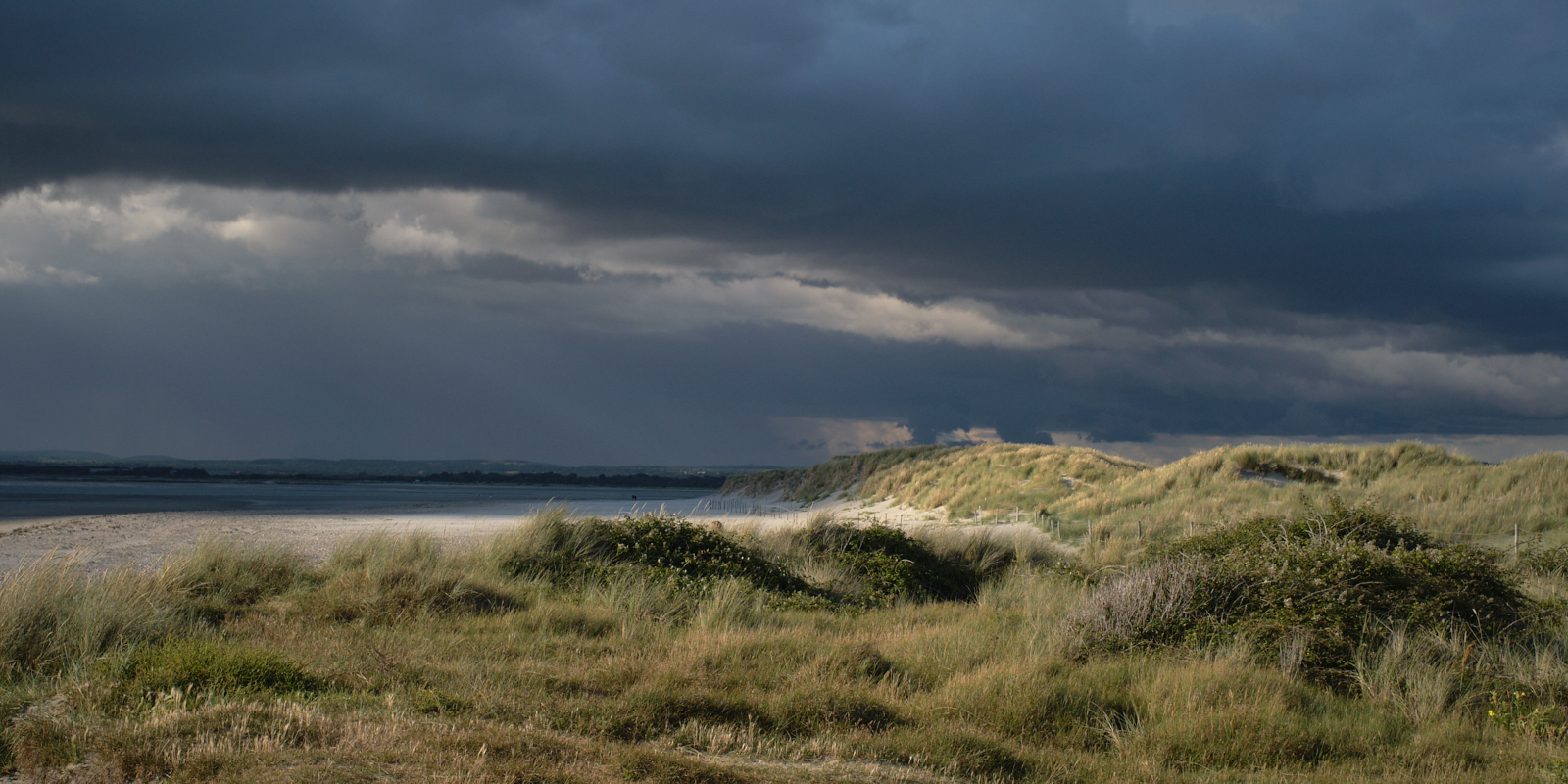
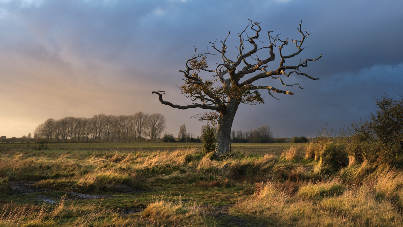
I especially like the drama in the first image of the approaching storm and the Late Afternoon in West Sussex.
I’ll look forward to seeing some more colour images, as I’m so used to your B & W.
LikeLike
Thanks Vicki. I included Autumn Woodland for the colours not because it was a particularly good image. I still struggle with ‘colour saturation’ probably because I am so used to mono. If I am to pursue colour work then I hope over time more of a style will develop, perhaps both in subject and how they are processed.
LikeLike
I think your colour images are just as good as your B & W, but that’s because you’re a great photographer and are good as ‘seeing’. Great, well-balanced compositions are part of that skill.
I look forward to seeing more colour on your website, although B & W photography, in general, has always been my favourite, well before I bought my own camera(s) when I retired.
LikeLike
Thank you Vicki. I shall do my best!
LikeLike
You caught me with the lonely tree on a late afternoon and I am looking forward to seeing more of how you colour the world. Thanks for sharing your thoughts about the fundamental differences between b&w and colour. And last but not least, I like the Dorset Woodland picture because the autumnal colours appealed to me emotionally 😉
LikeLike
Thank you. I won’t be giving up on Mono but do hope to make some more colour work in the future.
LikeLike
The sky is beautiful, I love this kind of atmosphere.
LikeLike
Thank you.
LikeLike