Posts from the ‘thoughts’ category

Photographic projects – and how I have come to appreciate their importance

In recent weeks I have been considering how and why my photography has developed over the past couple of years. In doing so I have come to appreciate the importance of projects. In this post I will write about a few examples and illustrate how they have impacted on my photography and how they might help you in the future.

The age old expression that ‘every picture tells a story’ may still hold true, but with millions of photos being uploaded to the web on a daily basis, via Instagram, Flicker, Facebook, Twitter (I could go on) ….. the world is now saturated with images. Whilst I still enjoy making and sharing ‘single’ shots’, my own feeling is that there is much greater value in a body of work which includes some form of narrative; hopefully a story contained within a set of images which makes viewing the work more meaningful and dare I say it, more pleasurable for the viewer. A story behind the image is far more difficult to achieve from just a single back lit picture viewed on a screen in the space of a few milliseconds, whereas a printed body of work is likely to hold the attention of the viewer for a longer period of time. These bodies of work may take the form of a panel, a photographer’s portfolio, part of an exhibition or published in a book.

New Art of The South Downs

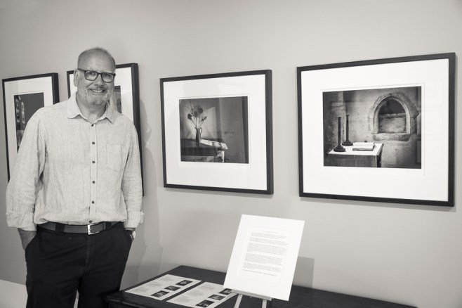
Yours truly at the recent ‘New Art of The South Downs’ Exhibition

Read more

Inspired by the Master photographer, John Blakemore – and my 300th post!

20170426-L1020338-Edit

Woodland on Ulva

I am a keen collector of books about photography and naturally the vast majority are by authors whose work I greatly admire. I find both the written word and the images can be inspiring, often providing little pearls of wisdom which might just help my own photography.  One such person is John Blakemore, a true master of the craft of black and white photography. Born in 1936 in Coventry, England he has been practicing his art since 1956, and in that time has built a portfolio of work which of its type is unlikely to be surpassed. Much of this work has now been archived at the Library of Birmingham.

He is probably best known for his landscapes and still life photographs. He is widely acknowledged as one of the finest monochrome printers, using the zone system to make some truly beautiful images – his use and control of tonality in a black and white photograph is quite superb.

I only have one of his books, titled – ‘John Blakemore’s Black and White Photography Workshop’. Whilst much of what he has to write relates directly to the traditional darkroom, his thoughts on tonality and printing can equally be applied to the digital darkroom as well. The book contains many of his best known photographs and if like me, you wish to improve your knowledge of black and white photography, this book is well worth adding to your collection.

So how did this book inspire me? How could his approach be applied to my own work?

One area where I have always struggled is trying to photograph woodland. From a composition point of view I find the subject matter very challenging. You could say I find it hard to see the ‘wood from the trees’, an old cliche perhaps but in my case a very true one. Even when the composition looks right I haven’t known how to process the image in a way which I find pleasing.

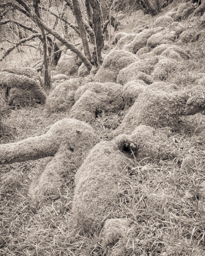
Recently I started reading through John Blakemore’s book and I came across a number of woodland landscapes which I very much liked. I enjoyed their treatment and this encouraged and inspired me. Having studied these images more closely I selected a few frames taken on my recent trip to Scotland to see whether or not I could emulate the ‘look’ of his work and process my pictures in a similar fashion.
 

20170426-L1020341-Edit

Boulders of Moss, Ulva


The tone curve in these four photographs is very different to the outcome from my normal processing methods and as a consequence this set of images work for me. Whilst there is a full range of tones, the mid-tones dominate each picture. Strong darker tones are my usual style, resulting in an image which has far more contrast. The images in this post are much softer and more restful to the eye. As a result I believe the viewers attention is held for longer so that the composition, the texture and form is more readily appreciated. A high contrast image can be quite punchy and dramatic but the eye can quickly tire when looking at an image of this type. These are far more subtle images and an approach I can see myself using again in the future. I will also be interested to see how they print on various types of paper.


20170429-L1020664-Edit

Eas Fors Waterfall, Isle of Mull


20170507-L1030047-Edit

Tree by a stream, Wester Ross


Your feedback and comments are very welcome and as this is my 300th entry, it’s an opportune time for me to thank all my followers who read, like and comment on my work. It’s very much appreciated and it’s one of the reasons I will continue sharing my images and thoughts in the future.

Lastly my thanks to John Blakemore for his inspiring approach to this art form.

As always these images are best viewed large, so do click on any one of the photographs and it will open in a new window.

Main Exit – dissecting the visual components of a photograph

Main Exit

Main Exit

I often ask myself the question – ‘Why does a photograph interest me and hold my attention for more than a few nano seconds? What are the various components of the image that make it visually appealing to me and maybe to others?’

In answer to these questions I thought I would try and dissect the key elements of this photograph which I have called – Main Exit. Do click on the image to view a larger version as this will help you see all the detail in the picture.

To begin, the image is monochrome; obvious I know, but a colour image of the same picture simply wouldn’t be as interesting. This shot is all about tone, texture, contrast and the overall composition. Colour would be a distraction. There is though a subtle tone which has been applied in post processing, which may not be immediately apparent.

The main focal point is the man in the top right hand corner walking into the building. We can’t see all of his body or his head, but we do see a reflection of his pale jacket and he stands out against the dark background. White on black will always draw the eye. He is framed within a dark square which ties in well with the square crop of the image itself. It’s virtually a picture within a picture.

A square crop doesn’t always work but in this example I think it enhances the overall composition. There is a strong diagonal lead in line from the bottom left hand corner which takes your eye to the main subject of the picture. There are paler lines in the ground which also lead the eye. These are in contrast to the vertical lines of the modern windows. The ground also slopes upwards, so that the metal base of the building narrows to a point where it meets the man. This aids perspective and adds to the sense of depth.

Reflections always provide visual interest because they distort reality. The older buildings are all askew, there is half a car and half a waste bin. Behind the glass there is a person sitting down  which begs the question as to what’s inside and the purpose of the building itself.

Top right there is a sign which says ‘Main Exit’ but the arrow points in the opposite direction to the man entering the building – has he gone through the wrong door?

As well as being a contrasty image there is also the visual contrast of the new and old buildings, the young person behind the window and the older person walking through the door. The contrast in texture between the ground and the mirror like surface of the windows.

Lastly a border has been added to provide a frame round the image.

For me it makes a visually appealing image, as the sum of all the component parts make for an intriguing story, complete with different textures and tones, all held together by strong compositional and geometric elements as well.

I have found this exercise beneficial and I hope you have enjoyed my ‘dissection’ of a photograph interesting. Arguably the approach could work just as well on images that you don’t like, as well as the ones that do. It’s worth a try.


“Sharpness is a bourgeois concept” – Henri Cartier-Bresson


There are many quotes attributed to Henri Cartier-Bresson, one of them being that – “Sharpness is a bourgeois concept”. With this image I have taken his saying quite literally. To an extreme in fact because there is absolutely nothing sharp or in focus anywhere in the frame. As a consequence this picture is sure to divide opinion.

When I took the shot I quite deliberatly adjusted the focus ring to give me an out of focus image. It was also shot with a wide aperture opening to minimise the depth of field, further ensuring a blurred image. The light was reasonably good and with a maximum shutter speed on my camera of 1/4000th of a second, I had to use a 3 stop ND filter to avoid blown highlights. In processing I added grain, a vignette and split toned the image.

Ignoring the complete lack of any sharpness the viewer can still discern a man, virtually a silhouette, standing on the beach watching his dog standing in the water. The ripples of the sea along the foreshore and the distant land mass on the horizon provide a sense of depth, and the placement of the man and his dog on the intersection of the thirds gives balance to the overall composition. There is also a triangle which is formed from the man’s head, out to the dog and back to the man’s feet.

I know this is what might be described as a ‘marmite’ shot – you either love it or hate it. Or perhaps you simply can’t understand why the photographer couldn’t at the very least focus his camera properly!

So does this image appeal to the viewer or is it quickly rejected for being technically poor because nothing is sharp, even though that was my intention at the outset? Does this very soft image portray a mood or feeling which would be non existent if the image had been sharp from front to back? There are so many questions and in my view there are no right or wrong answers. It’s my creative vision of a simple scene – one man and his dog, alone on the shoreline…..and the rest is down to your interpretation and imagination.

As always your comments and thoughts on this post would be most welcome.