How to measure your success as a photographer

I have been giving this topic quite a lot of thought of late and I think now have the answer. If you don’t want to read the whole post then just skip to the end to find out. Read more
I have been giving this topic quite a lot of thought of late and I think now have the answer. If you don’t want to read the whole post then just skip to the end to find out. Read more

The Image Circle inaugural exhibition is just four weeks away and my preparations are well in hand; well they were until I decided to have a bespoke portfolio made. Let me explain. Some time ago I knew that the photographs I would be displaying at the exhibition would be a selection of images from a body of work on Chichester Harbour now titled ‘Still by the Water’. This has been an ongoing project of mine for the past 18 months or so. In that period I have taken many hundreds of frames and of these I am very happy with about 50 images. Consequently they formed the short list for exhibition. I selected 24 photographs to frame and hang at The Oxmarket in Chichester, but then I asked myself the question -‘What happens to those pictures that didn’t make the final cut?’


In this post I thought it might interest those who read my blog to illustrate my approach to capturing a well known landmark and how I come to make a few images which become my take on a much photographed location.
One such famous landmark is St Catherine’s Chapel on the outskirts of Abbotsbury in Dorset. Perched high on a hill overlooking the Jurassic coastline it is very visible from the surrounding hills. The colour image is arguably the ‘straight’ picture postcard shot. A perfectly pleasing image, technically sound, but nothing out of the ordinary.

Convert the same image into black and white, and after a little processing in Lightroom and Silver Efex (my go to software for mono work) and the Chapel instantly has a more dramatic appearance. In my opinion still nothing special, but the sky is more a feature of the shot.
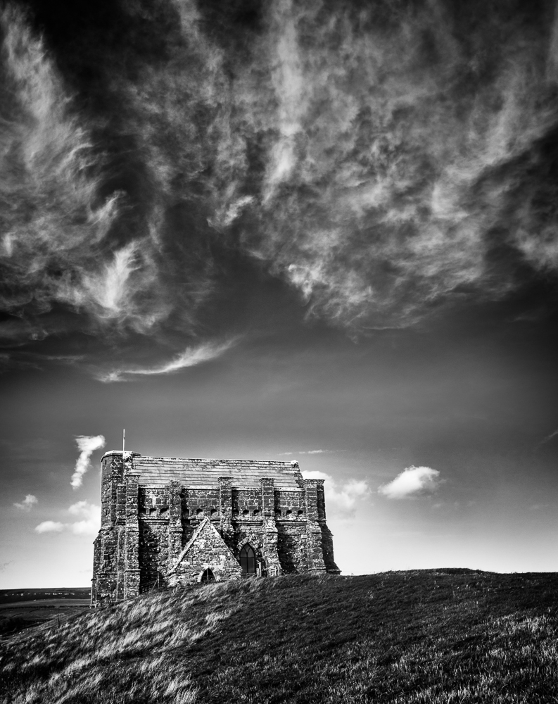
The third shot and a very different composition, this time a portrait. The wispy clouds above the chapel are all important but somehow I still don’t think it is the best shot in this sequence.
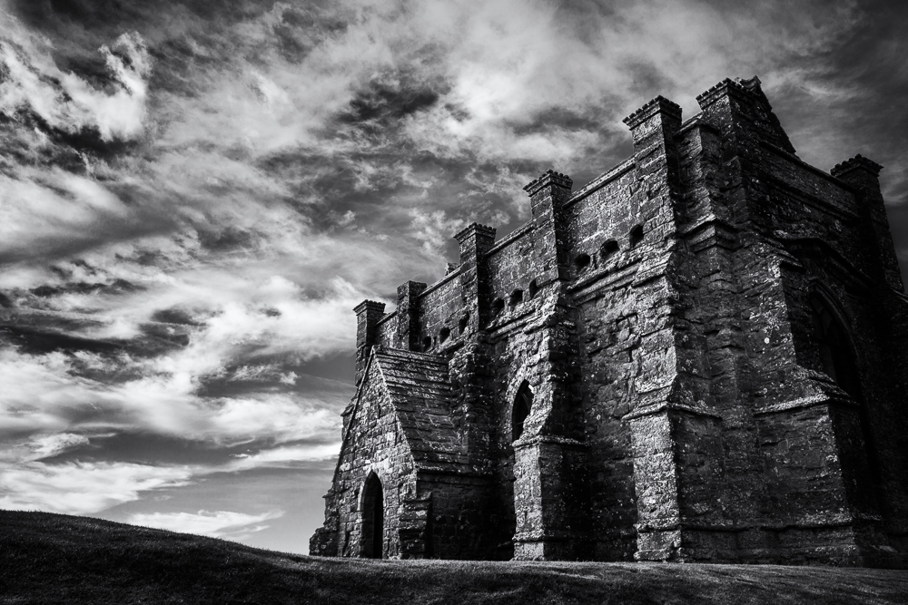
Finally, I moved in much closer to the chapel using a wide angle lens. As a consequence the building now dominates the frame and the converging lines of the buttresses give a sense of height and mass. This is complemented by the clouds which are a wonderful backdrop to the harsh lines and solid golden buff limestone structure of the chapel itself. The surrounding landscape has been excluded, so this image no longer provides a sense of place, but as a photograph it’s my favourite of the four. Would it be your choice as well? Certainly the most dramatic, and no longer the picture postcard view which I am always keen to avoid if at all possible.
The chapel is thought to have been built in the late 14th Century by the monks of nearby Abbotsbury Abbey. It was used as a place of pilgrimage; its isolated setting allowing monks to withdraw from the monastery during Lent for private prayer and meditation. As it can be seen from the sea it would also have served as a beacon after the Dissolution.
Do click on any of the images to view a larger version.

Earlier this year we visited the Isle of Mull which is part of the Inner Hebrides off the West coast of Scotland. There were a number of boats which had long since passed by their sell by date, but they are great subjects for photography.


Do click on any of these images to view a larger version.

17.09.47 – The Golden Hour begins
In the past couple of months I have been making more use of my Instagram account (@arfrost) and on it my profile reads – ‘A monochrome photographer with occasional colour lapses’. I think this sums up my approach to photography rather well, and this post is just that, a lapse into colour.
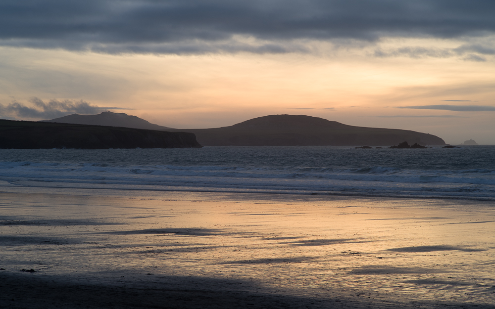
For many landscape photographers the ‘Golden Hour’ at the beginning or at the end of the day is one of the most popular times to be out with a camera. This set of images demonstrates rather well the reason why it can be a magical experience. The colour of the light is constantly changing and arguably the longer you wait, the greater the reward is likely to be.
17.24.03 Showing Potential
All of these images were taken from more or less the same position, looking out over Whitesands Bay in Pembrokeshire back in February this year. The first frame was taken at 17.10hrs and the last at just before 18.00hrs, a difference of just 50 minutes.

17.44.46 Jogger at dusk

17.54.10 Forty five minutes after the first frame

17.58.11 The Magical Golden Hour
As well as the glorious colour palettes the inclusion of people and in some cases their dogs as well, adds human interest to three of the five images, which appeals to me.
If you happen to find yourself in a wonderful location when the day is drawing to a close, and assuming you have the time to sit or stand and just wait; then there is no greater pleasure than to enjoy the ‘Golden Hour’. Whether you have a camera with you or not, the experience is hard to beat.
