St Eloi’s, Llandeloy ….. let the story unfold

There are times during a church visit when the building or a particular object ‘speaks’ to me, and when it does I like to spend time exploring that subject. To look for different compositions but more than that to try and tell a broader message, a story which lies behind the images – or in other words the reason why I was drawn to the subject in the first place.
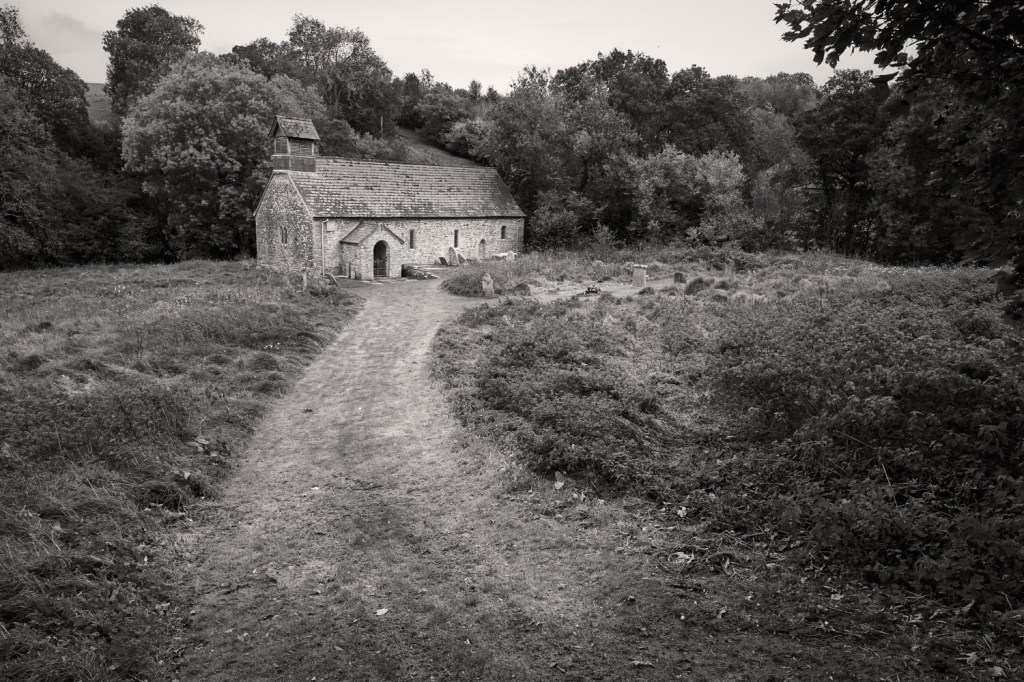
This is the first of a two part post on St Eloi’s, Llandeloy, Pembrokeshire in Wales. Tucked away it’s about 8 miles inland from St David’s Cathedral an altogether different and famous religious building which will attract many thousands of visitors. I doubt whether St Eloi’s will attract a couple of hundred people through its ancient doorway in a single year.
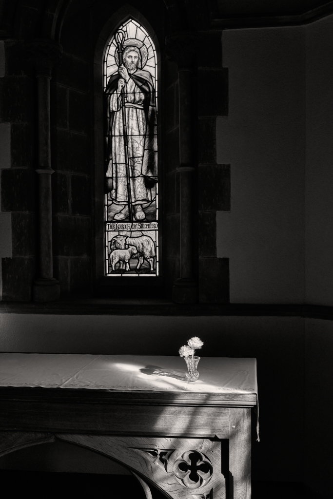
The principal subject for this entry is the book of prayer open at The Communion and sitting on an old prayer stand. Judging by the dirt it’s hard to know how long these two pages have been exposed to the light and not been turned.
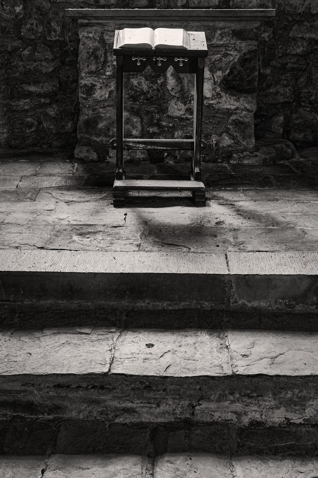
Moving back, the prayer stand itself is revealed, as well as the uneven stone floor and steps. An altar top is just visible. The light falls on the prayer book and a faint shadow of the stand on the floor suggests a window opening above.
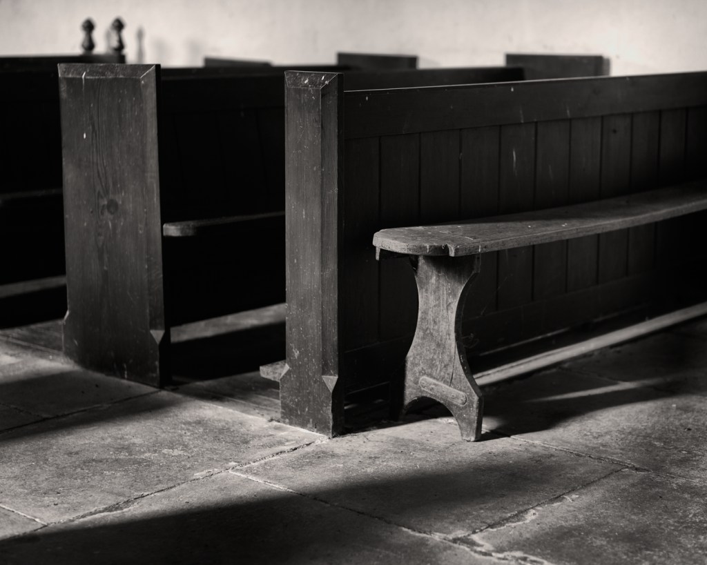
Changing the angle of view reveals a simple pew set off to the side, room enough for two or maybe three parishioners.

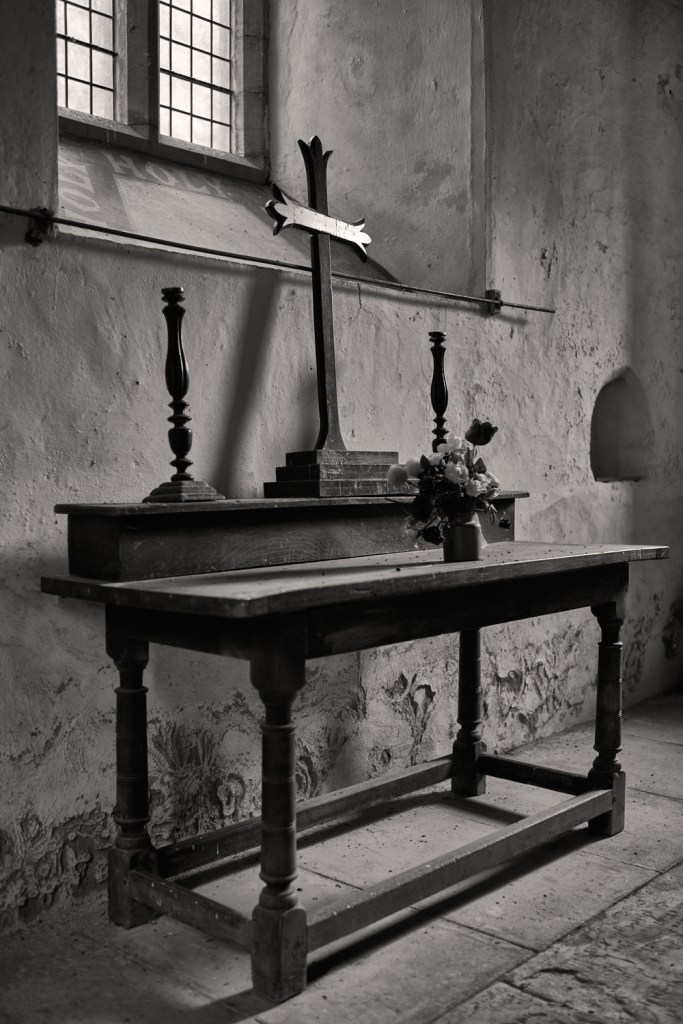
The image below arguably shows the whole scene. A plain metal cross stands on the stone altar top. It is in fact a side altar or bye-altar, which is subordinate to the central or high altar to be found in another part of the church. The window reveal is shaped by the incoming light shining on roughly hewn stone. Also clearly visible are what I assume to be mice droppings. It would appear that this church isn’t used or cleaned on a regular basis.

Taken at face value each picture is purely descriptive in its nature, however there is another narrative.
I find it sad to witness but these photographs depict an ongoing and wider problem as fewer and fewer people attend church and consequently more and more churches will fail and become redundant. Places of historical and architectural merit. Spiritual places often playing host to works of religious art, and certainly places which are full of memories from centuries past.
Charitable institutions have been formed to save and care for these special buildings. One such charity is the Friends of Friendless Churches, which not only look after St Eloi’s but work to rescue and protect more than 60 other churches of all denominations across Wales and England. However they rely heavily on donations and volunteers, an uphill struggle at any time.
On the one hand I feel a sense of joy that these churches are being preserved for future generations but on the other hand I cannot ignore a feeling of melancholy, as past times are remembered but hopefully will never be forgotten. Future generations should be able to witness for themselves the important of these sacred places.

This is the first post following my recent visit to St Eloi’s in early June. You will be able to read the second post in the next few days.