Posts tagged ‘coast’

All by myself

All by myself

Despite the title, this isn’t a long distance selfie! I am though drawn to lone figures in relatively empty spaces walking along with only their thoughts for company. Perhaps it’s because I can readily empathise with the concept of being on alone in a quiet space. After all there is so much ‘noise’ in this world that it has become something of a luxury and a joy to find somewhere with solitude and even a little silence.

Alone yes, but even here there is the sound of gentle waves lapping against shore and feet squelching as each step lands on the soft wet sand. I just hope this person had the good sense to switch off their mobile phone, or better still left it at home to avoid the temptation to check for messages, emails, likes or comments!

There is of course one other person present, and that’s me the photographer. Photography tends to be a solitary pursuit and I am very happy this should be the case.

As you are looking at this image there is now a third person, you the viewer. For as Ansel Adams once said – ‘There are always two people in every picture: the photographer and the viewer’ – and how right he was.

Depending on the device you are using to view this picture, you might like to click on the image to see a larger version, as the main point of interest is very small but hugely relevant!


Pembrokeshire – A ‘letterbox’ view

L1000301-Edit

As I write this post the sun is shining and Summer is almost here but these four images depict a very different time of year. They were all taken on the same day back in February. Some may say a typical late winters day in Wales, when nobody in their right mind would be out with their camera. Mist, drizzle and poor visibility. However these conditions can be ideal for the monochrome photographer.

In all cases the native 3 x 2 crop of the 35mm sensor included too much sky, and with little or no interest in this part of the picture I have cropped each image to what might be described as a ‘letterbox’. The aspect ratio is about 3 x 1, but what really matters is whether or not the crop works compositionally, and I believe it does. Photography is often about what you choose to exclude from the frame to strengthen a picture, not just about what is included already.

In the first shot taken at Newgale Sands, I focused on the foreshore which has softened the figures, the sea and distant rocks. This has helped to emphasize the misty conditions. The couple and their dog are an essential part of the image. The provide scale and as they are the only people on the beach they serve to reinforce the fact that the weather was so poor keeping most sensible people indoors, but for dog walkers and photographers!

L1000306-Edit

After taking the first shot I looked behind me only to find a swathe of mobile homes which overlook this section of coastline. Very quiet at this time of year, and only coming to life when the weather improves and the holiday makers return.

L1000338

Moving further along the coast I stopped at Little Haven. Conditions remained the same and this time I wanted to capture the tidal movement of the sea. Resting the camera on a wall I used a ND filter to give me  a slow shutter speed, about 1.6 seconds. Several exposures where necessary to give me the look of the movement in the sea water I was after.

L1000365

Finally a shot of what I assume is a farmhouse taken at Marloes. A typical dwelling in this part of the world but what appealed to me was the telegraph poles and how they could be used to create what I think is a pleasing composition.

Each picture looks better larger, so do click on an image to view a larger version which will open in a new window.


Marloes, Pembrokeshire – soft proofing in Lightroom

Marloes

If you read my blog on a regular basis you will probably have noticed that although I work almost entirely in monochrome, rarely are my images in ‘pure’ black and white – in other words they are toned. Either with a single colour, or more recently I have used a split tone where the highlights are toned with one colour and the shadows are toned with a different colour. This split tone is easily applied in Lightroom and the balance between the two tones can also be adjusted.


Screen Shot 2017-05-31 at 18.06.17


Whilst I like the effect of split toning it does present me with a new problem, and that is one of printing. I very much enjoy the process of printing; in many ways it’s the rightful conclusion to everything that has gone before it. In the past printing a ‘pure’ black and white photograph was fairly straightforward from my point of view. The fact that my monitor wasn’t properly calibrated (good but not great) didn’t matter hugely to me; I could produce a perfectly acceptable print by observing the histogram, processing accordingly and adjusting the contrast to achieve the look I was after.

With split toning, however subtle the effect, I am now printing a ‘colour’ image, so what I see on the screen and how that image is produced in print becomes much more critical. The choice of paper (and there are now so many excellent photographic papers), use of the appropriate colour profile for printing, as well as having a correctly calibrated monitor, now all play a more important part than they did before.

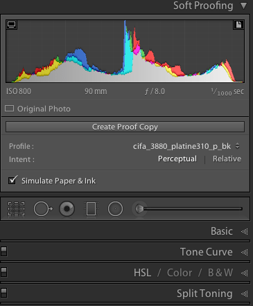
For these reasons I started exploring the soft proofing panel in Lightroom which forms part of the ‘Develop’ mode. It is easily opened by pressing ‘S’ on the keyboard. From here you can select the colour profile for the paper you wish to use and select either perceptual or relative as the intent. From here Lightroom will create a virtual copy of the image with the colour profile and intent embedded. The name of the file/copy will include a reference to the colour profile, which is a very convenient feature for future reference. This is an invaluable benefit and one that Lightroom makes so easy. Depending on how the image changes its appearance in soft proofing you can go on to make the usual processing adjustments to the contrast, clarity, exposure etc so that the image reflects how you want the photo to be printed. By choosing a matt paper colour profile I found the proof copy was much ‘flatter’, it lacked contrast when compared to the original image. In processing I added back more contrast to the proof copy.


I do not own a device for calibrating my monitor and perhaps that is something I should acquire in the future. In the meantime I did use the Display Calibratior Assistant on my iMac and whilst not a precise tool, I have been able to calibrate my monitor to more closely represent what comes out of the printer.


There is no question that I still have more to learn regarding printing and with two exhibitions on the horizon this year; one in July and one in November, I am very keen to make a decision on my choice of paper and be able to produce consistent results. More test printing is required. I also know that Photoshop has a soft proofing feature and in time I may look into this as well but for the moment Lightroom seems to be a very straight forward way to achieve the results I am wanting.

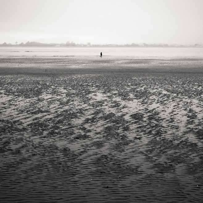
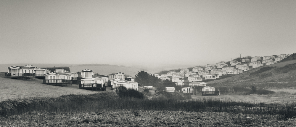
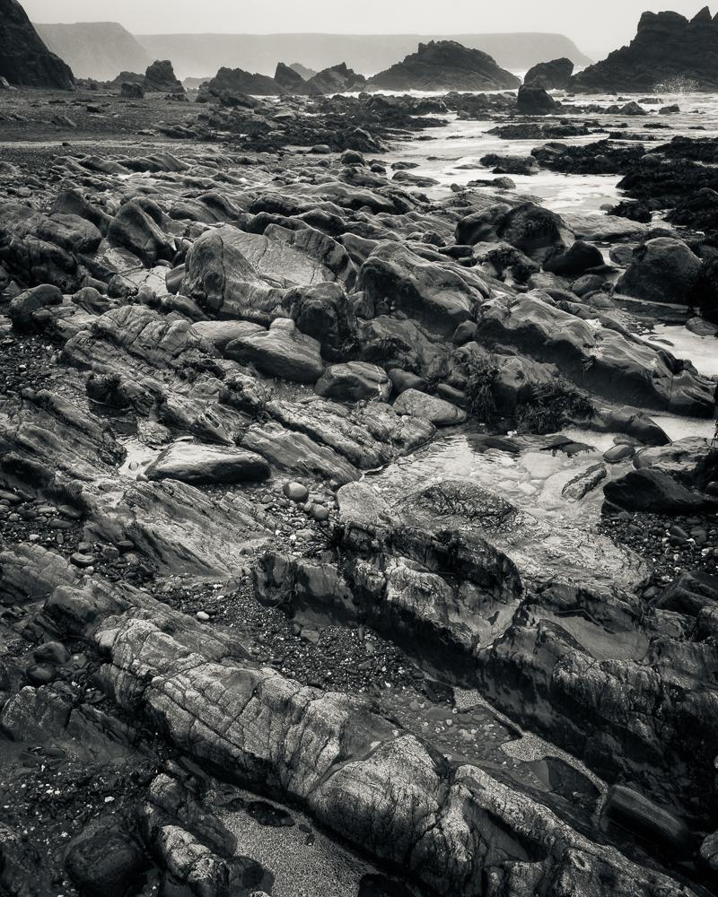
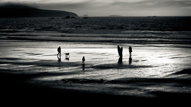
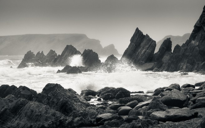
I shall leave you with a few more images of Marloes in Pembrokeshire, Wales. Fortunately when I visited this location earlier in the year, the height of the tide was just about right – ideal conditions for some dramatic coastal photography.


Please note that I am using Lightroom 5 and I am not using the most recent operating system on my iMac, so the screen grabs may look different. To be frank I am not a great one for always upgrading to the latest software. If it works then I don’t feel the need to automatically change anything. I do realise this might get me into trouble one day but for now I’m very happy with what I’ve got and it works for me!

Whitesands Bay – late in the day

Whitesands

Taken on the first evening during my recent visit to Pembrokeshire, this shot was taken late in the day as the sun started to set. There were only a handful of other people about, all pleased to be at this rather lovely sandy bay.

It’s a location which is popular with surfers but on this occasion there was only one person with a board, but I like the separation and variety of the other characters in the picture. The man walking his dog, the young child running towards his or her mother who is looking out to sea. We do not know if there is a connection between this group of people. It doesn’t really matter, for they were doubtless enjoying their time there, just as much as I enjoyed the scene and taking a few frames.

Porthgain Harbour – before, during and after Storm Doris

My stay in Pembrokeshire last week coincided with the pending arrival of Storm Doris. The naming of severe storms in the UK has become a convention since 2015. One of the ‘tour’ locations on the itinerary was Porthgain Harbour which lies on the north west coast. A pretty little hamlet, its name translates to Chisel Port, for it was once was used for quarrying. First it was slate, then brick and later granite were all shipped from this place. Now it’s perhaps best known as a tourist attraction with a choice of excellent places to eat and a couple of fine art galleries. In calmer weather there would also be a few fishing boats but I guess these had been removed from the harbour for the winter.

We first visited Porthgain in the afternoon, a couple of days before ‘Storm Doris’ was due to hit our shores. The sea was calm and the sun was setting in the west, so there was no direct light on the old Harbour Master’s Office at the end of the quay.

the-harbour-masters-office

The Harbour Masters Office in Porthgain – ‘The calm before the storm’

A couple of days later we returned for a very stomach satisfying lunch of fish and chips (what else?!) and timed our visit to coincide with the incoming tide and the arrival of the storm. It had been very gusty in the morning so we expected some dramatic seas. However as the wind was blowing more from a south westerly to westerly direction and not from the north west, the harbour was somewhat sheltered from the brunt of ‘Storm Doris’. Nevertheless the waters were very rough and as wave after wave hit the rocks, plumes of sea spray were being blown into the air.

porthgain-harbour

Porthgain Harbour ‘During the storm’

porthgain-harbour-2

Porthgain Harbour – ‘Sea Spray’

Believing the sea would still be quite rough the next day, we returned again in the morning knowing the light would be falling on the Harbour Master’s Office. With clear skies it did, but the sea itself was surprisingly quite calm, so a wide angle view of the harbour was the best shot to be captured in the circumstances. The old brickworks are clearly visible on the left hand side.

porthgain-harbour-3

Porthgain Harbour – ‘The morning after’

As mentioned earlier The Met Office started naming storms in the UK in 2015. The idea to raise people’s awareness of forthcoming bad weather, which might cause damage, flooding or even loss of life. I do understand the need to do this if a severe storm is expected, but to my mind ‘weather warnings’ are now issued all too frequently. In the past heavy rain and high winds would have been accepted as normal and quite regular events during the winter; today though they come with yellow and amber warnings, which may or may not prove accurate anyway.

On this occasion ‘Storm Doris’ was much more severe in other parts of the country than in Pembrokeshire, which only goes to prove how difficult it is to forecast the weather even with all the technology and computer predictions available to the forecasters.