Posts tagged ‘black and white photography’

Inspired by the Master photographer, John Blakemore – and my 300th post!

20170426-L1020338-Edit

Woodland on Ulva

I am a keen collector of books about photography and naturally the vast majority are by authors whose work I greatly admire. I find both the written word and the images can be inspiring, often providing little pearls of wisdom which might just help my own photography.  One such person is John Blakemore, a true master of the craft of black and white photography. Born in 1936 in Coventry, England he has been practicing his art since 1956, and in that time has built a portfolio of work which of its type is unlikely to be surpassed. Much of this work has now been archived at the Library of Birmingham.

He is probably best known for his landscapes and still life photographs. He is widely acknowledged as one of the finest monochrome printers, using the zone system to make some truly beautiful images – his use and control of tonality in a black and white photograph is quite superb.

I only have one of his books, titled – ‘John Blakemore’s Black and White Photography Workshop’. Whilst much of what he has to write relates directly to the traditional darkroom, his thoughts on tonality and printing can equally be applied to the digital darkroom as well. The book contains many of his best known photographs and if like me, you wish to improve your knowledge of black and white photography, this book is well worth adding to your collection.

So how did this book inspire me? How could his approach be applied to my own work?

One area where I have always struggled is trying to photograph woodland. From a composition point of view I find the subject matter very challenging. You could say I find it hard to see the ‘wood from the trees’, an old cliche perhaps but in my case a very true one. Even when the composition looks right I haven’t known how to process the image in a way which I find pleasing.

Recently I started reading through John Blakemore’s book and I came across a number of woodland landscapes which I very much liked. I enjoyed their treatment and this encouraged and inspired me. Having studied these images more closely I selected a few frames taken on my recent trip to Scotland to see whether or not I could emulate the ‘look’ of his work and process my pictures in a similar fashion.


20170426-L1020341-Edit

Boulders of Moss, Ulva


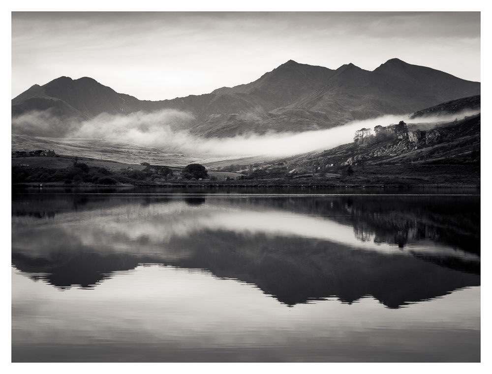
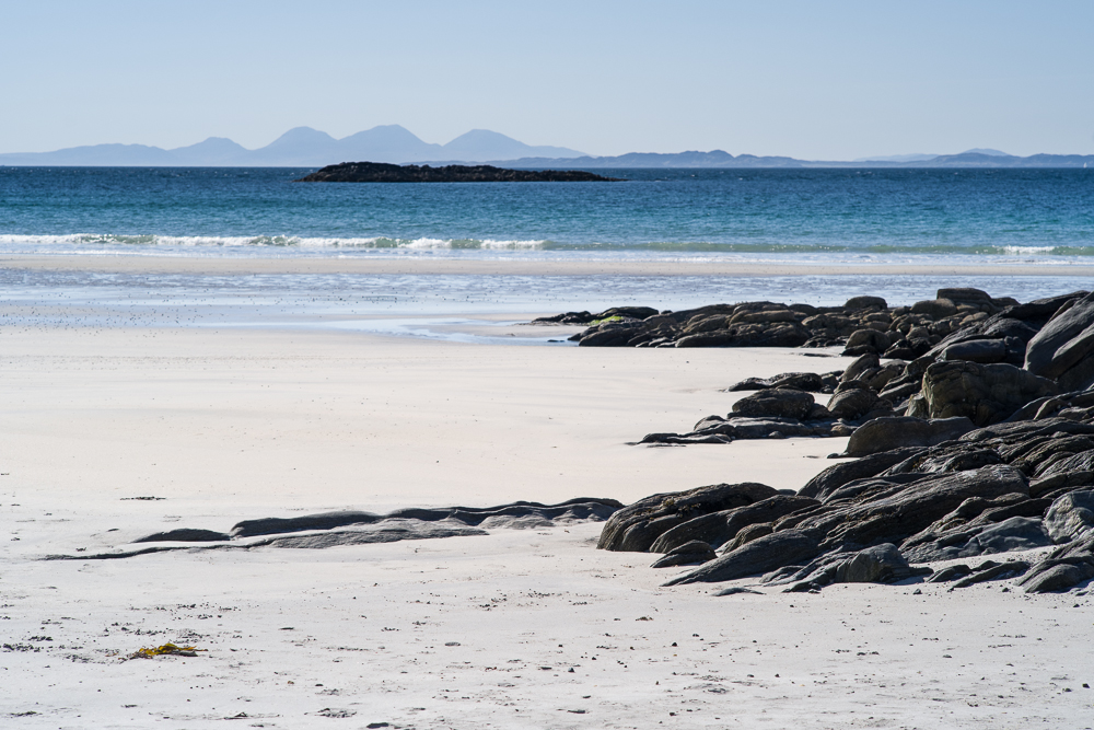
The tone curve in these four photographs is very different to the outcome from my normal processing methods and as a consequence this set of images work for me. Whilst there is a full range of tones, the mid-tones dominate each picture. Strong darker tones are my usual style, resulting in an image which has far more contrast. The images in this post are much softer and more restful to the eye. As a result I believe the viewers attention is held for longer so that the composition, the texture and form is more readily appreciated. A high contrast image can be quite punchy and dramatic but the eye can quickly tire when looking at an image of this type. These are far more subtle images and an approach I can see myself using again in the future. I will also be interested to see how they print on various types of paper.


20170429-L1020664-Edit

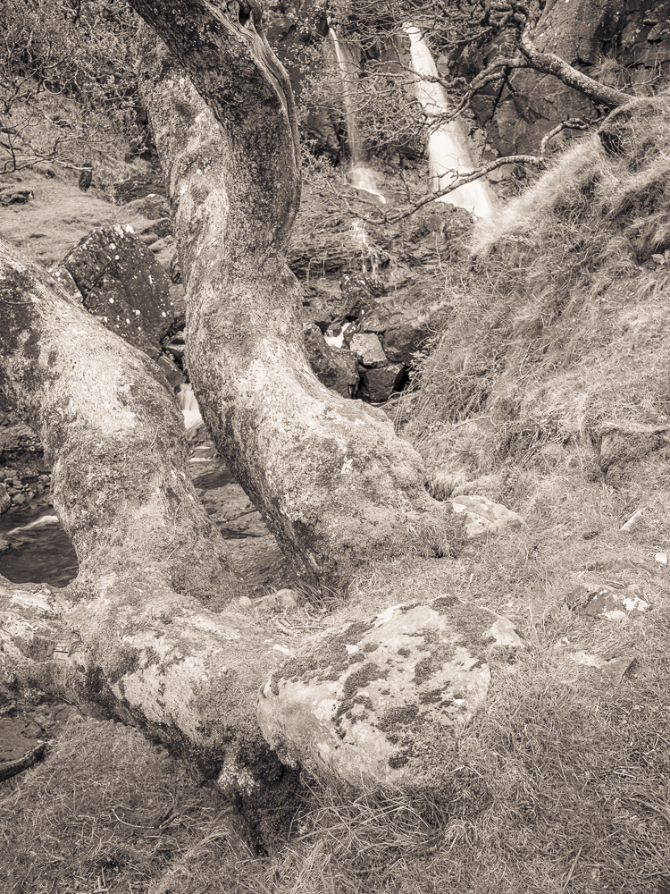
Eas Fors Waterfall, Isle of Mull


20170507-L1030047-Edit

Tree by a stream, Wester Ross


Your feedback and comments are very welcome and as this is my 300th entry, it’s an opportune time for me to thank all my followers who read, like and comment on my work. It’s very much appreciated and it’s one of the reasons I will continue sharing my images and thoughts in the future.

Lastly my thanks to John Blakemore for his inspiring approach to this art form.

As always these images are best viewed large, so do click on any one of the photographs and it will open in a new window.

Llynnau Mymbyr, Snowdonia – another one from the archives

20151028-L1004252-Edit

A few days ago I posted an image taken back in 2015 during a trip to Snowdonia in Wales, which I had not processed or shared before. Whilst searching the Snowdonia folder in Lightroom I also came across this picture. This shot of the Snowdon Horseshoe was taken looking down a lake called Llynnau Mymbyr. The obvious appeal to this image is the early morning mist hanging in wait for the sun to rise and its reflection in the calm waters of the lake. I clearly remember this scene and can recall that within a few minutes the mist had been burnt away and the very reason for taking the photograph in the first place had disappeared.

Marloes, Pembrokeshire – soft proofing in Lightroom

Marloes

If you read my blog on a regular basis you will probably have noticed that although I work almost entirely in monochrome, rarely are my images in ‘pure’ black and white – in other words they are toned. Either with a single colour, or more recently I have used a split tone where the highlights are toned with one colour and the shadows are toned with a different colour. This split tone is easily applied in Lightroom and the balance between the two tones can also be adjusted.


Screen Shot 2017-05-31 at 18.06.17


Whilst I like the effect of split toning it does present me with a new problem, and that is one of printing. I very much enjoy the process of printing; in many ways it’s the rightful conclusion to everything that has gone before it. In the past printing a ‘pure’ black and white photograph was fairly straightforward from my point of view. The fact that my monitor wasn’t properly calibrated (good but not great) didn’t matter hugely to me; I could produce a perfectly acceptable print by observing the histogram, processing accordingly and adjusting the contrast to achieve the look I was after.

With split toning, however subtle the effect, I am now printing a ‘colour’ image, so what I see on the screen and how that image is produced in print becomes much more critical. The choice of paper (and there are now so many excellent photographic papers), use of the appropriate colour profile for printing, as well as having a correctly calibrated monitor, now all play a more important part than they did before.

For these reasons I started exploring the soft proofing panel in Lightroom which forms part of the ‘Develop’ mode. It is easily opened by pressing ‘S’ on the keyboard. From here you can select the colour profile for the paper you wish to use and select either perceptual or relative as the intent. From here Lightroom will create a virtual copy of the image with the colour profile and intent embedded. The name of the file/copy will include a reference to the colour profile, which is a very convenient feature for future reference. This is an invaluable benefit and one that Lightroom makes so easy. Depending on how the image changes its appearance in soft proofing you can go on to make the usual processing adjustments to the contrast, clarity, exposure etc so that the image reflects how you want the photo to be printed. By choosing a matt paper colour profile I found the proof copy was much ‘flatter’, it lacked contrast when compared to the original image. In processing I added back more contrast to the proof copy.


I do not own a device for calibrating my monitor and perhaps that is something I should acquire in the future. In the meantime I did use the Display Calibratior Assistant on my iMac and whilst not a precise tool, I have been able to calibrate my monitor to more closely represent what comes out of the printer.


There is no question that I still have more to learn regarding printing and with two exhibitions on the horizon this year; one in July and one in November, I am very keen to make a decision on my choice of paper and be able to produce consistent results. More test printing is required. I also know that Photoshop has a soft proofing feature and in time I may look into this as well but for the moment Lightroom seems to be a very straight forward way to achieve the results I am wanting.

I shall leave you with a few more images of Marloes in Pembrokeshire, Wales. Fortunately when I visited this location earlier in the year, the height of the tide was just about right – ideal conditions for some dramatic coastal photography.


Please note that I am using Lightroom 5 and I am not using the most recent operating system on my iMac, so the screen grabs may look different. To be frank I am not a great one for always upgrading to the latest software. If it works then I don’t feel the need to automatically change anything. I do realise this might get me into trouble one day but for now I’m very happy with what I’ve got and it works for me!

Ardalanish Weavers on the Isle of Mull

In the past couple of weeks my wife and I have enjoyed a wonderful time exploring the Isle of Mull off the west coast of Scotland. During our stay in a cottage near Bunessan on the Ross of Mull, we had the good fortune to visit the Weavers at Ardalanish farm, which overlooks a beautiful sandy bay (see the last image). We received a very warm welcome from Kathy followed by an interesting tour of the mill, prior of course to visiting and buying a couple of items in their well stocked shop. They use rich black wool from the Hebridean sheep which are kept on the farm and this is mixed with wool from Shetland and Manx Loaghtan sheep. The mill itself is powered by wind turbines also sited on the farm.

I know very little about the art of weaving but the mill was of great interest; the traditional looms and other machinery, the tools that lay around and the whole process of making such fine woolen cloth, which is then used to make a wide variety of clothing and homeware. Taken from their website I quote “Weaving is a fascinating mix of mechanics, maths, hard work, inspiration, creativity, trial and error and a little dose of magic”. Having seen them at work I can believe every word.

I asked permission to take a few images and I hope they capture something of the process and the place. If you can’t visit personally then do take a look at their website to find out more about the Weavers at Ardalanish.

…. and here are the results of all their hard work –

The weavers work in a glorious location (when the sun shines and the sky and sea are blue) – Ardalanish Bay on the Isle of Mull, and yes the sea really was that colour! This beautiful sandy bay looks out towards the Isle of Colonsay with the Paps of Jura in the far distance. Footprints other than our own were hard to find. I can’t think of a more peaceful, special and simply beautiful place.

Just a taster image of more photographs to come following our trip to Scotland, and in particular the Isle of Mull.

My successful Associate Distinction of the Royal Photographic Society

I have to admit that yesterday was a rather special day. I received formal confirmation from The Royal Photographic Society that I had been awarded an Associate Distinction in the Conceptual and Contemporary category for my panel of fifteen images and statement of intent. I had previously been awarded a Licentiate Distinction back in 2012.

My submission was recommended for the distinction by a panel of judges on the 19th April when I took my images to the Headquarters of the RPS in Bath for the assessment. It then takes up to 10 days for this recommendation to be ratified by the Distinctions Advisory Board before the actual certificate is awarded.

I am of course absolutely delighted to have achieved this distinction by The RPS, which was formed in 1853 and is recognized as one of the leading Photographic Societies in the world.

I have selected a few of the images in the panel for this entry but if you would like to see all the pictures then I have created a new gallery – simply click here.

As well as the images themselves, a written statement of intent is required for the submission and I have included the text below:-

Countryside Churches

As a child growing up in London in the 1960’s, our family holidays were largely spent in Sussex or the West Country. My late parents would often take me to remote churches in the countryside for reasons I didn’t really understand.

Fifty years later and now living in West Sussex, I have come to appreciate the importance of these places of worship; partly for their historical interest and splendid rural locations, but mainly for the simple and beautiful charm of their interiors. Here I can share the same experience of peace and tranquility with the many generations that have gone before me.

Sadly many of these churches are under threat from a general decline in religious observation. Fortunately some in my selection have been saved and are being preserved by The Churches Conservation Trust. Mainly Saxon or Norman in origin, they are still consecrated but rarely used for regular worship. They are devoid of the adornments and distractions of a fully functioning parish church, apart perhaps from an old Bible or prayer book. I am rarely disturbed by other people when I visit to contemplate and to photograph, which only heightens the feelings these rural churches evoke.

My panel is made up from a number of churches in the West Sussex and Dorset countryside. Using only the natural light available, the monochrome images depict a sense of timelessness; quiet places where solitude and sanctuary can still be found amidst our increasingly busy lives.

(244 words)

And finally here is the hanging plan of all the images.

To view the individual images in my ARPS Panel do click here.