Photographer and subject drawn to the light ….. The story behind the picture recalls a quote by Henri Cartier-Bresson.
I have said this before, but much can be learned by studying the images of famous photographers whose work you admire. Similarly their writings can also encourage and inspire. I particularly enjoy reading quotations by some of my favourite photographers – Ansel Adams, Minor White and Henri Cartier-Bresson to name just three. I wholeheartedly recommend having a shelf full of photography books to revisit from time to time, browse at leisure and enjoy.
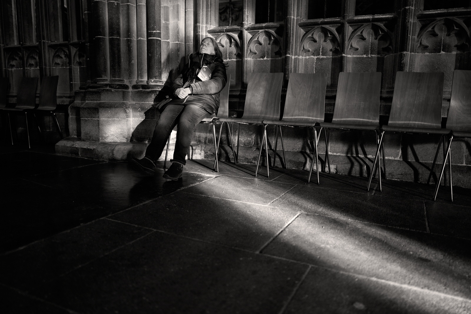
I took this image in Wells Cathedral in Somerset on Boxing Day, just a few days ago. Its capture reminded me of a quote by Cartier-Bresson that I recalled reading in the past. I couldn’t remember the exact words, only the sentiment. It didn’t take me long to find the quote and this is what he wrote:-
“Sometimes it happens that you stall, delay, wait for something to happen. Sometimes you have the feeling that here are all the makings of a picture – except for just one thing that seems to be missing. But what one thing? Perhaps someone suddenly walks into your range of view. You follow his progress through the viewfinder. You wait and wait, and then finally you press the button – and you depart with the feeling (though you don’t know why) that you’ve really got something.”
Let me now explain the story that lies behind this image. I hope you will find it interesting. I should begin by saying that Wells Cathedral is not only a place I have visited and photographed previously, but one which never ceases to inspire me to make images. I always find that I am drawn to how the light behaves; it’s almost as if it’s playing a magical tune.
As I wandered around I noticed how a low narrow shaft of light illuminated the stone floor and the base of a large pillar at the end a row of seats. The light was coming and going but I crouched down and adjusted my position to compose the image. I peered into the screen on the back of my camera and I didn’t have to wait very long before the brightest light returned to the scene.
Just as I was about to press the shutter, a lady walked into my field of view and sat down in the chair next to the pillar. A little frustrated I stood up, but then I guess intuition took over. I crouched down again, quickly recomposed and took the shot. Just the one release as I didn’t want to attract her attention and appear to be invading her privacy. It was only later that I could see that she had her head back and eyes closed!
I looked at the screen to review what I had captured. The camera’s exposure was set to protect the highlights, so much of the image was very dark and underexposed. I would have to wait until the image was downloaded to see whether or not I had a ‘keeper’. Something inside me made me feel rather excited to find out.
There is no question that initially I had been drawn to the scene by the light. Arguably the picture lacked a true focal point and I was aware that the modern chairs were rather out of keeping with the architecture. Nevertheless I felt it was a scene worth capturing. In truth though there was something missing, and that something walked into the viewfinder at precisely the right moment. I believe that she too had been drawn to the light. It was the Christmas season so quite possibly a light of a more spiritual nature.
Perhaps you can now understand why I recalled the quote by Cartier-Bresson…… it was almost an exact match for the image I made and my experience in doing so.
For previous posts on Wells Cathedral please click on the links below: