I would think that most photographers have been inspired by the work of Ansel Adams. I know I have. Ansel Adams was a great exponent of chiaroscuro. The art of using strong contrast in a picture where light subjects are set against a dark background or conversely dark subjects are set against a light background. When used creatively it can work so well in monochrome photography. As well as adding depth to an image, it can be used in a very impactful and dramatic way.
Over the years I think I have learned to see in black and white. To understand how a scene or particular subject will translate to monochrome. To seek out compositions which when processed make an interesting and pleasing image. I am helped of course by the camera having a black and white preview but I need to spot the potential image first, long before I reach for the shutter button.
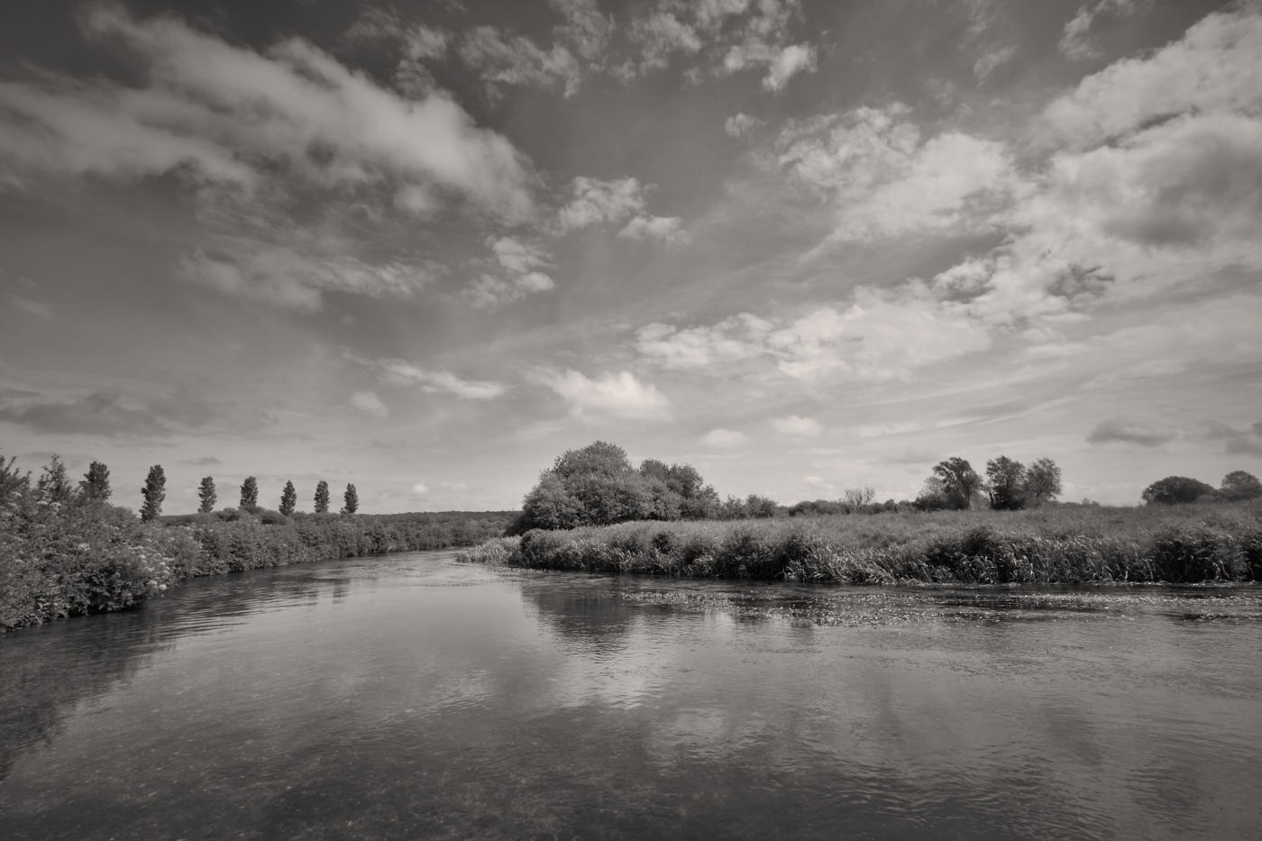
It’s not very often that I only post a single photograph, let alone provide an explanation as to why I enjoy the result. On this occasion I considered this picture of a dead tree in its skeletal form worthy of doing so. My reasoning – well for me it’s a good example of why I love black and white photography.
The horizon line virtually splits the image in half. Light adjoins dark. The uppermost branches stand out against the bright clouds. I have used the dark areas in the sky to prevent the eye wandering outside the frame. The lower part of the tree is bathed in light, enhancing their shape, texture and form. They contrast so well with the dark background of nearby trees and hills in the distance. I like the inclusion of a building, just to the left of the trunk. This adds scale and depth to the image without it being a distraction to the main subject.
At the time of taking, I ask myself how can I process the image to best effect. Will I need to darken parts of the sky and in the case of this image, where do I place the branches of the tree to make the most pleasing composition. I would like to think the answers to all these questions have resulted in an image which you can enjoy.
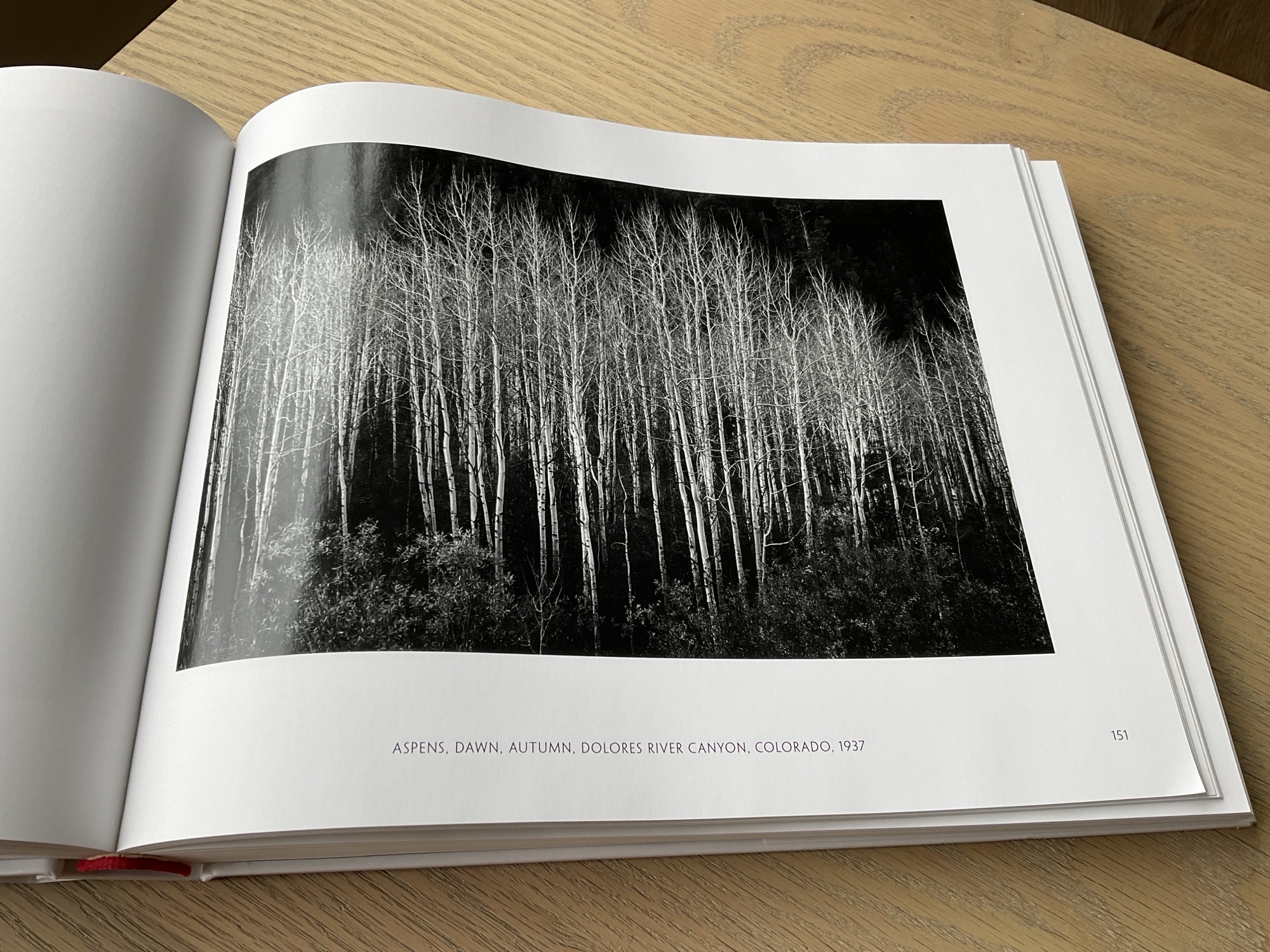
I have many photography books which I probably don’t look at as often as I should. One of these books is ‘Ansel Adams – 400 Photographs’. A truly wonderful collection of his work spanning many decades. His use of light and dark, form and texture, all of which he brings together to enhance the composition. Every page is a lesson in the art of great photography and includes many examples of how chiaroscuro is used to excellent effect. A book for every photographer’s shelf.
“The negative is the equivalent of the composer’s score, and the print is the performance“
Or in this digital age, you can replace the word negative with digital or RAW file.
I can think of no better way to sum up the importance of printing your photographs. In the days of film (which still applies of course) any negative worthy of presentation was printed in the darkroom. Bathed in red light there was an air of anticipation and excitement, as the photographer gently washed developer fluid over the paper. And as if by magic the image would slowly start to appear.
The art of photography is only complete when the image appears on a sheet of photographic paper. This is when the captured image finally comes to life. You can hold it in your hand, feel the surface and weight of the paper and pass it around for others to see and enjoy. Leaving a processed image on a hard drive is no different to storing the negative strip in an envelope which never sees the light of day. In my opinion an excellent photograph, or just one of your favourites, should be printed.
In Part 4 of this series on photographic workflow I want to write about printing. This post has been delayed as I decided to buy a new printer which arrived this week and I thought it might be interesting to share with you the reasons why I chose an Epson SC-P700. I will go through how it is set up, the software I use for printing, my paper selection and lastly making the print.
( I have added the links to Parts 1, 2 and 3 of my photographic workflow at the end of the entry)
After a little research I decided the right printer for my purposes would be the Epson SC-P700. An A3+ photo printer using pigment inks. It’s quite compact and I liked its functionality. Ten or more years ago I bought an Epson 3880 A2 printer. It is still working but I don’t have the space for it in the room where I use my computer equipment. Besides my wife wanted a printer for her artwork, so I decided to treat myself.
I no longer want to print as large as A2, A3+ is plenty large enough. In additon to its reduced size and weight, perhaps the biggest advantage of the P700 over the 3880, is that it has separate ink feeds for the Photo Black and Matte Black ink cartridges. The Epson 3880 has one feed for both these cartridges. This means that whenever you want to switch between a gloss and a matte paper, the printer would have to change the feed from one cartridge to the other. It took time and in the process wasted a lot of ink.
I am still getting to know the new printer but I like the fact it has a semi-opaque top cover with a built-in light. This allows you to see the photograph as it’s being printed. It’s not as magical as being in darkroom but I enjoy it all the same. I no longer have to wait until the paper re-appears at the front of the machine to see how things are going. I also appreciate the pop up screen. It’s good quality and the touch menu is easy to navigate. Far more intuitive to use than the buttons and menu of the Epson 3880. It even gives you a historical readout of the prints you have made, the date and time it was printed and the settings used. Very useful. Time has moved on and you would expect the functions of a printer to improve and they have been with the P700.
I won’t go into any more detail about my decision making process, but I would like to thank Keith Cooper of Northlight Images for his incredibly helpful website and YouTube Channel. A commercial photographer based in the UK, what Keith doesn’t know about digital printing isn’t worth knowing. I have learned a huge amount from his insightful and very comprehensive articles and videos. There is a link below to his review of the Epson SC-P700 which includes a very useful section on how to set up the machine.
Out of the box to making my first print took me about an hour and a half. It connected to my WiFi network without any problem at all. Another big plus as I no longer have a long lead trailing across the carpet for me to trip over! Overall it was quite straightforward although I did need to delete and reinstall the Epson Print Layout software for it to recognize the printer. Once I had done this I was good to go.
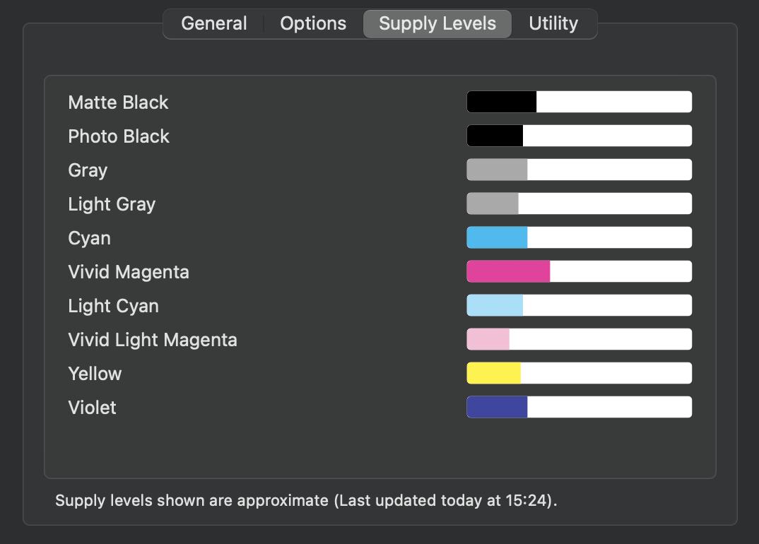
One further point – having installed the ink cartridges the initialization process takes about 15 minutes and Epson are quite transparent when they say this uses quite a lot of ink. The supplied cartridges are not full of ink out of the box, so I was quite pleased to see the remaining supply levels once the printer was set up. As I will rarely be printing in colour I just bought spare cartridges of the four Black/Gray inks. There should be sufficient colour ink to last me for quite a while. Keep in mind that even a black and white print will use some of the colour ink. Epson also supplies a spare maintenance tank, as the one included fills up quite quickly during the initialization apparently.
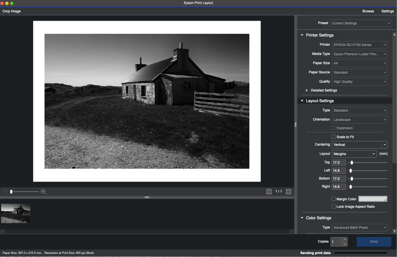
There are many ways to print from Photoshop, Lightroom, Affinity Photo or indeed Capture One which is my preferred RAW processor. However I think the simplest solution, and it suits my workflow, is to use Epson Print Layout. You can find out more about it and download the right version for your computer and operating system here – Epson Print Layout .
From Capture One I can select an image then ‘Open with’ Epson Print Layout. I have already ‘baked in’ all my adjustments and created a Tiff file. If this is not the case then to carry any adjustments across to Epson Print Layout which have been made in Capture One I need to ‘Edit with’. From there it’s simply a case of selecting the media type, paper size and so on. I then use the Advanced B&W Photo settings which are again very straightforward to use for printing in monochrome of course. I have rarely, if ever, used an ICC Colour Profile. In my opinion it’s just not necessary to get a truly great black and white print.
Epson Print Layout Software
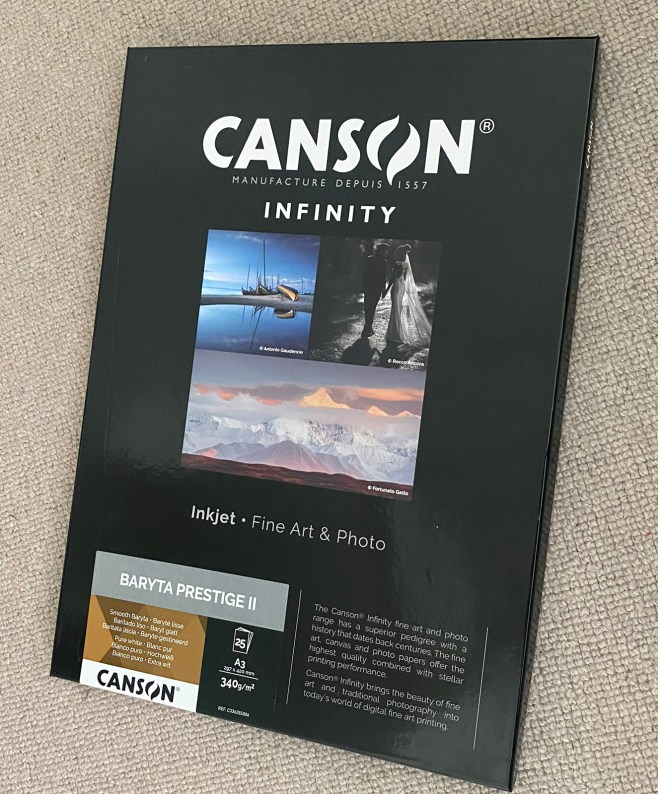
Before printing I had to choose the type of paper for the photos I want to print. Sounds obvious of course, but making the right choice has a significant bearing on the look of the finished photograph. There is a bewildering selection of papers from many manufacturers. They all offer a range of glossy, lustre, matte, fine art papers and the list goes on. Some have a slight texture and some are more suited to black and white than others. Test packs of various papers are useful but for the work I want to print I was looking for a paper that perhaps best mimicked a paper that would have been used in the darkroom. I selected a Baryta Paper by Canson, pictured here. (Baryta Prestige II). I have used Canson papers in the past and always liked the results. It’s quite a thick heavyweight paper at 340gsm, so it feels substantial in the hand.
Having set up the machine I ran a quick test using an ordinary sheet of plain A4 paper. I ran this through the printer just to make sure it was working correctly. This gave me the confidence to use a sheet of Canson paper for my first print. I couldn’t have been more pleased with the result.
The first print
Very happy with result
For more information about printing on Baryta type papers do watch the video below. Again it’s by Keith Cooper of Northlight Images, and is well worth sparing some of your time. So too is the video giving his advice on Advanced B&W Fine Art Printing.
The next stage, and one which presents quite a challenge, is choosing which images to print. I know this is going to prove difficult as the cost of printing can’t be ignored. I will have to be quite ruthless in my selection and only print my favourite images. I did print a lot when I was submitting pictures for club competitions or on the few occasions I was going to exhibit my work. Those days are behind me now, so I simply want to print a selection of images for my own pleasure. I could have sent them to a photo lab but I much prefer printing my work. I feel more in control of the finished result.
I intend starting with a project which has been ongoing for some time now. Images of the Dorset landscape close to where I live. I had already printed contact sheets onto sheets of A3 paper as shown below. There are 140 photographs and more are still be captured. At a little over £3 per A3 sheet, not to mention the cost of the ink, printing all of them would be a very expensive exercise! I may decide to print more than one photograph per sheet. Epson Print Layout works well in this regard as you can easily set up and save templates for repeated use.
Which ones do I choose to print?
This post is already a rather lengthy one, and I am beginning to think the topic of collation, final selection, preparation for print, presentation and storage is a subject in its own right. So there may well be a Part 5 to this Photographic workflow series.
For now I hope you have found this post interesting and if you wish to look at Parts 1, 2 and 3 here are the links below.
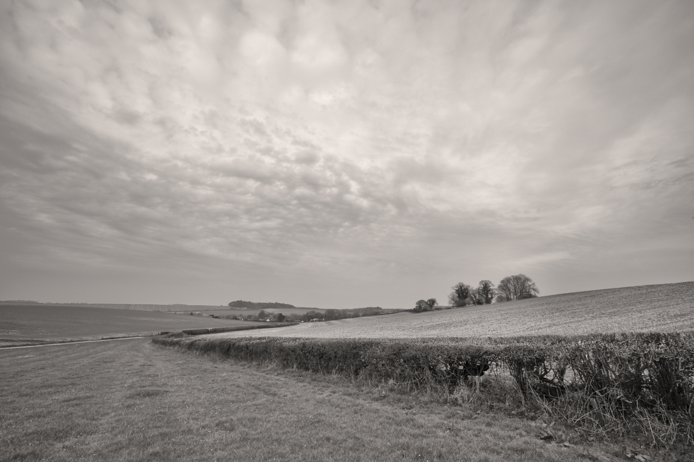
In the latter half of last year I made a conscious effort to make images in colour and not in black and white. Monochrome had been my default creative choice for many years, in fact for nearly a decade. Whilst some of the images I made in colour pleased me, I was finding it increasingly hard to motivate myself to make more colour pictures. As a consequence the past few months have proven to be a very lean period. I even had one kind follower asking me if I was okay? Rest assured I am fine, but photographically speaking I can only admit to being in something of a creative rut.
A change of tack was required. In more recent weeks I have been out in the countryside near our home in Dorset with the sole intention of making black and white images. Whether overcast and dull, or bright and sunny, the camera has recorded what has drawn my eye. I had no high expectations. This was not about making prize winning pictures, nor even ones which would be added to one of my galleries at a later date. Quite simply this was an exercise to teach myself to see the world in shades of grey again, and in the process to make a few images which might rekindle my love of photography and in particular the genre which has been the core of this site.
Was it a success? 100% yes. I not only immersed myself in the beauty of the countryside but I made images which in all likelihood had they been in colour would have done nothing for me. In life you have to try new things and although I can still see myself making some colour images, if I am being completely honest with myself, my heart is in monochrome. The creative medium I discovered back in 2011 which has given me so much pleasure ever since.
Why monochrome I ask myself? Is it the timeless quality of mono? Almost certainly. Is it the greater freedom of creative choices? Again yes. The removal of colour instantly renders an image unreal, an abstraction of the world from how we normally see it. Different processing techniques can evoke feelings and expression in a way which may not always be possible in colour. That’s not to say that colour doesn’t have advantages over B&W, it certainly does but for the most part it’s not for me. Colour is a distraction and if I look at two images of the same subject, one in colour the other in black and white, almost invariably I will find the monochrome version more pleasing. It’s all down to personal preference as we all have different tastes. Wouldn’t the world be a boring place if we all liked the same thing?
What else did this experience teach me? Whilst I have often advocated, but not always practiced, the maxim ‘always carry a camera’, in the hope that something might draw my eye, there is really no substitute for going out with the intention of making photographs. Yes of course some days will be more productive and rewarding than others, but looking isn’t the same as observing and to find strong compositions in good light takes time and concentration. Sherlock Holmes famously said; “You see, but you do not observe. The distinction is clear.” There is another benefit to this more considered approach to image making – I appreciate the beauty of the countryside so much more. I stop to not only observe, but also to listen and absorb the very nature of my surroundings. I am all too aware that I can miss photo opportunities if always on the move.
There is another advantage to being out and about with a camera to take photographs as opposed to going for a walk and taking a camera. There is clearly a priority of purpose. It might also be deemed to be practicing, which doesn’t always make perfect, but I do strongly believe practice can enhance your good fortune. It has been said many times before, but the saying “The harder I practice, the luckier I get” holds true for many pursuits in life.
Similarly Henri Cartier-Bresson said – “The first 10,000 photographs are your worst”. In this digital age that number could easily be increased 10 fold. Not only will practice increase your chances of a successful outcome but you will become more familiar with your camera, lens choice and other equipment, further enhancing your technical skills. I will freely admit having to re-learn which actions I had assigned to certain function buttons when I went out the other day!
I doubt that Ansel Adams would have gone out for a walk in Yosemite with his view camera and large tripod purely in the hope that a scene worthy of capture might appear in front of him. After all he wanted to make images, to indulge himself in his love of photography and to fully appreciate the majesty of the world around him. I think it entirely appropriate to say that he was a photographer first and not a rambler with a camera!
I have enjoyed writing this entry whilst sharing some of my thoughts and recent images with you.
From now on, it’s back to my first love of monochrome, and images of the countryside which I am very fortunate to experience.
I seem to have spent a fair amount of time down at East Head in West Wittering recently. The sand dunes and large areas of beach when combined with ‘big’ skies provide me with so many scenes to photograph. The low light at the end the day is a great time to be there; more so, if a weather front is just passing through. In this image the last rays of sunlight are illuminating the old and rickety dunes fence, one of the last of its type at East Head. There are now more metal posts and wires which are far less attractive from a photographer’s point of view.
These sand fences are put in place to protect the dunes from erosion by reducing wind speed across the sand surface and encourage foredune deposition. They also help to control public access, but for me they quite simply provide some excellent foreground interest in a photograph which is always going to be enhanced by a dramatic sky.
I read a quote by Ansel Adams the other day which read. “Sometimes I do get to places just when God is ready to have somebody click the shutter”. I think this might just have been one of those occassions.
Do click on the image itself to view a larger version.