It’s quite rare that I only include a single image in a post.
My photographs are often defined by location or subject.
In this particular case these points are of no interest to me.
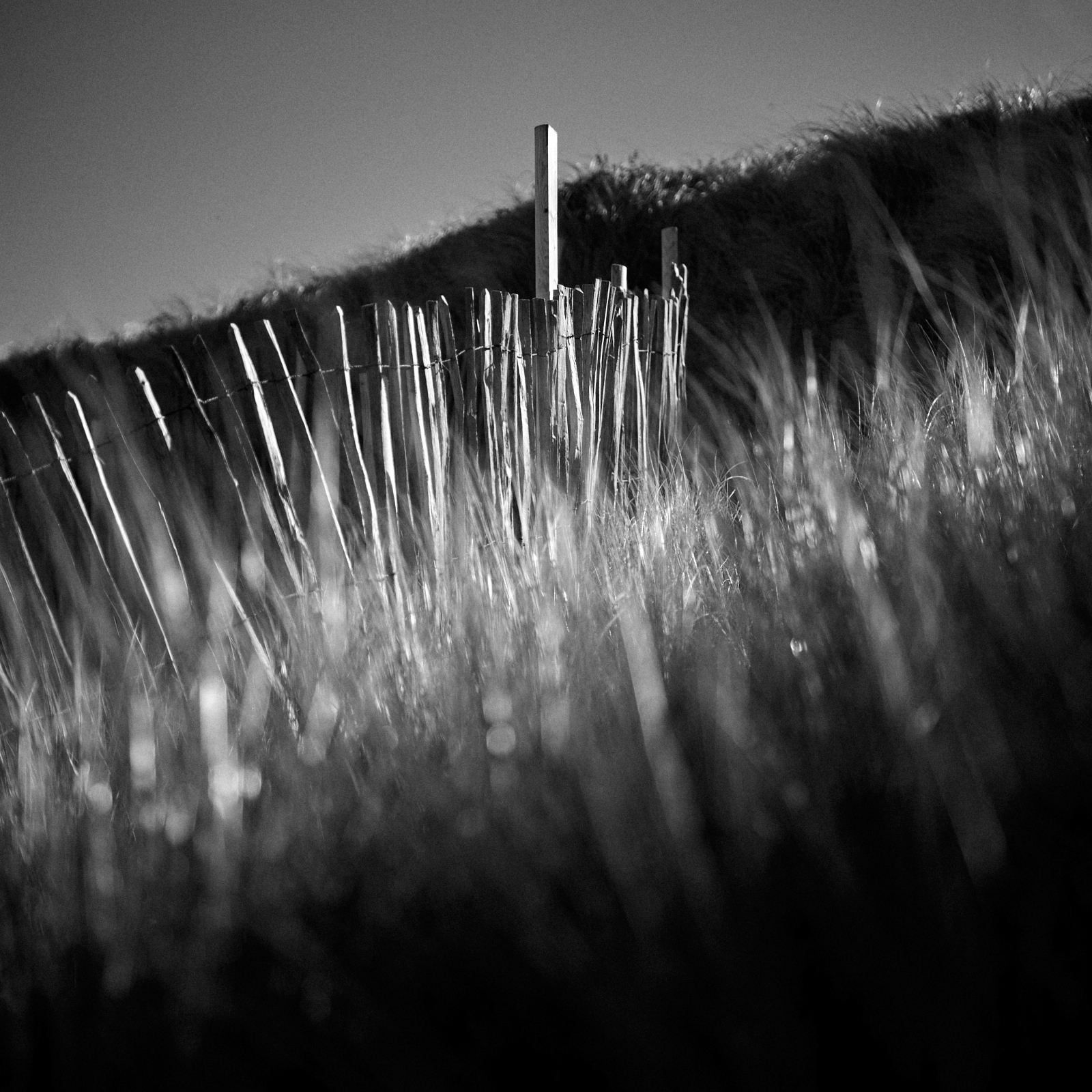
This image is all about the light and it’s polar opposite – the dark.
When I saw how the low penetrating sunlight pierced through the grasses and lit the paling fence, I just knew it was a photograph crying out to be made ….. so I did.
Nothing more and nothing less ….. just capturing the light ….. in black and white.
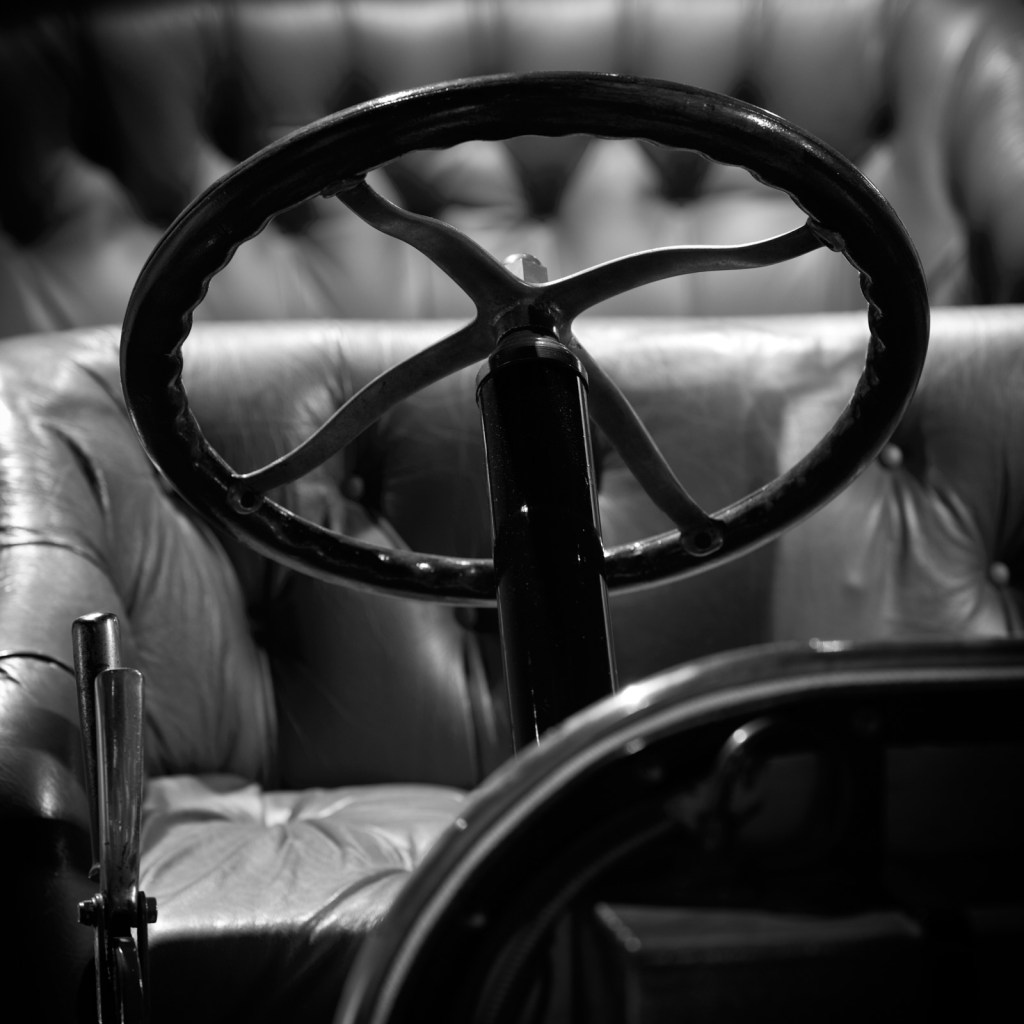
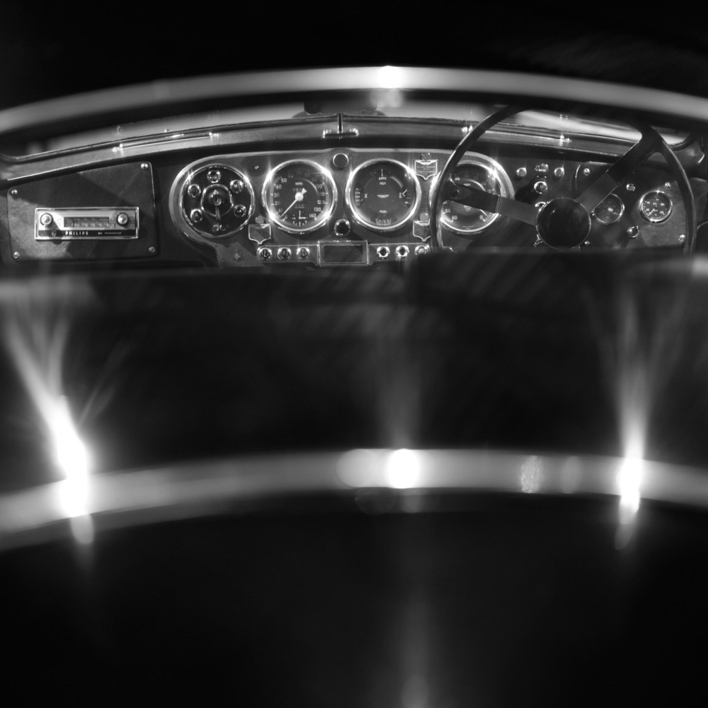
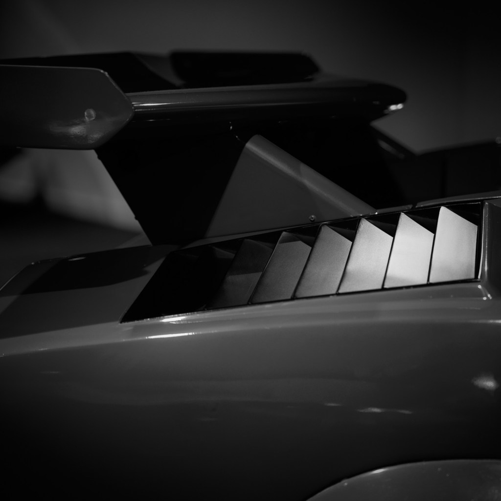
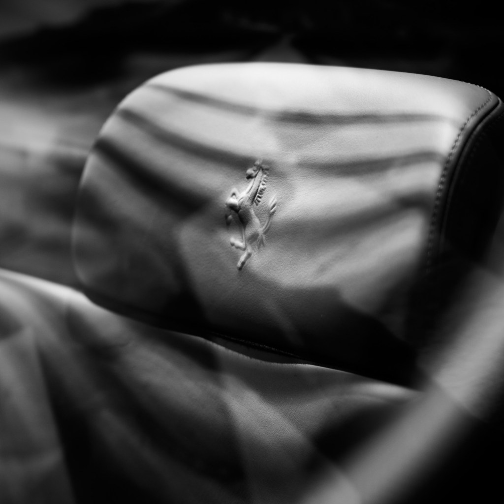
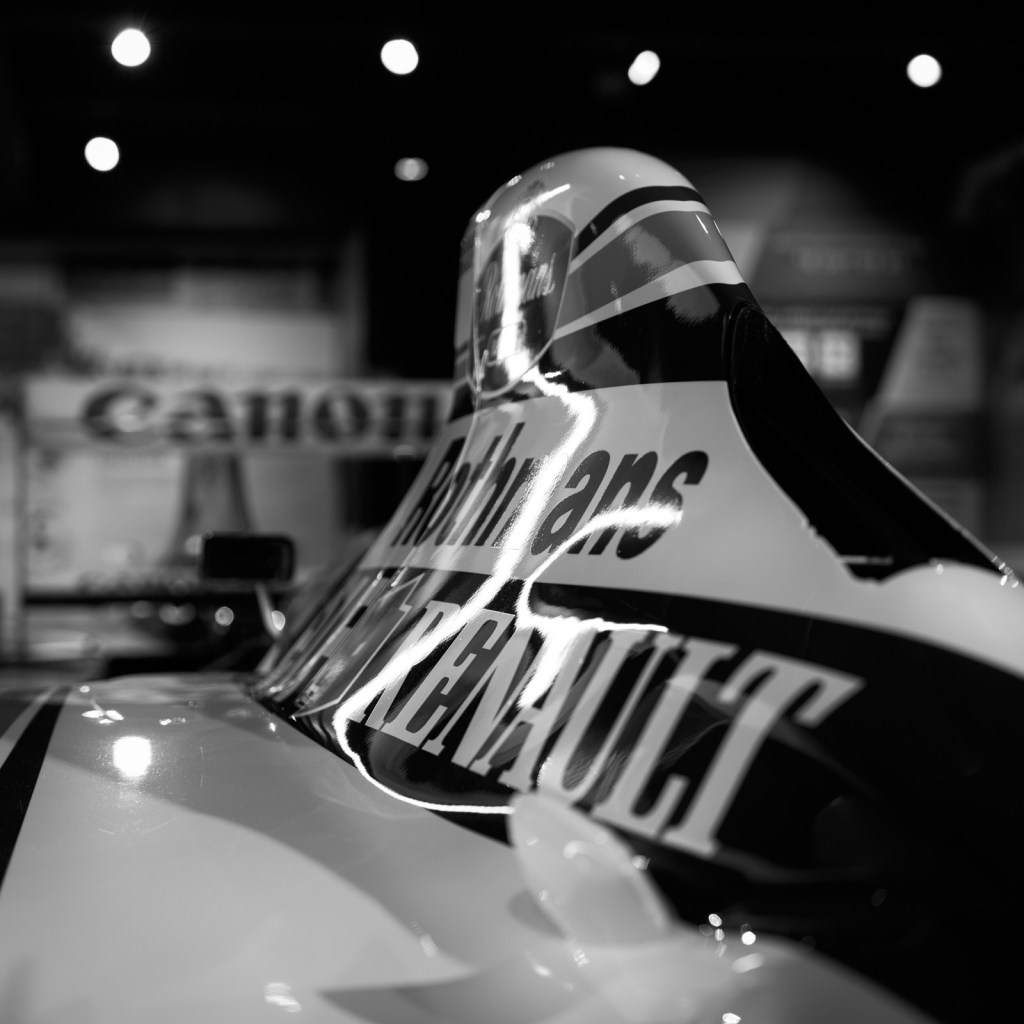
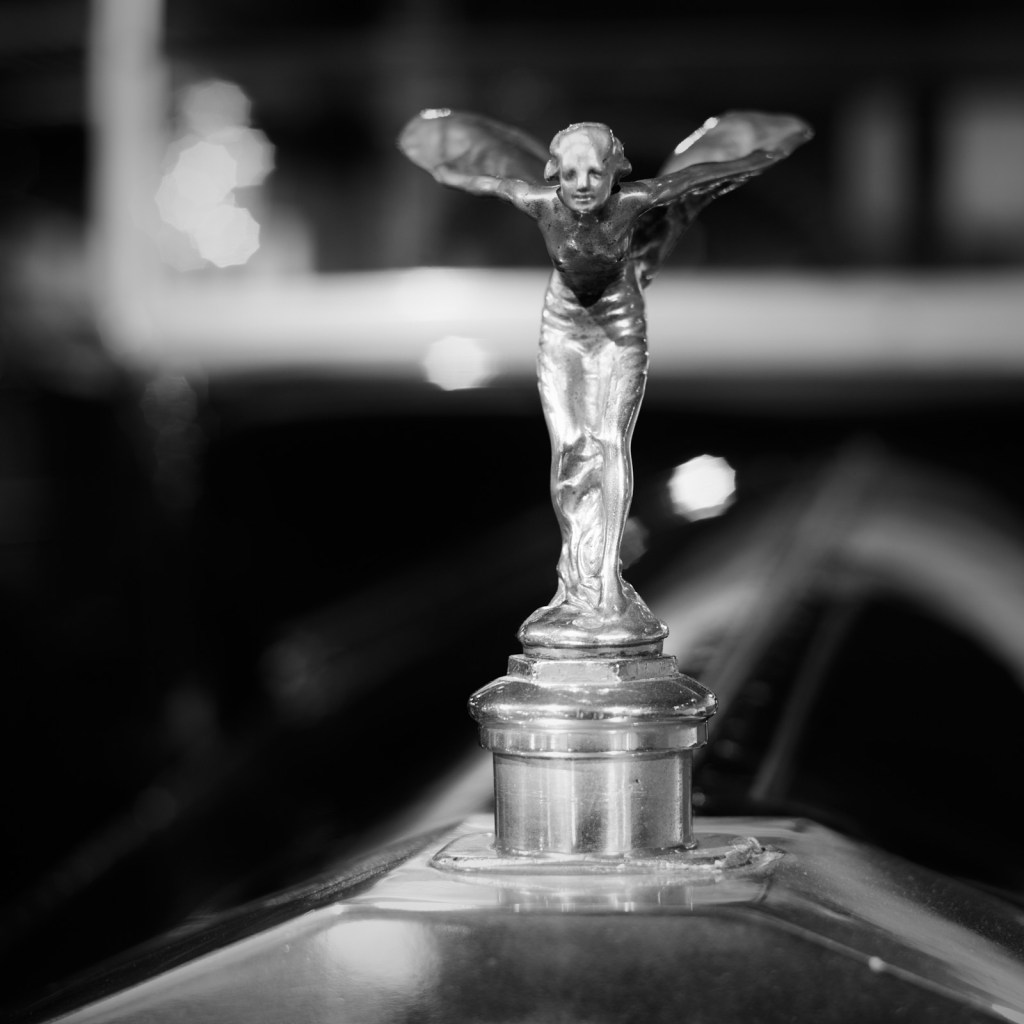
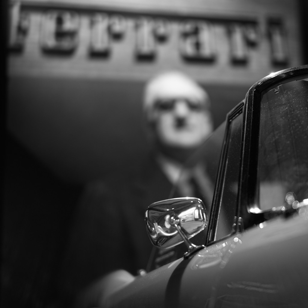
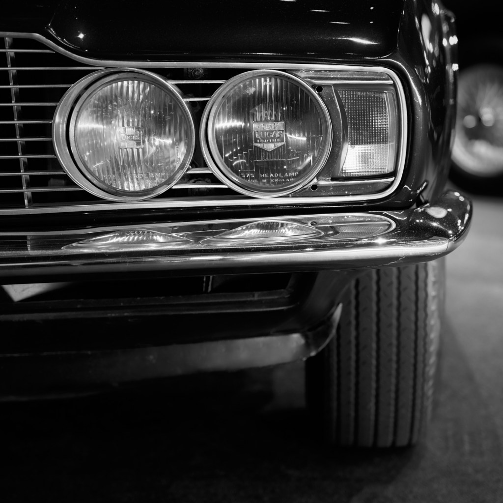
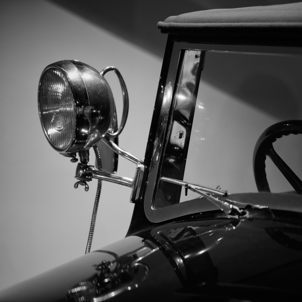
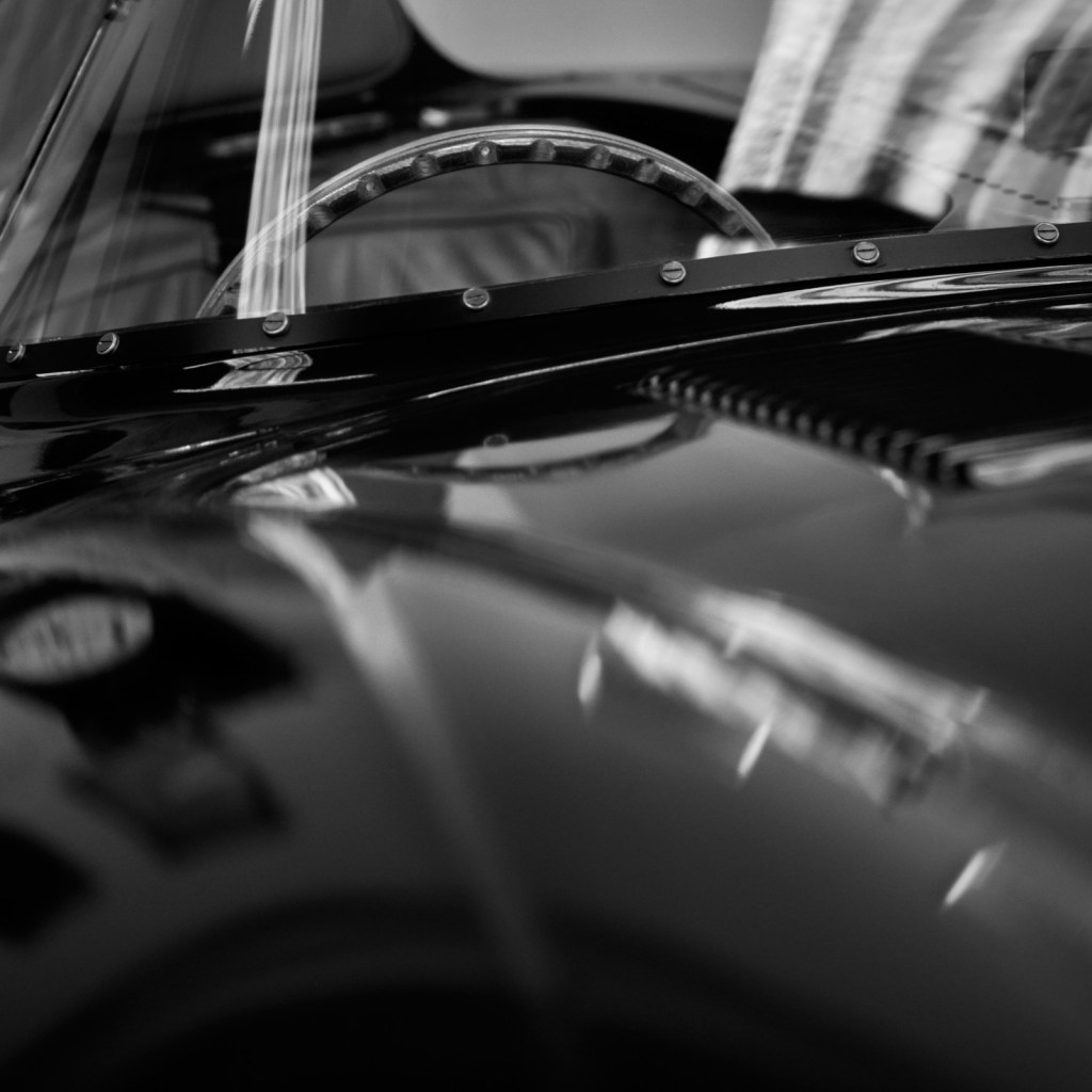
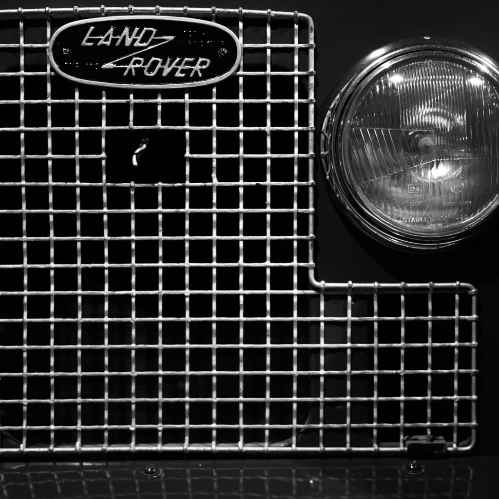
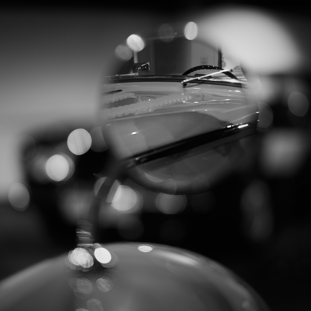
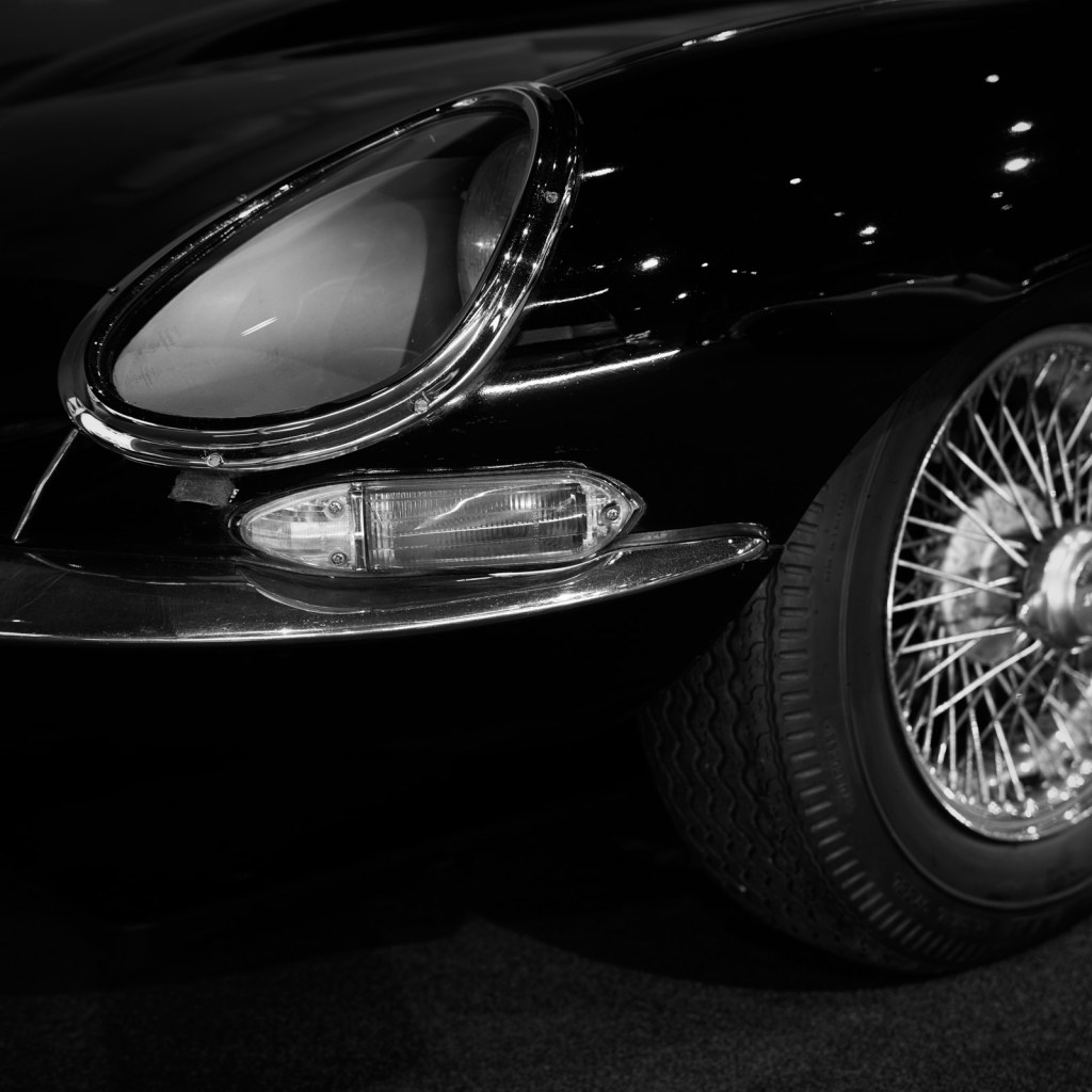
When photographing any subject it’s all too easy to fall into the trap of framing the picture to capture the whole thing. Nothing is omitted and a ‘bumper to bumper’ picture of a car can in truth be nothing more than a record shot. From a purely visual point of view the composition ends up being far too busy. Add a distracting background can only add to the confusion. This is particularly true in a museum where the four wheeled exhibits are displayed in close proximity to one another. There is little or no separation and the resultant photograph is almost invariably a disappointment. In a phrase it lacks viewer engagement.
Abstraction and knowing what to leave out, can I believe make for a much more interesting and pleasing image.
I recently made a second visit to the Haynes Motor Museum in Somerset, England. My photographic intentions were very clear.
I set out with the specific aim of making photographs which told a story and would in my view capture the essence of both the place and the wide range of cars on display. I wanted to make positive use of the artificial lighting. To work with what could be distracting sources of light and reflections. To embrace out of focus areas, to enhance the image, and adding a further layer of interest whenever possible.
I thoroughly enjoyed combining two of my passions in life – motor cars and photography. There are a huge variety of cars at the museum spanning all eras. With my camera and a selection of lenses I experimented with various settings in the hope of making some interesting black and white compositions.
You can be the judge of whether or not my approach was successful.
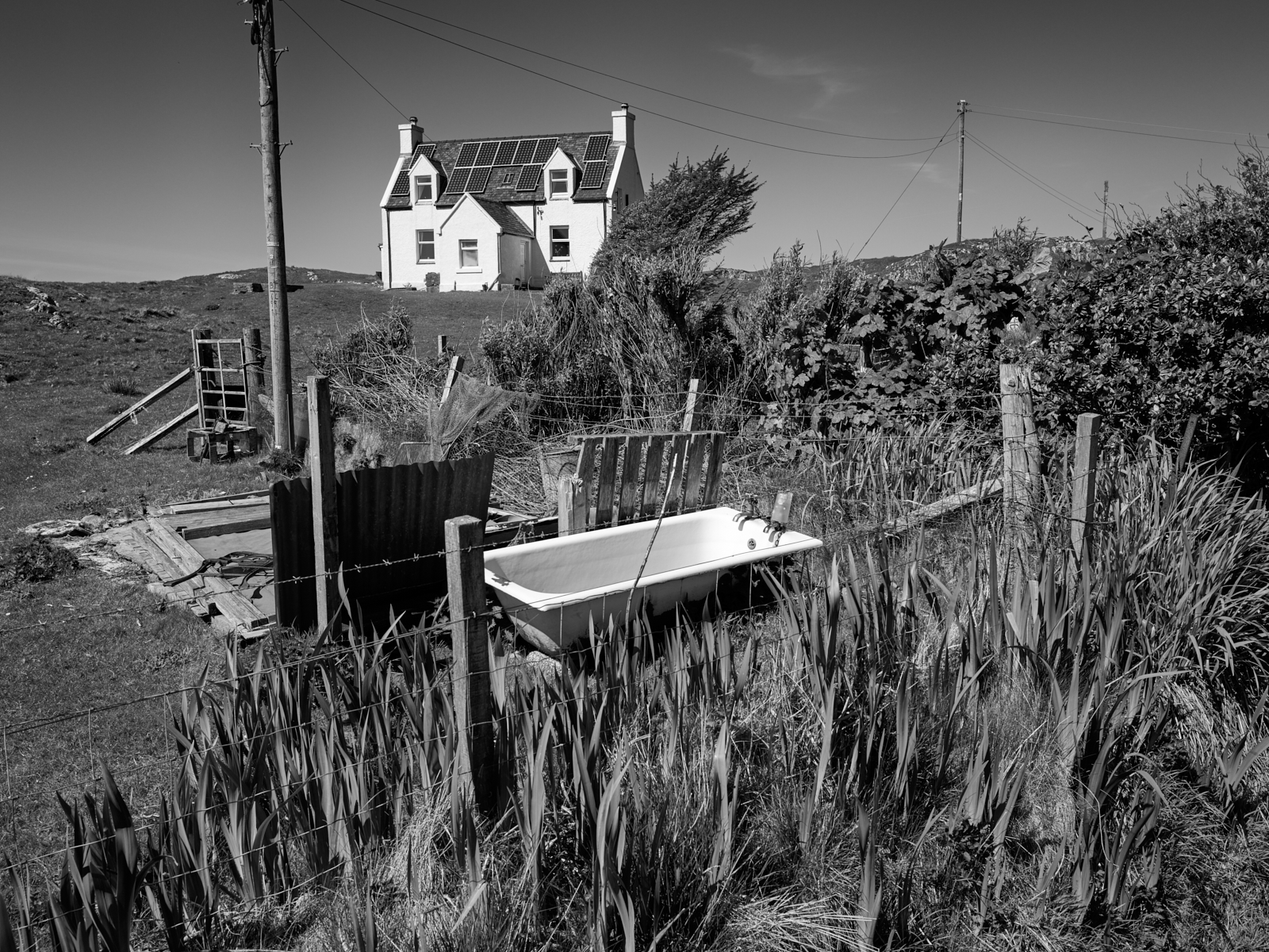
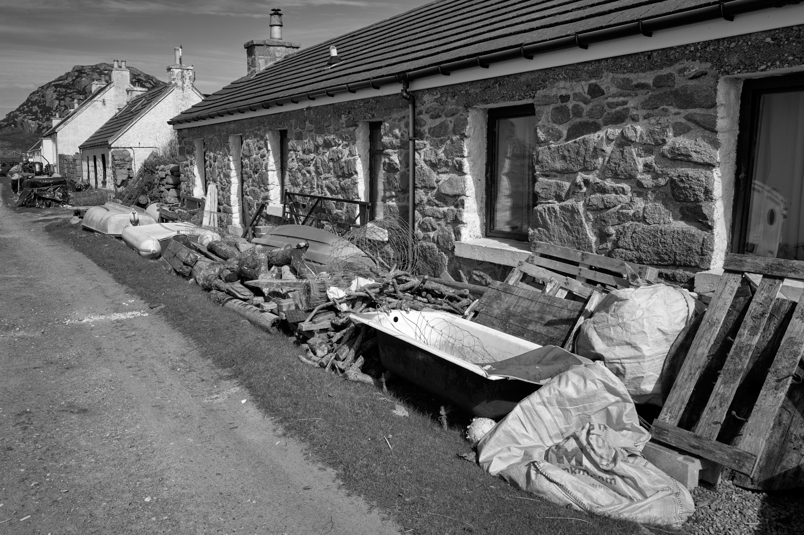
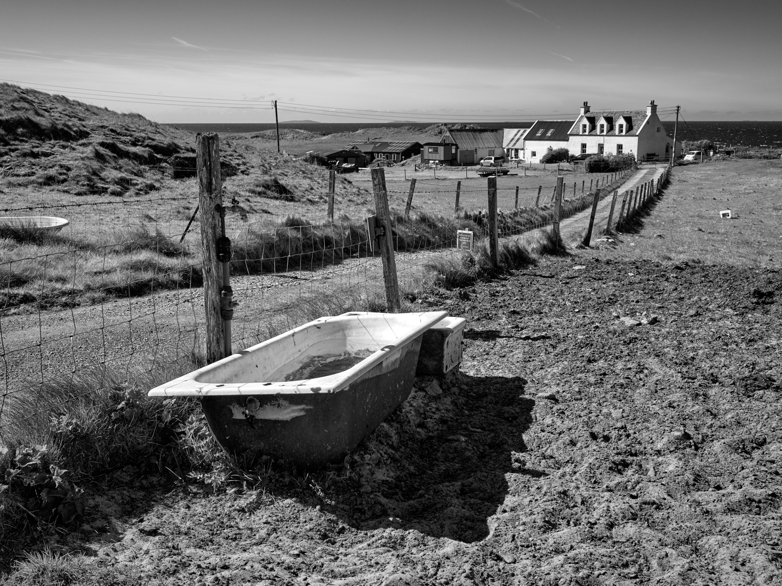
By way of something different I couldn’t help but notice the number of old baths dumped on land or outside a property. I guess some are repurposed, cattle troughs for example, but there is probably another explanation. From Fionnphort at the western tip of the Ross of Mull it’s a four hour round trip to the nearest recycling centre just outside the town of Tobermory in the north east corner of the isle!
Here are links to Parts One and Two in this series.
There are so many facets to these isles, to the point that trying to capture the spirit of the place with just a handful of images can’t possibly do it justice.
My wife and I have visited the Scottish Isles and in particular the Isle of Mull for over thirty years. However living on the South coast of England and travelling by car, means a minimum of two days on motorways, other stretches of tarmac and ferry crossings to reach our final destination. We take pleasure in the journey but we would probably visit more often if it wasn’t so far away. However being the distance it is does make it that much more special.
Admittedly accessibility is arguably the same for many people which does help to keep the number of visitors down. As a consequence places like Mull and Iona remain wild, beautiful and peaceful in equal measure.
In Part One of this short series I featured Iona Abbey. In this entry I will share a series of images captured during our week long stay back in the Spring. Apart from location they have little else in common but I hope they help to convey why and how much we love coming to this part of the world.
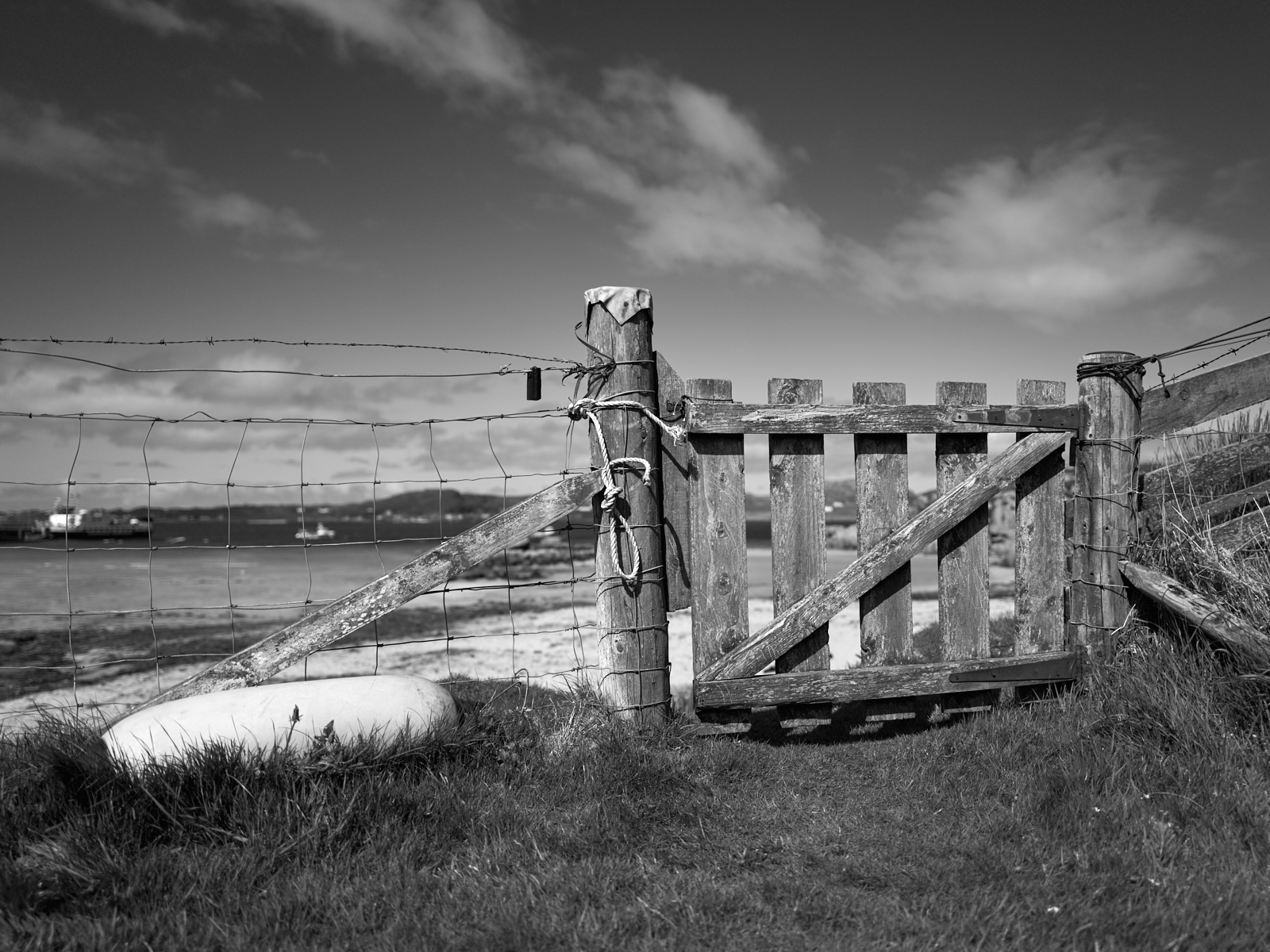
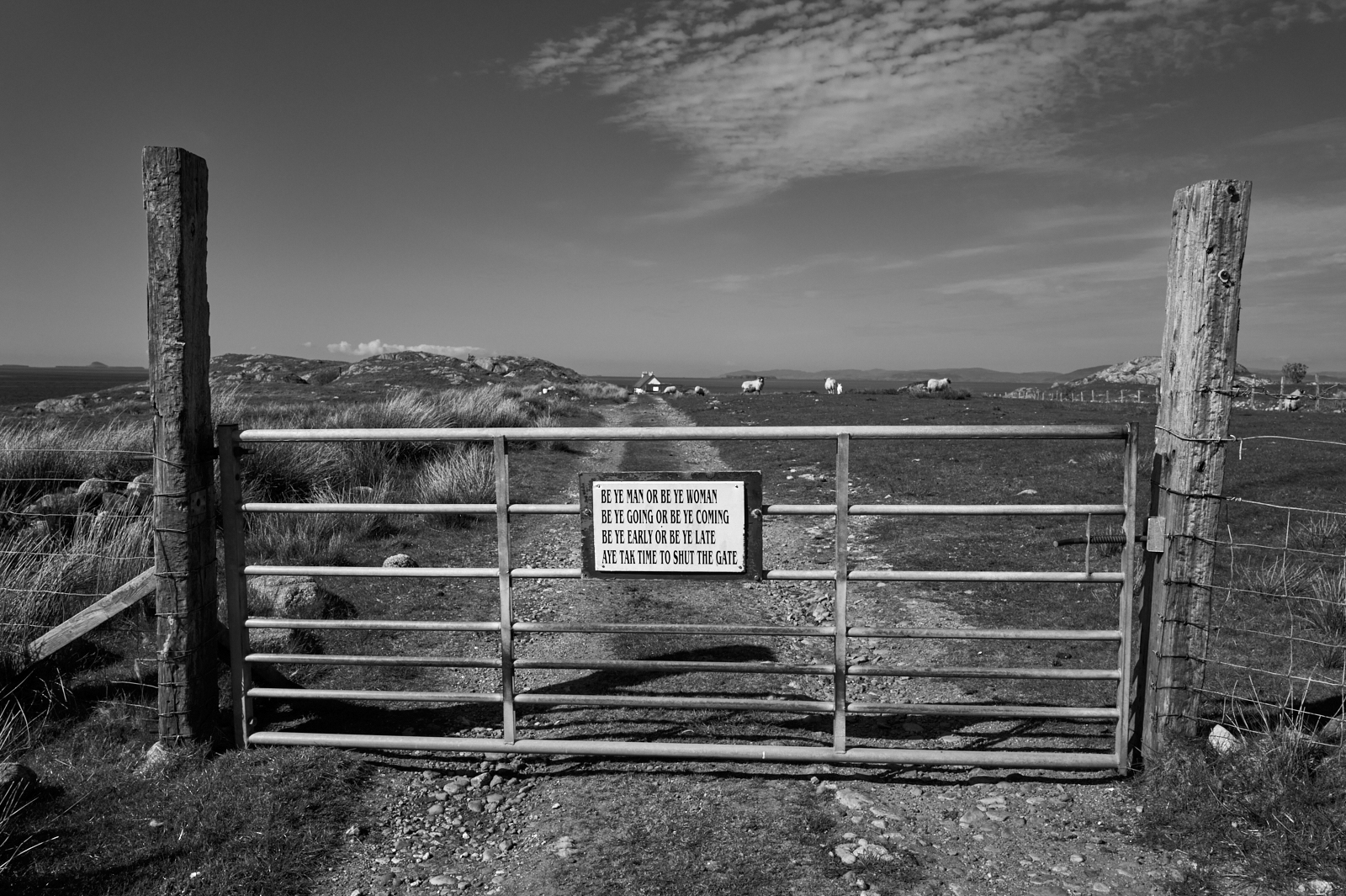
A gate into the beach at Fionnphort with Iona in the far distance
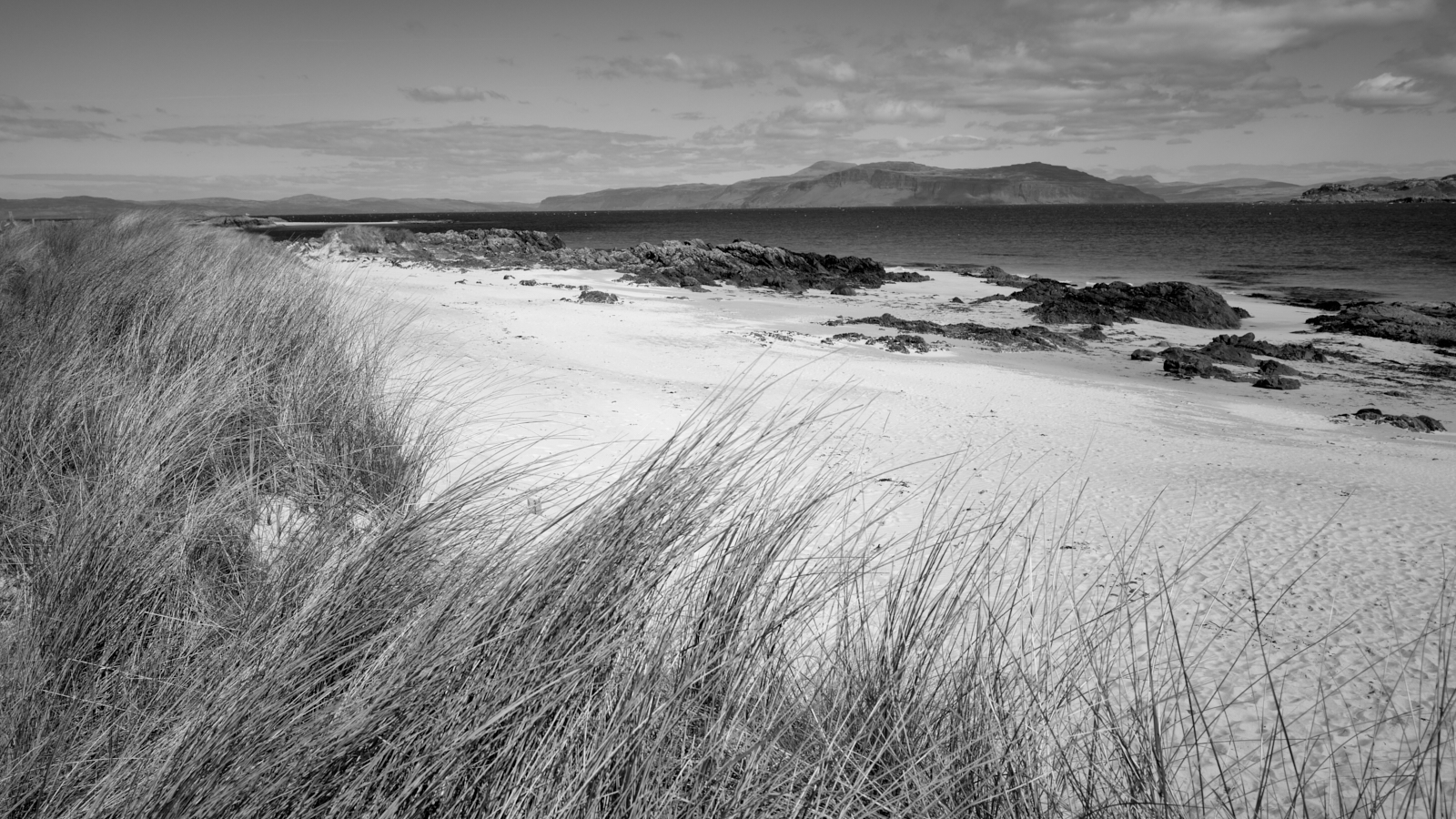
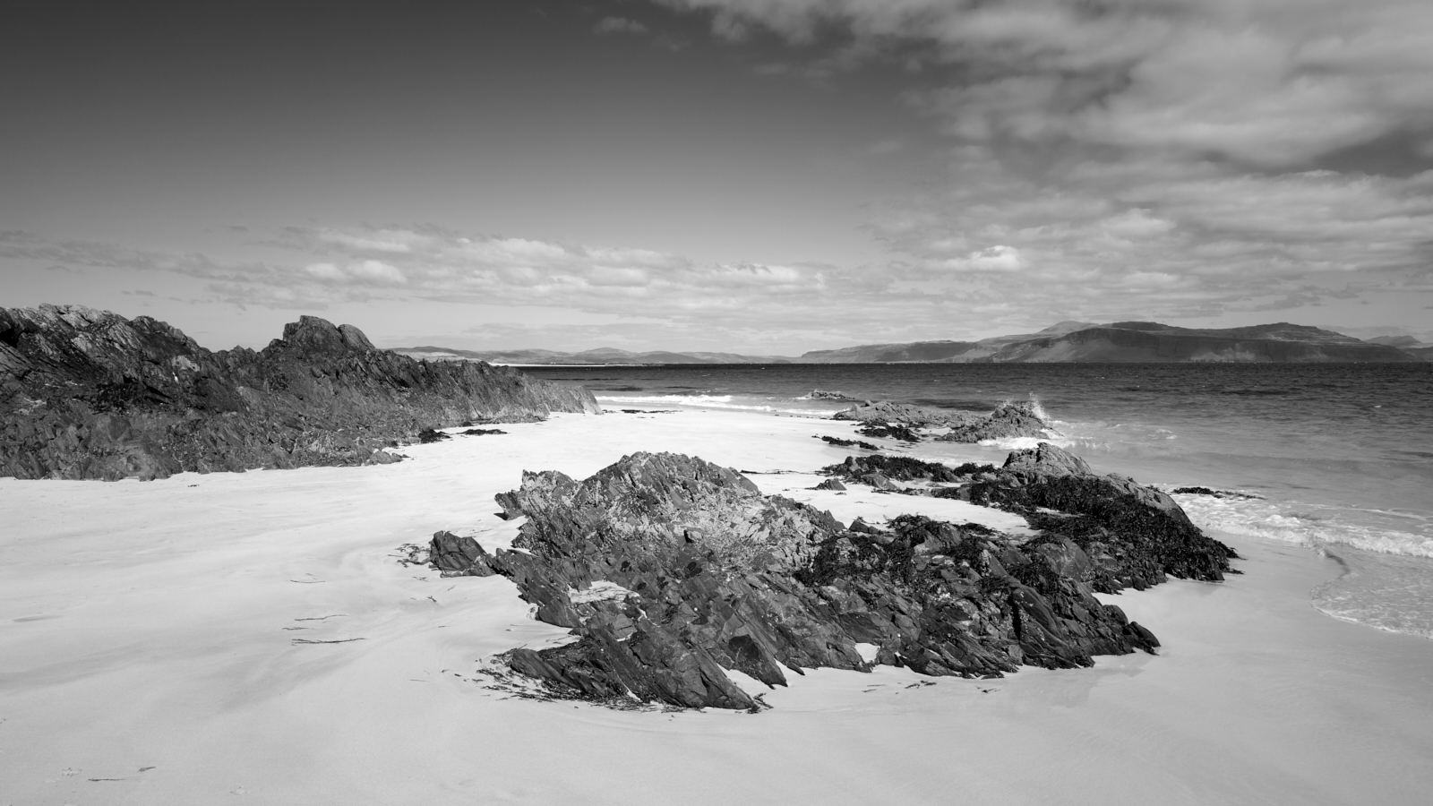
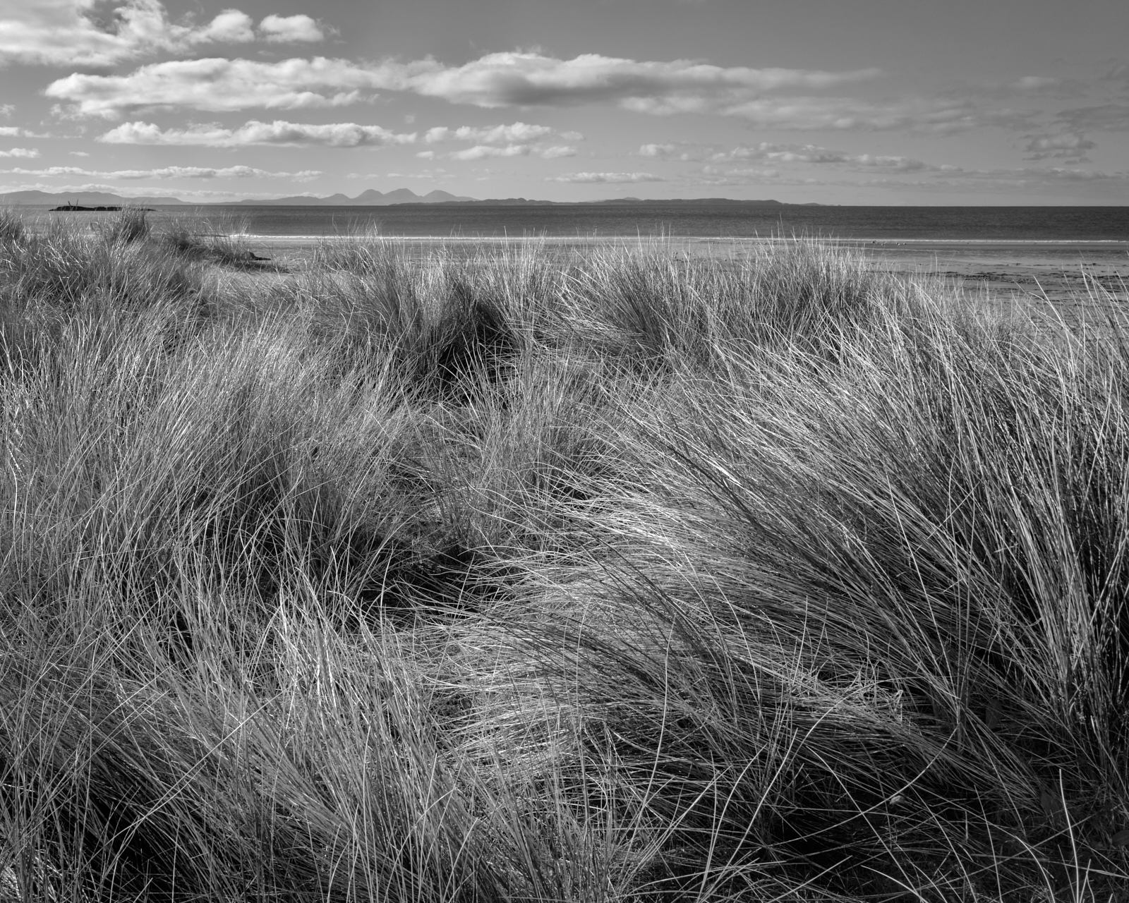
Uisken beach, Ross of Mull
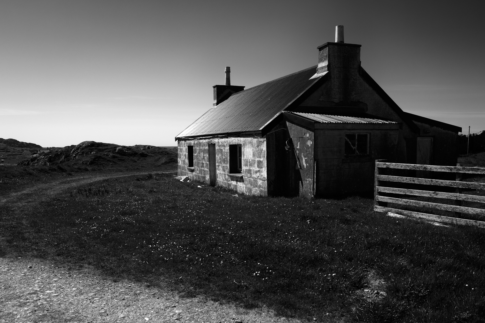
Typical Croft House, Isle of Iona
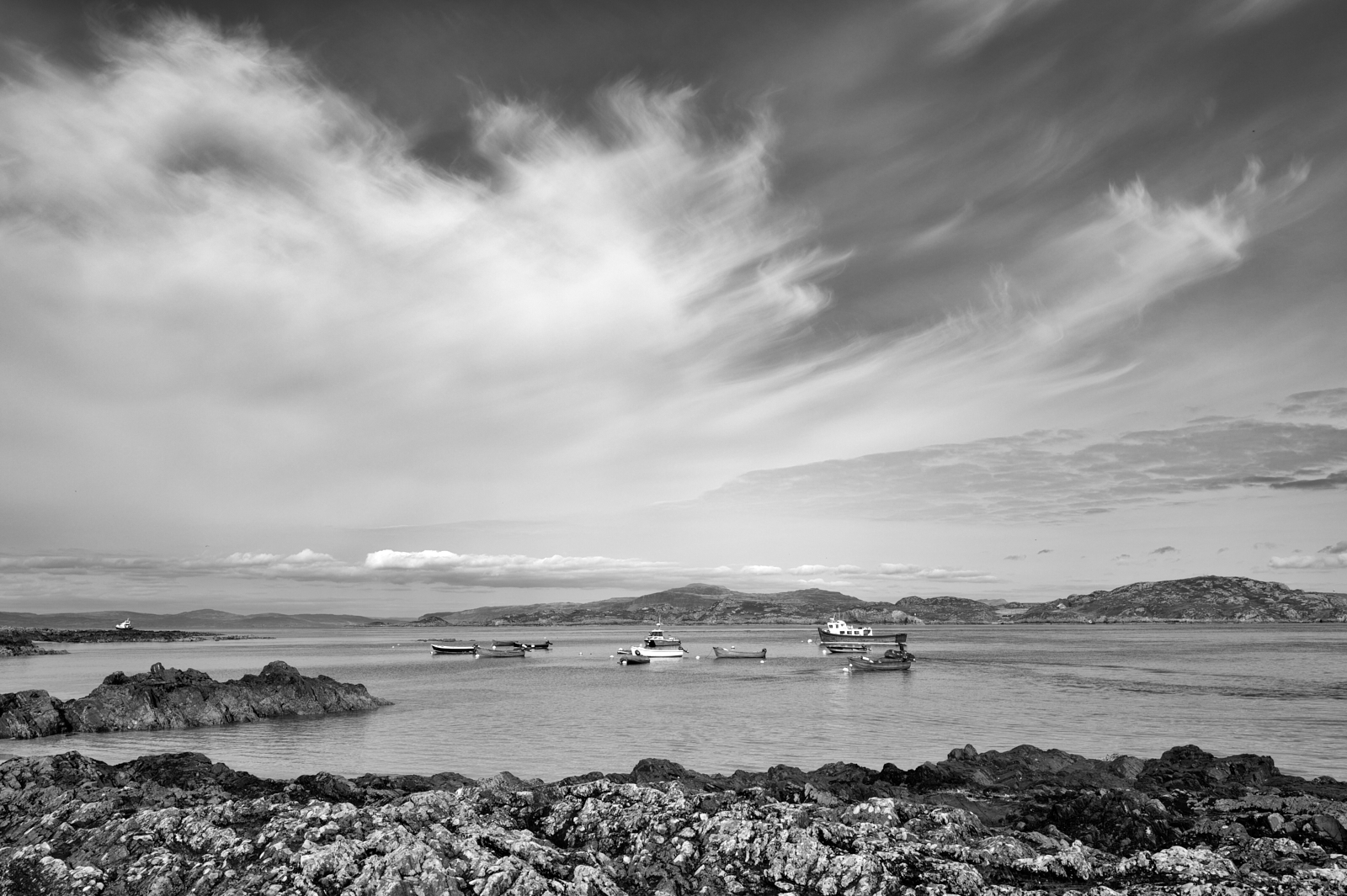
Looking across the Sound of Iona, from Iona with Mull on the horizon
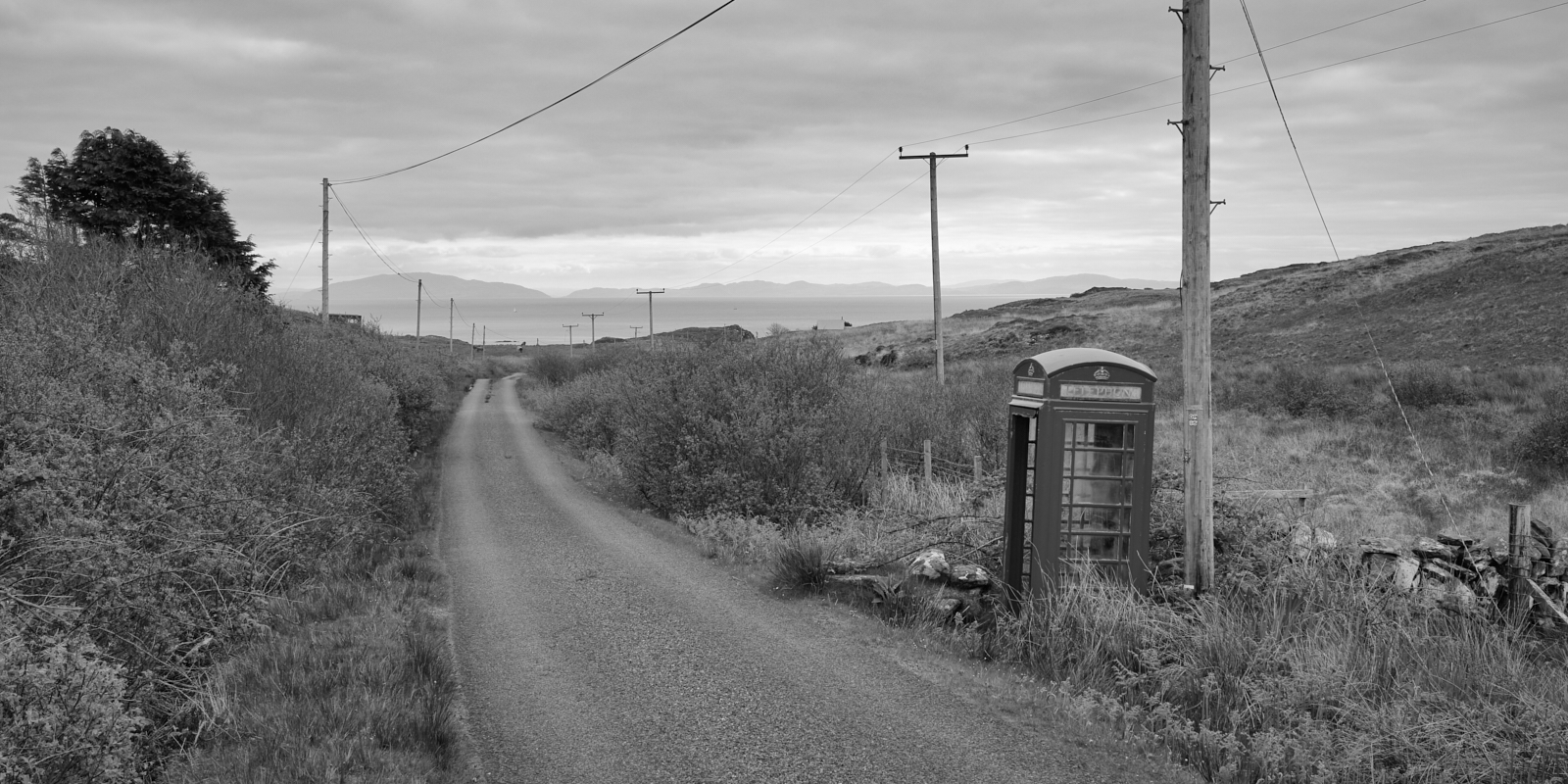
Redundant telephone box on the Ross of Mull
White Strand of the Monks, Iona ….. quite possibly my favourite and most magical place on the isle.
Please shut the gate, Near Kintra, Ross of Mull
Be Ye Man or Ye Be Woman, Be Ye Going or Ye Be Coming
Be Ye Early or Be Ye Late, Aye Tak Time to Shut the Gate
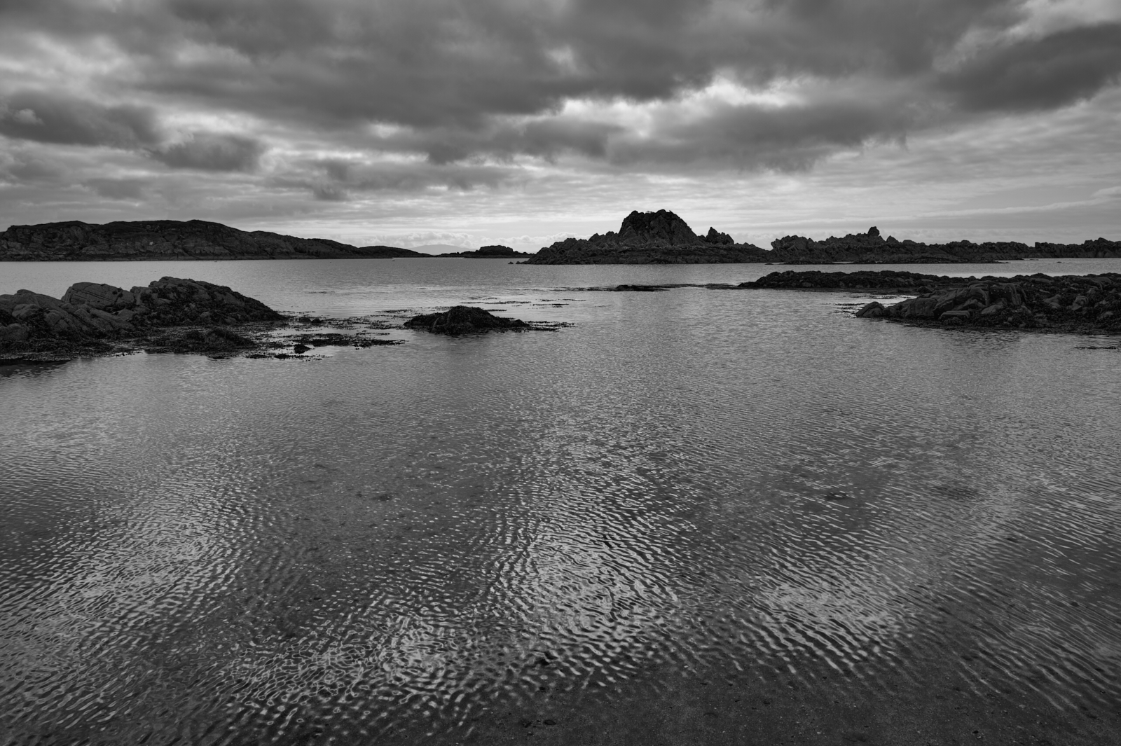
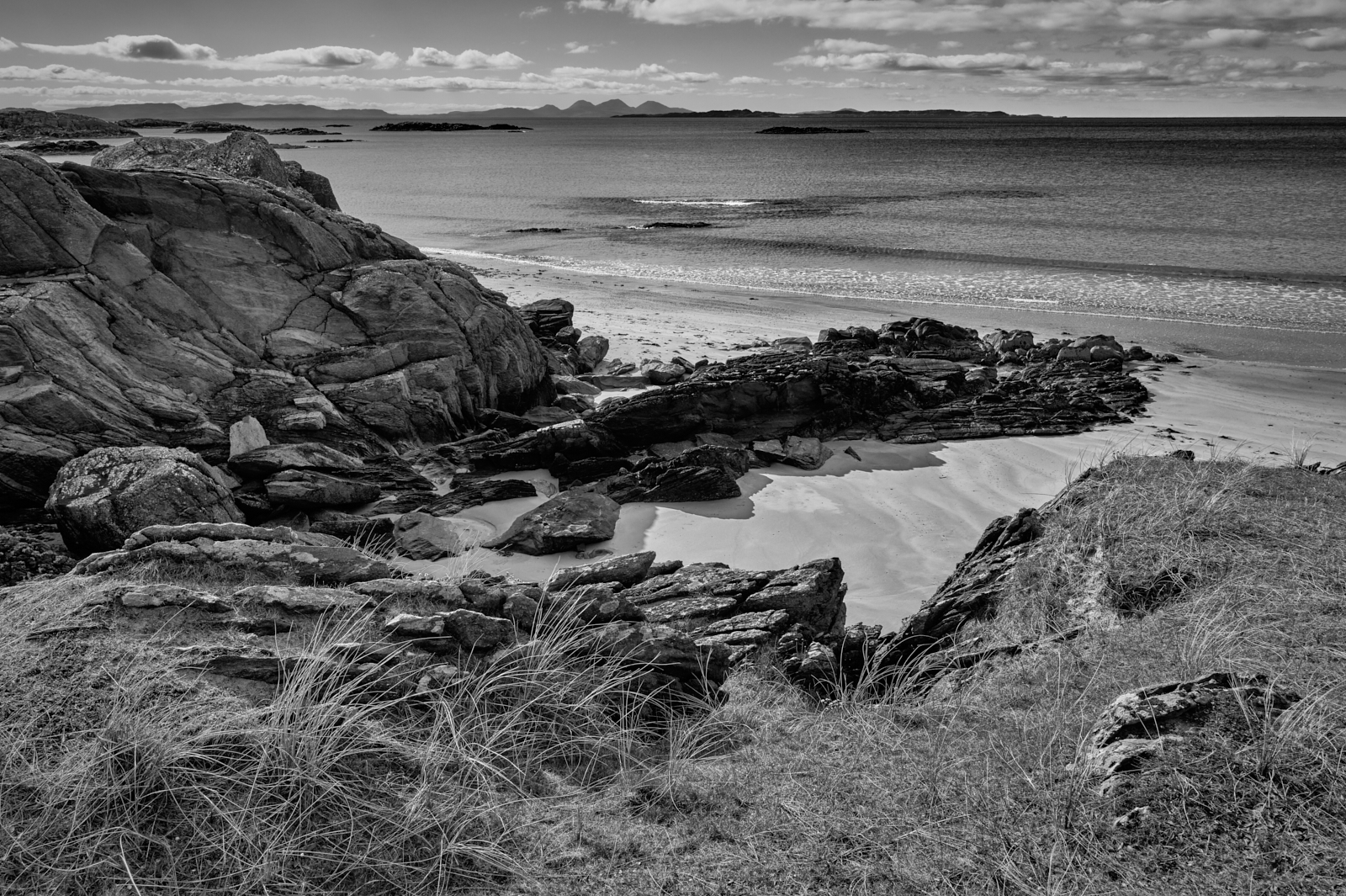
Ardalanish beach – looking out to the Paps of Jura, Isle of Mull
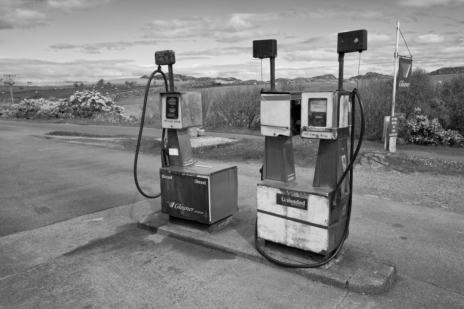
Petrol station – they are few and far between
The Paps of Jura on the skyline from Ardalanish beach
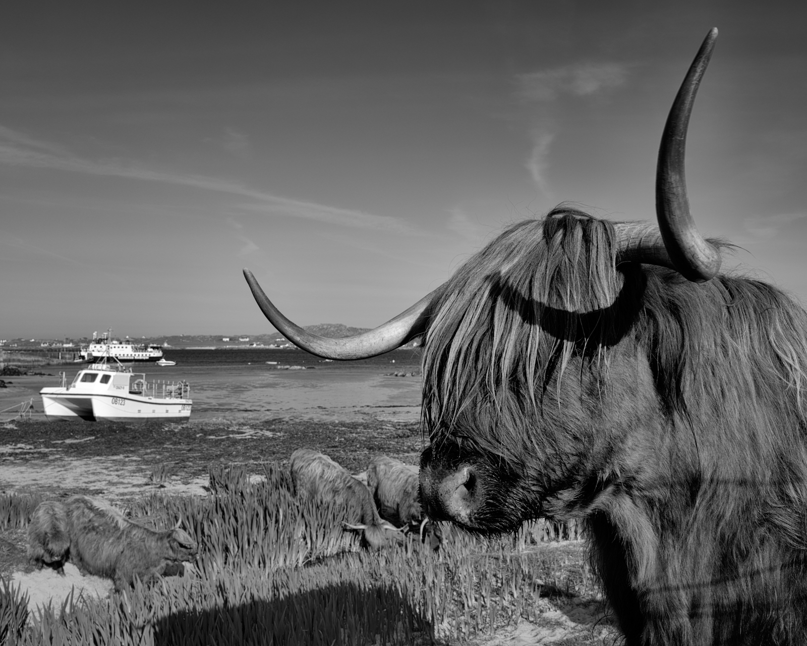
Highland cattle at Fionnphort – even they like a visit to the beach!
I shall finish with a Gaelic saying which was on inscribed on a wall in the Abbey which read;
‘Am fear a thèid a dh’l, thèid e trì uairean an.’
It means –
Those who come to Iona will come, not once, but three times.
As this was our second visit to Iona I very much hope this saying will come true, and that we will return on another day.
(A note for fellow photographers – I wanted to travel light this holiday so all these images were captured with the Leica Q3)
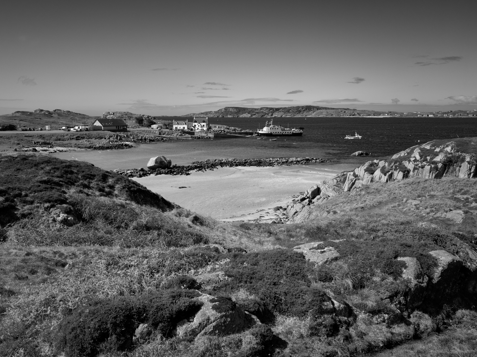
The ferry crossing at Fionnphort at the end of the Ross of Mull
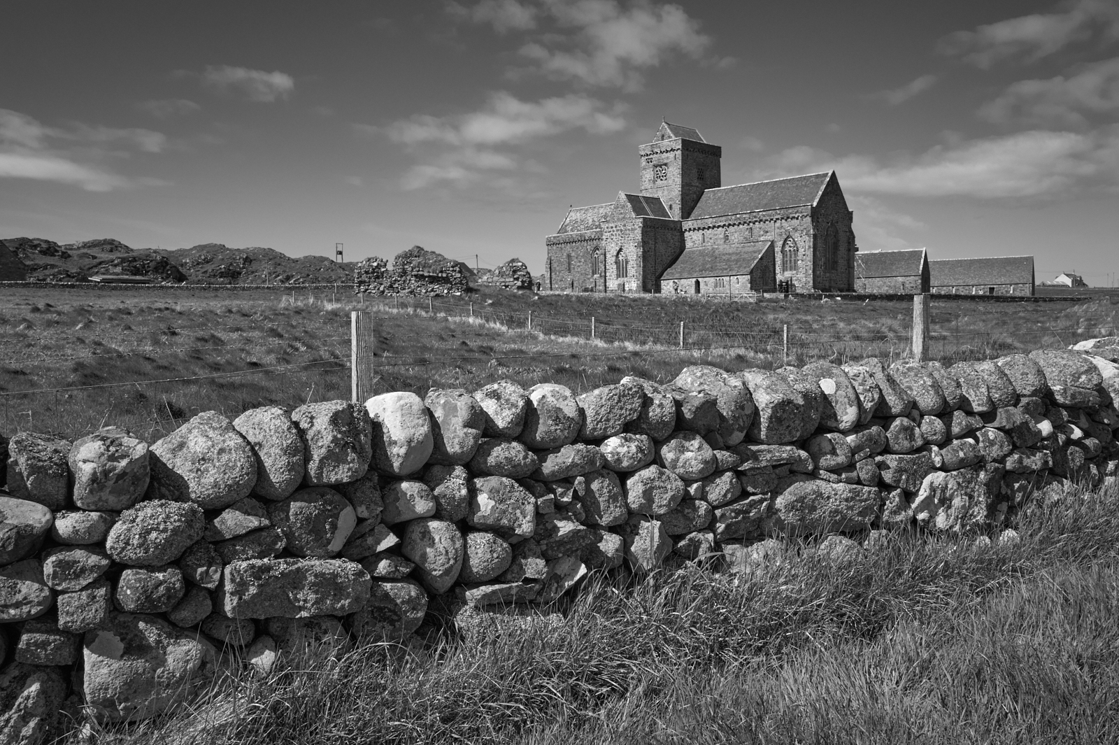
For many centuries The Isle of Iona has been a cherished destination for pilgrims wishing to visit the Benedictine Abbey and experience for themselves the beauty, peace and spiritual nature of the Isle. It was on this isle that St Columba and his disciples first landed in 563AD, having rowed from Ireland in a currach, a small boat with a wooden or wicker frame covered in tarred animal hides. There is much speculation as to why the Irish Saint, then known by his Irish name as Colm Cille, meaning “Dove of the Church”, made what would have been this tortuous journey. But in doing so he spread the word of Christianity in Scotland and further afield.
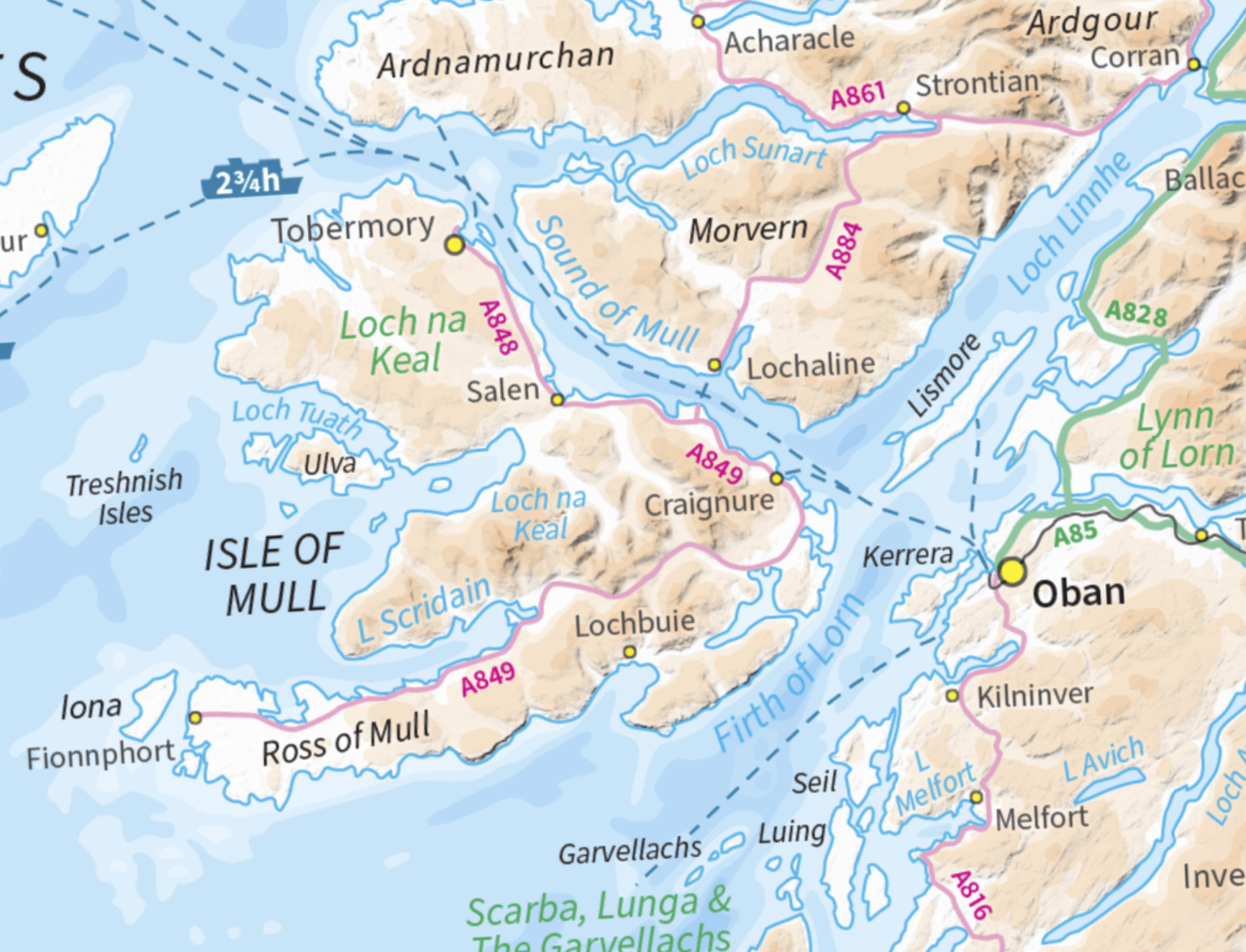
The Isle of Mull with Iona at the western tip ofthe Ross of Mull
Even today using modern means of transport it requires a fair amount of effort to reach Iona. From Oban on the Scottish mainland a ferry crossing of about an hour docks at Craignure on the Isle of Mull. An hour and a quarter long drive along the A849, albeit a mainly single track road leads to Fionnphort. From there another ferry crosses the Sound of Iona in ten minutes. These ferry crossings are very weather dependent, so once you arrive on the island the feeling of isolation on Iona is tangible. Keep in mind it is only 3 miles long a 1.5 miles wide. When Samuel Johnson and James Boswell famously toured the Western Isles and the Hebrides in 1773, they reached Mull via the Isle of Coll. A significant and challenging adventure given the journey on land would have been horse and carriage.
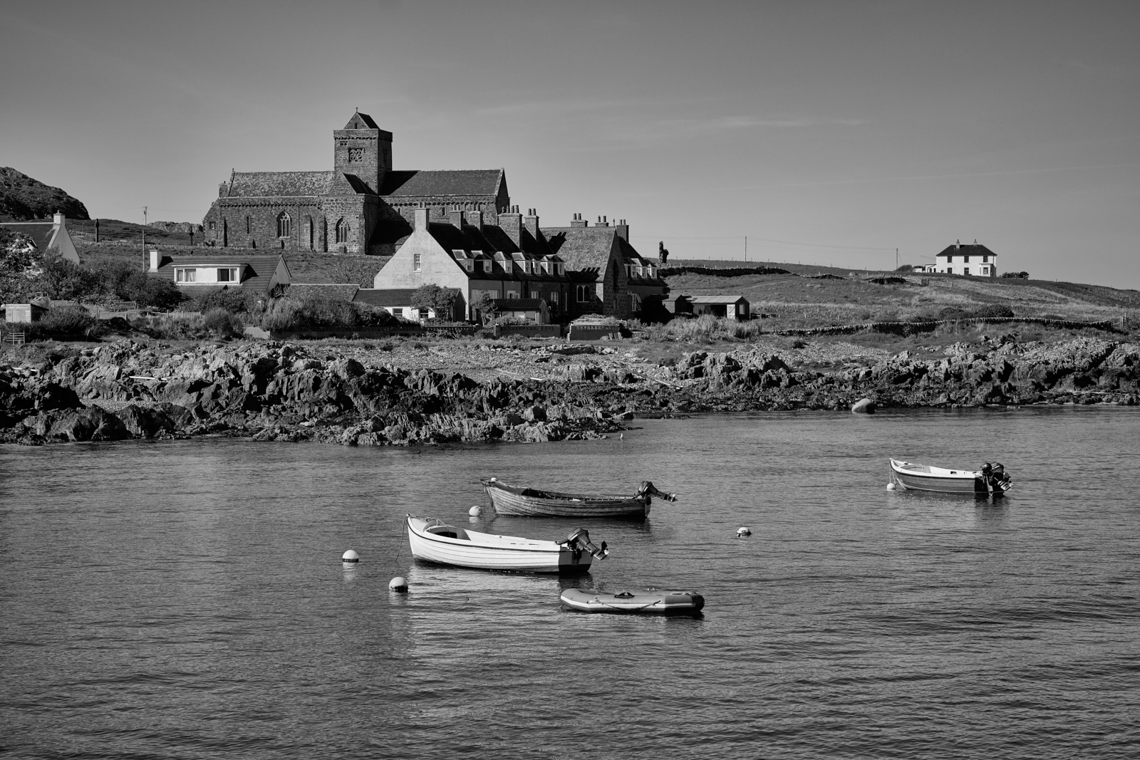
A much photographed view of the Abbey from the Sound of Iona
Earlier this year my wife and I had the good fortune to return to this very special and beautiful place; The Isle of Iona forms part of the Inner Hebrides in Scotland and lies at the western most tip of the Isle of Mull. We stayed in a small property in Fionnphort and overlooked the Sound of Iona. From our accommodation for the week we could see the small ferry port and observe the regular sailing of the Caledonian MacBrayne ferry as it made the 10 minute crossing. We were blessed with lovely weather although that did have the effect of increasing the number of visitors.
Iona Abbey
As you might imagine there is considerable history attached to the Island and in particular to the Abbey. Too much in fact for me to describe in any detail here, suffice to say that the Sacred Isle became the hub for early Christianity as missionaries spread the word across northern Britain. The original celtic monastery founded by St Columba no longer exists and the current Abbey dates from the 13th Century, although monastic life ended in 1560 with the protestant reformation and the building was left derelict. Restoration only took place in the early part of the 20th Century before final completion in 1965.
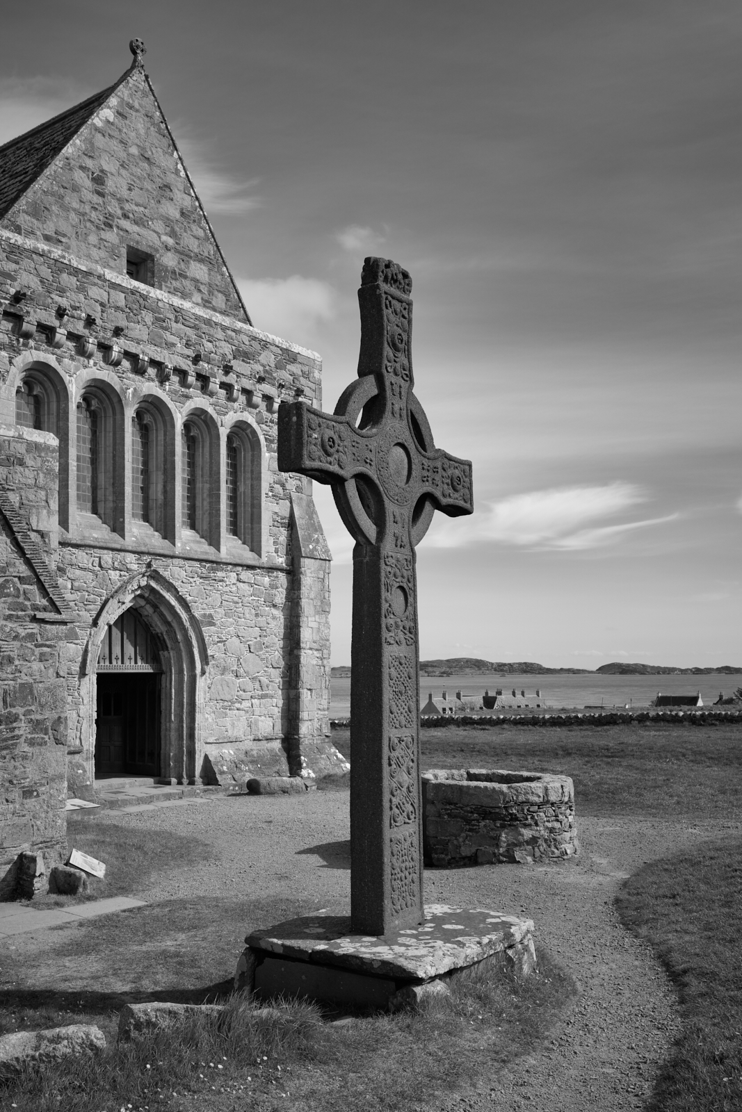
A replica of the 8th Century St John’s Cross – what remains of the original cross can be seen in the Abbey Museum
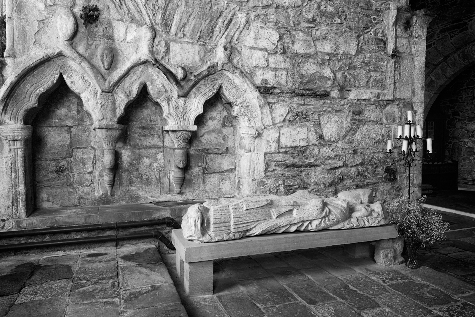
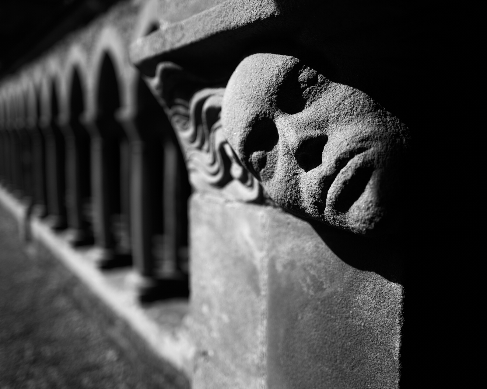
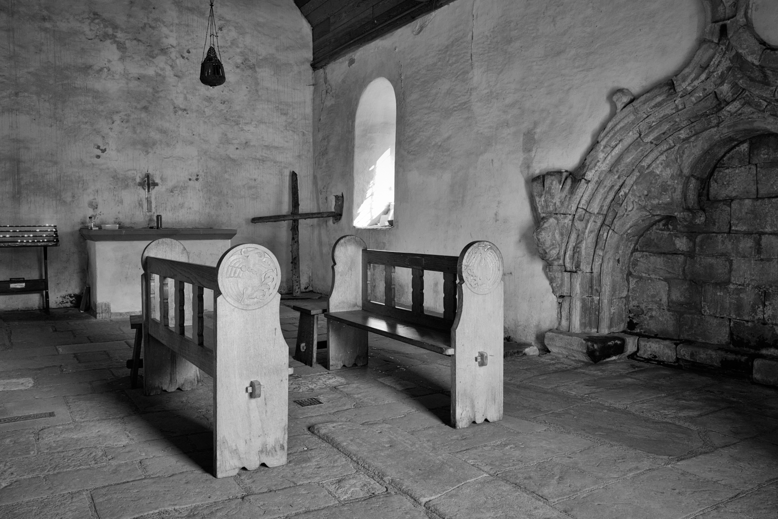
Medieval stonework in the Chancel
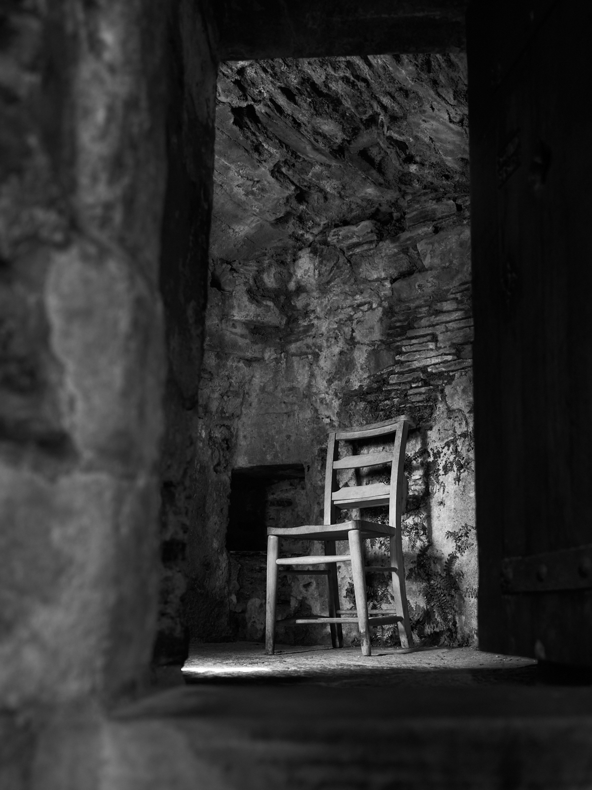
Interior detail – notice the ferns growing out of the wall
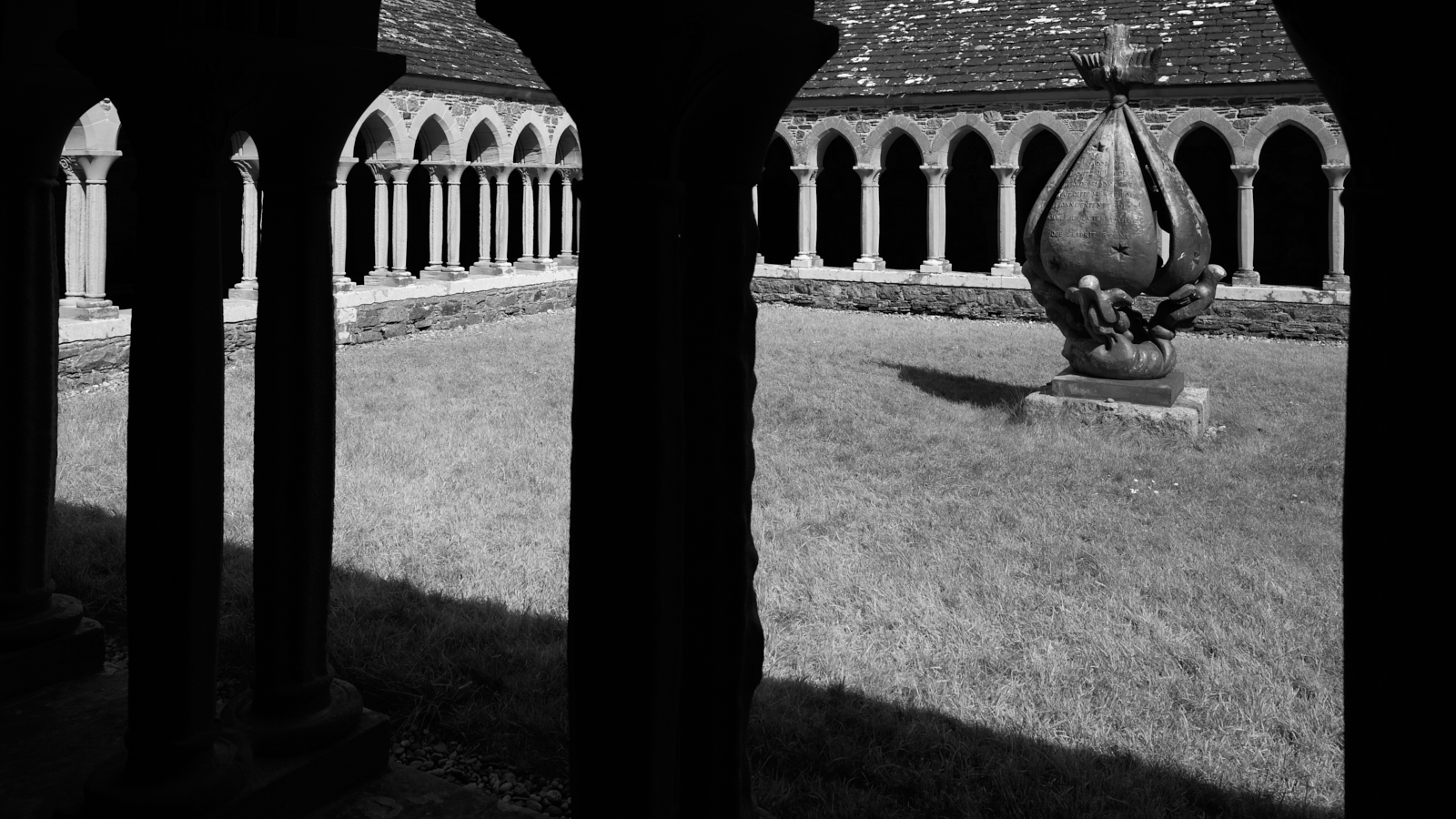
The Abbey Cloisters
Detail of one of the many stone carvings in the Cloisters – Alpha and Omega
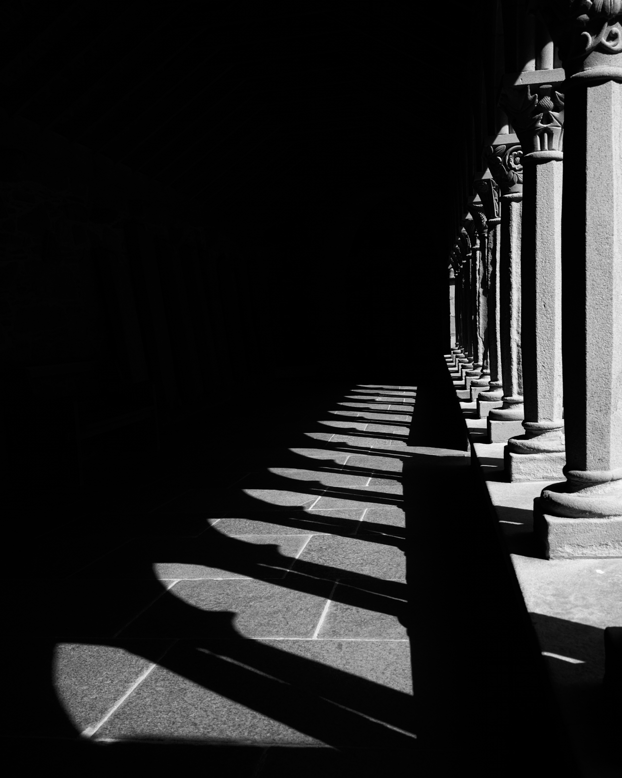
Light and darkness in the Cloisters
During the Dark Ages Iona was the subject of many raids by the Vikings, mainly in the 9th Century and the graveyard of St Oran’s Chapel was used as the final resting place for many local clan chieftains and ‘Kings of the Isles’. During this period the island also became a leading artistic and scholarly centre, known for its carved stone crosses and illuminated manuscripts which included the famous Book of Kells.
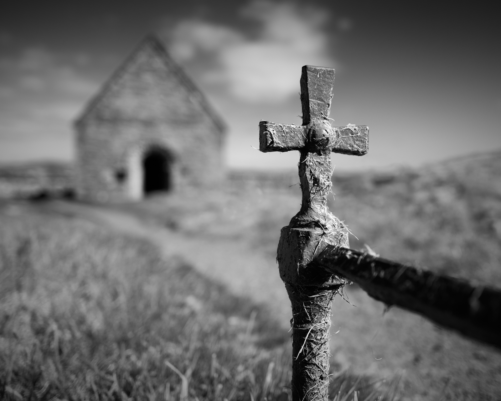
St Oran’s Chapel
The interior of St Oran’s Chapel
This is Part One of three posts about the Isles of Mull and Iona.