
Car details in mono at The Goodwood Revival
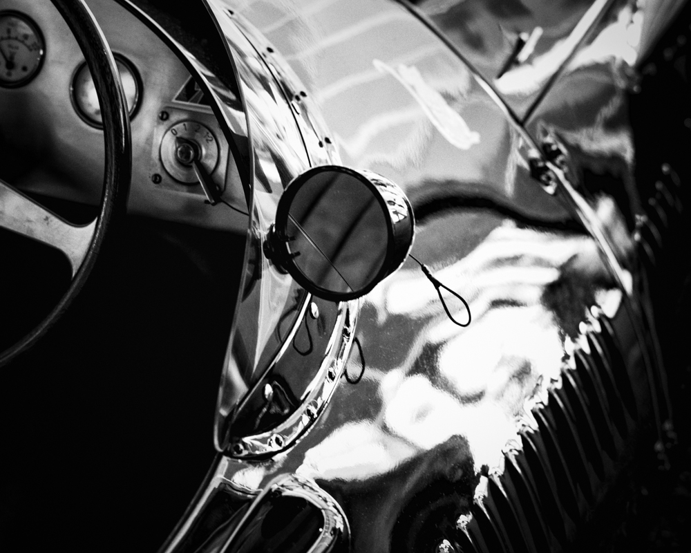
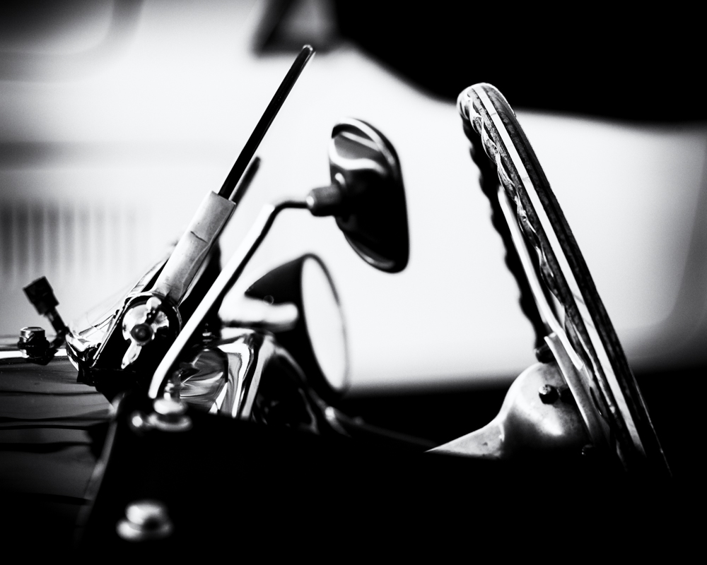
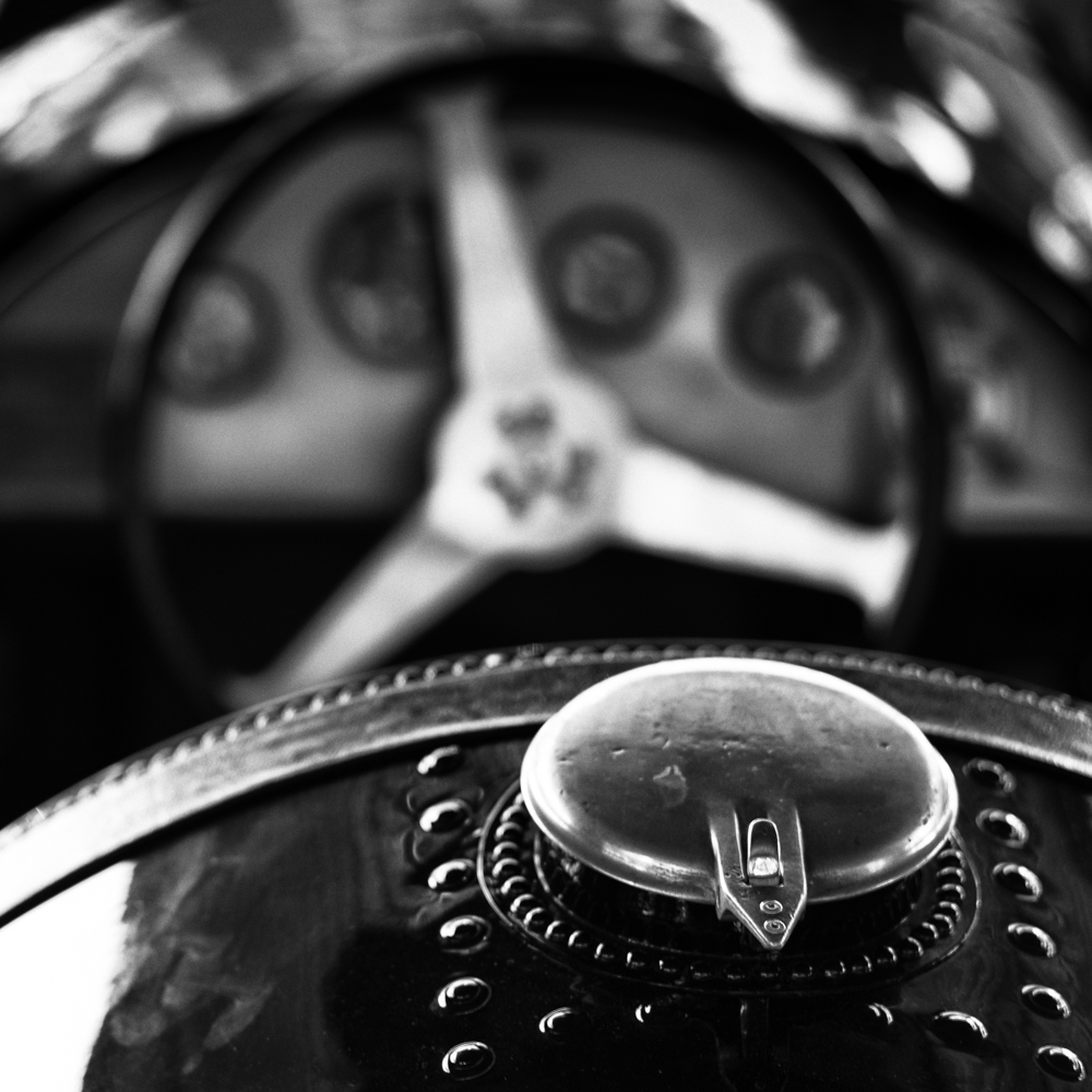
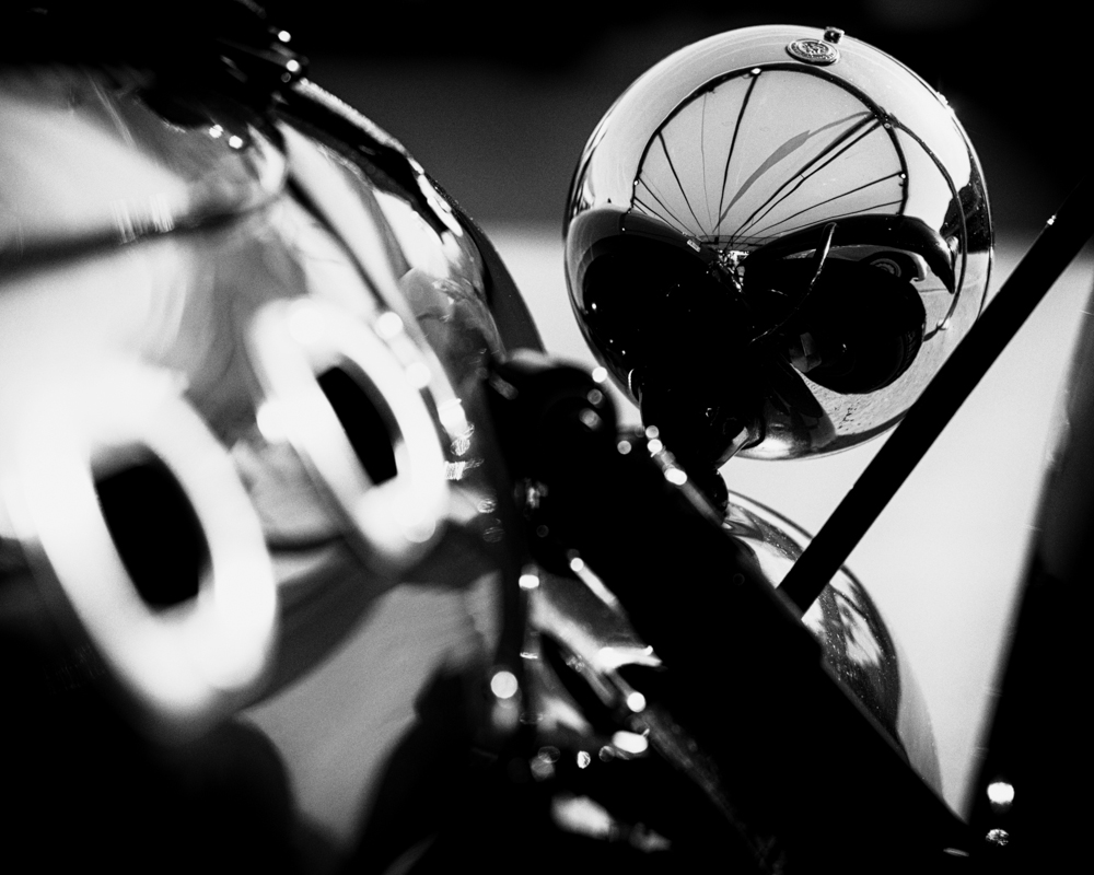
This selection of six images were taken at The Goodwood Revival earlier this month. I am fortunate to have been to this event on numerous occasions, but in the past the photographs I have taken of these stunning racing cars have largely been from a trackside position and panning with a long lens. Countless images of this type must be taken every year and whilst some can make good action shots, I wanted to get much closer, capturing the wonderful detail and craftsmanship of these fine machines.

In all these shots I have used a wide aperture, giving me a shallow depth of field. The eye is drawn to one particular detail, and whilst other elements are out of focus, they are still important to the overall composition. The conversion to monochrome and the use of high contrast impart a graphic feel and I would like to think the outcome is a more artistic approach to the making of the image. After all these great cars are works of art in their own right and need to be appreciated for their flowing lines, hand crafted detailing, all mixed in with a feeling of raw power.

I have done something differently in this entry by using all six thumbnails to create the featured image. Whether this works or not, I don’t know but the idea is to whet the appetite, and encourage readers to view the whole entry. However to really appreciate each shot, you need to click on a picture to see a larger version, which will open in a new window.

6 Responses to “Car details in mono at The Goodwood Revival”
Excellent set of well processed intimate portraits of a classic machine. Enjoyed looking at them.
LikeLiked by 1 person
Thanks very much…I’m pleased you enjoyed them.
LikeLike
A very good set of images, Alan, of which, for me, the stand-out one is the third one down. Compositionally I find that strong. The elements: windshield, mirror and steering wheel, combined with the deep shadow at the base of the image, create a classic triangular design. I like the way these elements are placed against the light area of the image. All six of them successfully exploit shallow depth of field. I love the contrast too – classic B&W.
LikeLiked by 1 person
Thanks Andy. I too like the third image. The others work well but arguably need to be viewed larger to appreciate them. Thanks as always for commenting. Alan.
LikeLike
An absolute feast for the eye Alan, superbly processed and rich in tones
LikeLiked by 1 person
Thanks very much James.
LikeLike